What’s the reason behind the simplification…or de-branding?
Some of the largest corporations in the world have recently abandoned complexity and detail in an effort to simplify their brand identities.
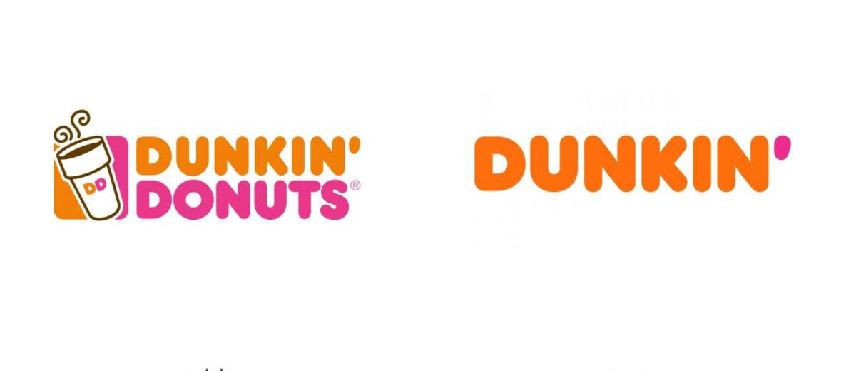
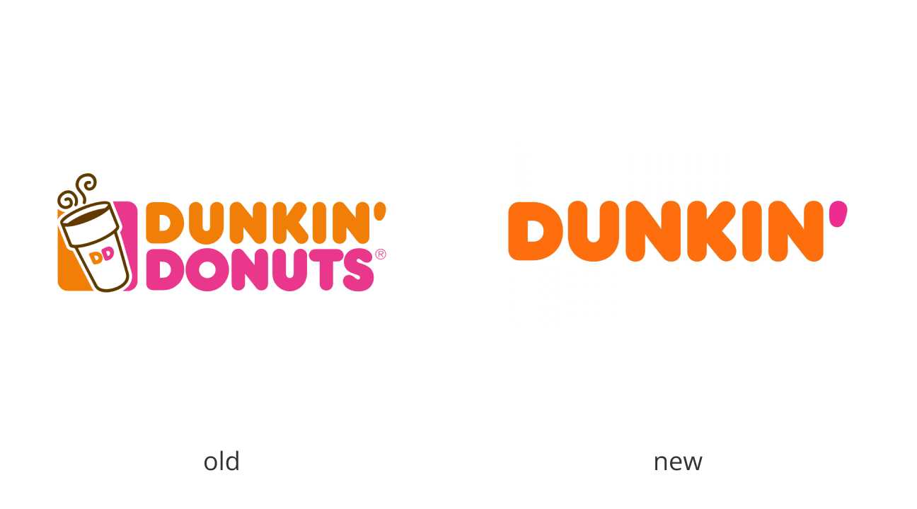
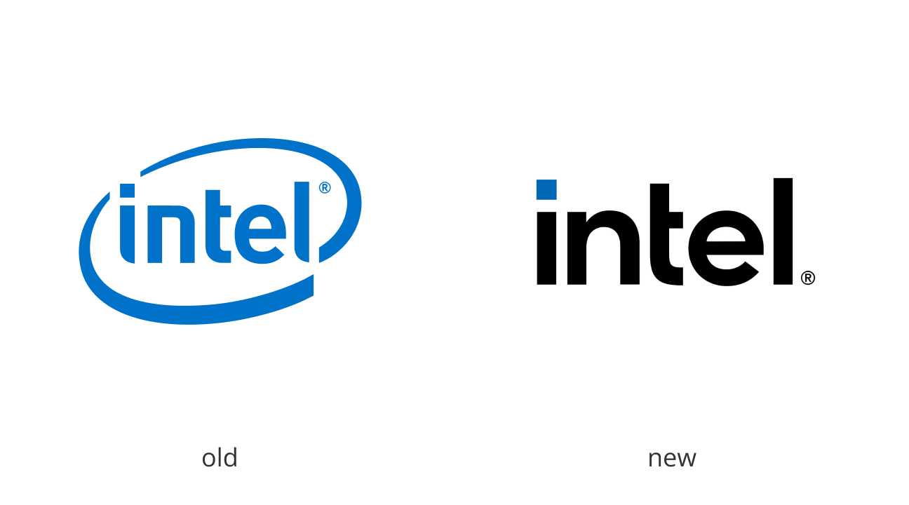
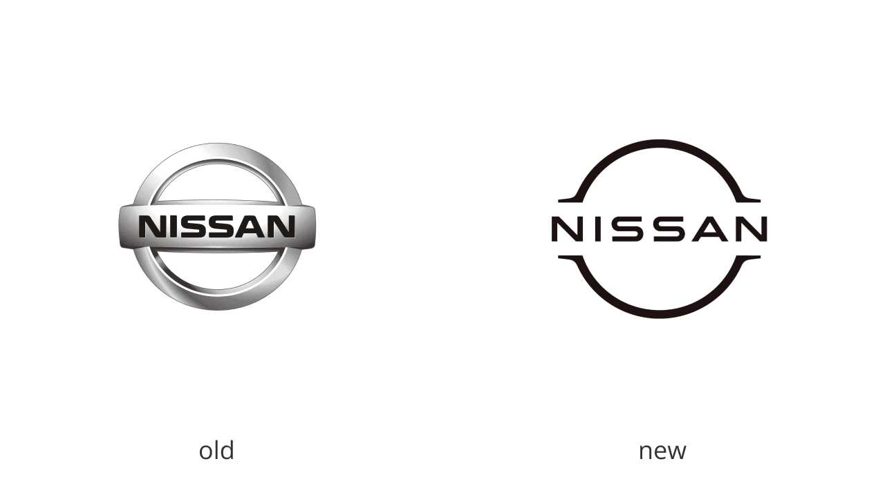
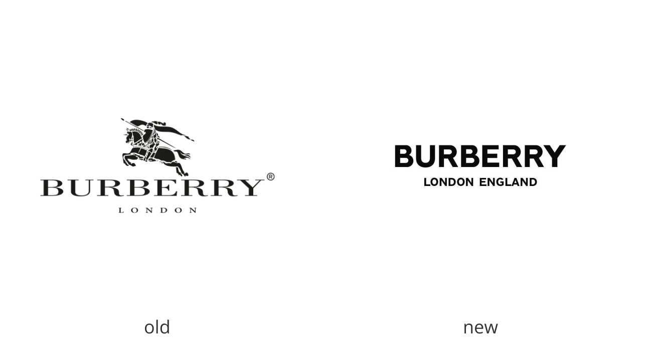
You may have noticed over time that these brands have become simpler, sometimes eliminating their names or switching to flat designs. Major brands like Google, Intel, Uber, Nissan, Toyota and a number of other well-known companies have shed their logo’s depth and shadow.
But what triggered this wave of logo de-branding?
Change driven by technology
Logos for brands must embrace adaptability. The days of a single logo version lasting 20-30 years are over. Major brands have realised that in order to remain relevant, their logos must be updated on a regular basis.
With the demands of mobile-first design, brands are returning to the 2-dimensional look, which then became the norm.
As mobile-first design takes precedence, we are seeing more and more advertising campaigns being shifted to the Web. With that said, logos must be completely readable when displayed at pixel boxes or “favicons”.
A space for expression
Flat and simplified brand identities can also be used to project an infinite number of messages and moods. Such adaptability is especially beneficial for brands that span multiple genres (movie studios), have a diverse offering (food companies), and strive for hands-on consumer engagement (political campaigns).
Take Warner Bros. for example. Their logo simplification allows the studio to incorporate its identity into films (and merchandise) with wildly disparate themes.
The iconic “BR/31” symbol was opened up to become “a canvas for flavour expression” in the de-branding of the Baskin-Robbins identity. A dynamic system with limitless possibilities showcases the eclectic flavours available.
Baskin Robbins logo makeover

Accessibility
The basic sans-serif typefaces are a favourite among logo designers. These typefaces have a contemporary and sleek appearance. They are used to make lettermark and wordmark logos readable for people with vision problems. This is crucial as accessibility becomes increasingly important.
While this approach sounds practical and useful, the challenge now for designers is to make this form of minimalism distinctive enough for brand identities to be easily recognizable.
My thoughts
While logo simplification or de-branding has been successful for a few major businesses, there have also been occasions where it has done more harm than good.
This is the case when a decision was made by Sony Pictures to produce a de-branded version of one of their most well-known films. Unfortunately, their de-branded version re-released in DVDs did not align with Sony’s favourable market reputation. Many customers thought that the re-released product was a fake. As a result, many of them attempted to return the DVDs for a refund.
Every significant technological advancement inspires new trends. You can expect more businesses and brands adopting the logo simplification strategy to blend in with other competing brands.
With logo design, the options are virtually endless. I believe logo designers can make standing out work better (one that communicates core values to their audiences) and more original, while staying current with trends.
What are your thoughts on this topic? Share with us in the comments below.
Thanks for reading!


A simple and Creative logo is best.
You describe it so well, basically covered all the facts about why should a logo be simple, it was really educative and effective, keep it up, love your work.
https://www.americanlogodesigners.com/