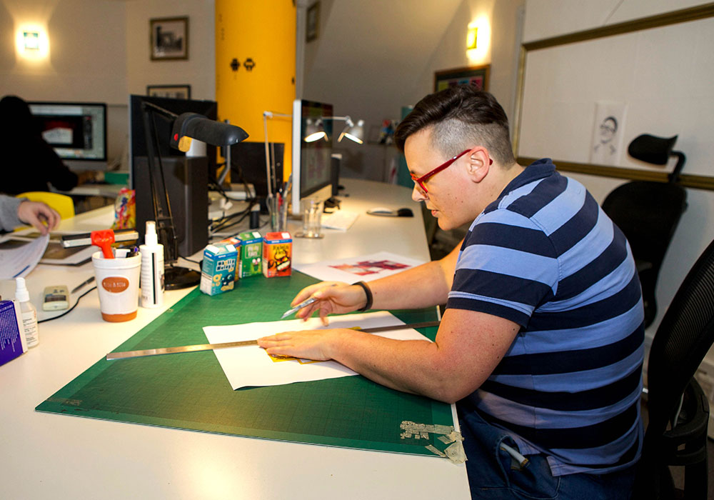
I’m Rachel Wynn, senior designer for creative marketing agency Twogether. During my 18-years experience in the world of design, I’ve worked for the technology, financial, health, and retail sectors. Branding, typography, illustration and print design are the things that get me excited. But the one thing that I truly feel passionate about is simplicity.
Whether it’s a brand or product logo, a new user experience for a website or even a DM for a new cloud storage system — I believe a simple, focused brief leads to the most effective and memorable creative solution.
This was a team effort that utilised many skillsets to achieve the final result. As the designer, I worked alongside Art Director Rod Kavanagh, Illustrator Jeff Cummins and Copywriter Ravi Karawdra.

The Brief:
This particular brief called for a lead generation campaign designed to inform UK retailers of the growing threat of cyber criminals — and the potential threat they could pose to their business.
The desired result was to encourage them to take action and help them protect both their reputation and their customers with Sophos UTM (Unified Threat Management).
As part of a creative team, our main objective was to create something that would have cut through in the retail space — a solution that would engage the customer, whilst delivering and promoting the features of the product.
The Idea:
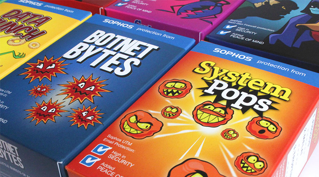
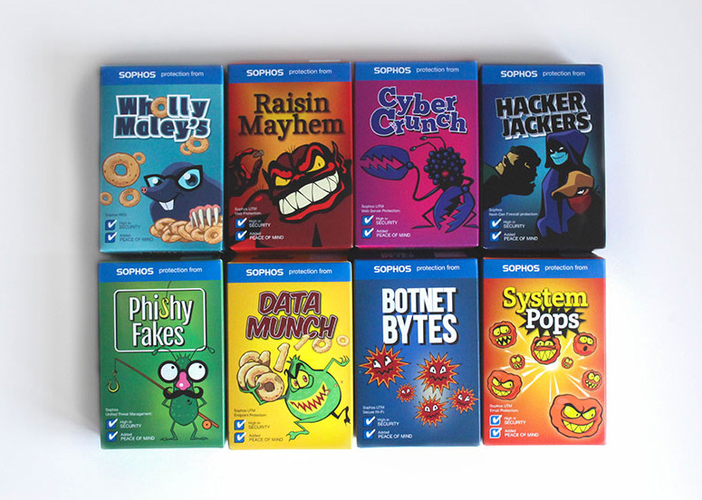
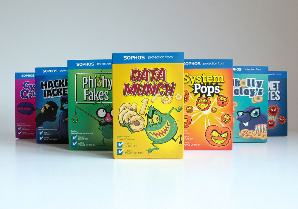
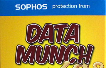
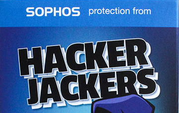
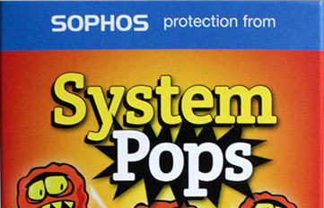
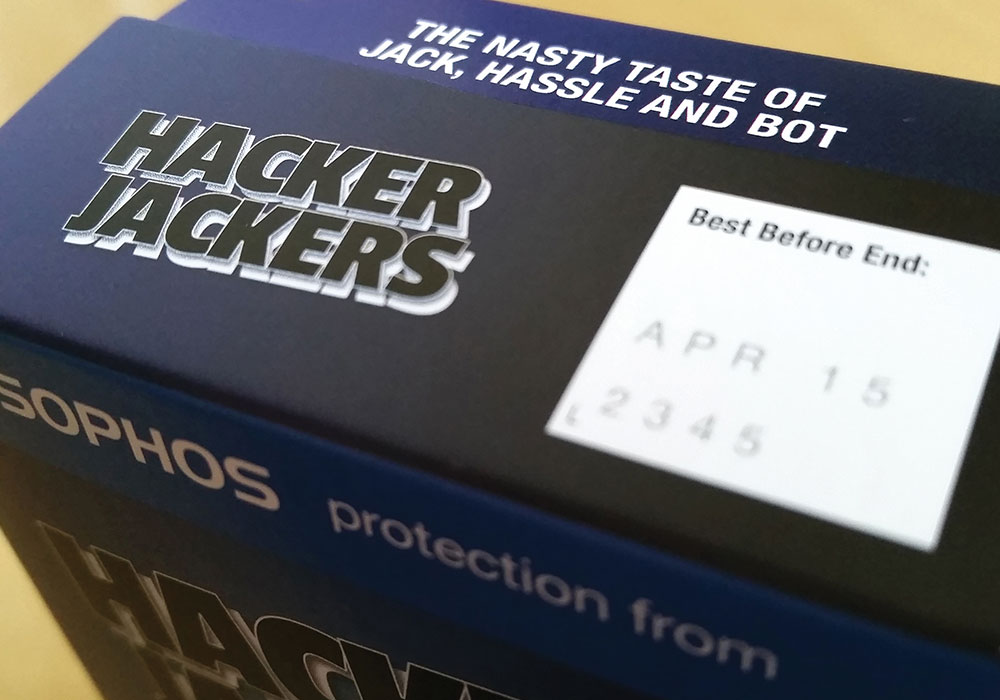
The concept of a breakfast cereal variety pack was a simple mechanism to deliver very serious content, in a fun and engaging way — a clever solution to show how consumers can easily buy much more than they bargained for if the retailer isn’t protected against cyber crime. The added advantage of separate cereal box units meant we could devote one pack to each protection feature of Sophos UTM.
The Creative Process:

The first stage of the design process was research — an exhaustive quest to study names of cereals, pack designs, characterisation and typography. Together with tone of voice and descriptions of the cereal itself, this analysis would help shape the design and look of our particular creative.
The next stage was to brainstorm ideas for the actual names for each pack — playing on existing consumer language, whilst also incorporating the aspect of security that Sophos UTM provides, we came up with a variety of humorous, and slightly cheeky, product names.
The Characters:
Once the names had been agreed and finalised, we looked at creating a key character for each box — developing the illustration style whilst having fun adding personality to them.
The Typography:
Different typographical styles and approaches were created for each individual pack — using carefully chosen fonts that worked well with key illustrations to create the overall look for our bespoke variety pack. 
The Copy:
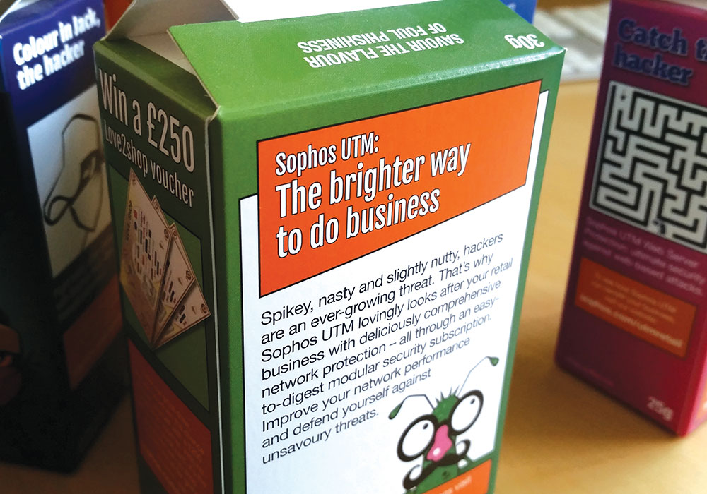
The language and tone of voice was written and crafted in a way that consumers could easily relate to and engage with. We wanted our cereal boxes to appear as real and “credible” as possible— so the copy was written in the same style, format and tone of existing cereal multi-packs.
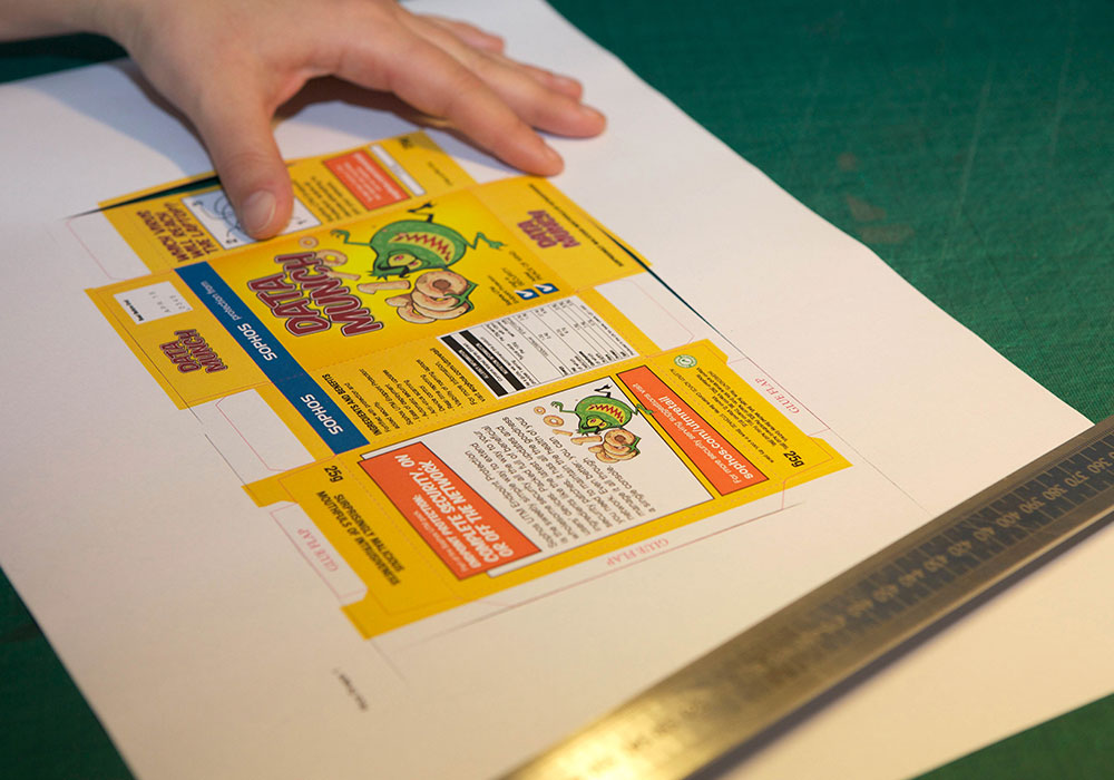
The Detail:
It’s the tiniest detail that makes for the best design — in our case, this meant the description of:
- Content of the cereal
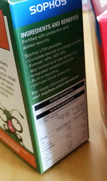

- The Best Before date
- The simple puzzles and games on the side of the packs.

The Design:
Once printed and assembled, I was happy with the layout, colours and messaging that all contributed to the authenticity of our multi-pack. Hard work, late nights and a few minor arguments later, I feel we have a result that we can all be proud of — a clever, relevant and eye catching mechanism that delivers a lot of technical content, in a clear, simple — and most of all, fun way.