

There are over 1.2 million apps available for download in the App Store alone. They generate millions of dollars per year for Apple and for the developers, but creating an app and submitting it to the App Store doesn’t mean it will be successful.
A beautiful app without great user experiences is rarely going to be a success. They need to work smoothly and be pleasant for the user; otherwise their interest will quickly disappear. There’s a set of factors that make apps successful.
Although you can never be sure of how much of a hit your app will become, you can always increase the chances of it being a success by following some mobile app marketing strategies.
Be Clear About The Purpose
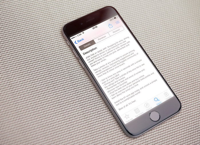
The first contact of users with an app is not after they download it. It is when users would consider whether or not they should buy and download your app. If your app costs money, then more work is needed to convince potential users to buy it. If it’s worth buying, they will eventually very kindly recommend your app to their friends and families.
In order to attract potential customers, explain what the app does. Show a few good screenshots and write about your Unique Selling Point (USP). Ask yourself questions like:
- Why should users spend their hard-earned money on my app instead of my competitors’
- What purpose does it serve?
- Is it easy to use?
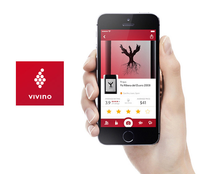
For wine lovers, they love apps like Vivino. When you search for it in the AppStore, you can easily recognize the app from their cool tagline that reads “Vivino is not your partner in crime, it is your partner in wine“. It shows a bit of the app’s personality and makes you want to buy the app simply simple because it sounds cool.
Onboarding Process
Regardless of how good and useful your app is, there are always going to be people who just don’t get it. If your app is complex, using it might be a challenge for certain types of users.
Vessel, an online streaming service, has a simple onboarding process that shows new users how their app works. The usefulness of this small feature makes users fall at ease with the app as they gesture their fingers.
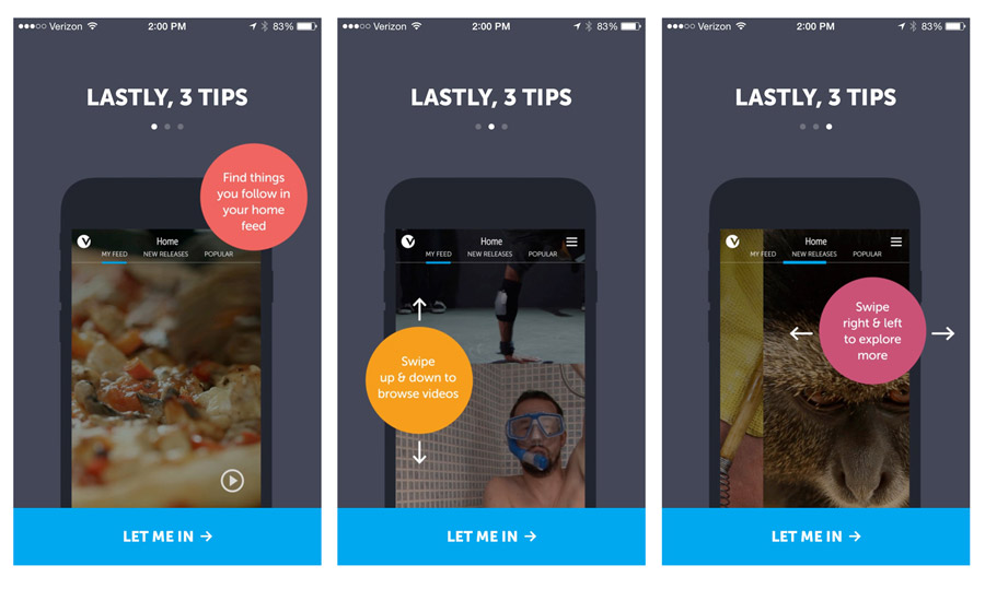
Every app is unique in its own way, how and what it does and who uses it. The onboarding process can be useful, pragmatic and really does make an app user-friendly. To further simplify apps, developers sometimes have to add interaction methods that most users have not yet been exposed – especially if they are new to the smartphone environment and have not heard of gestures before.
So create an onboarding process and your users will thank you for it.
Following The Human Interface Guidelines
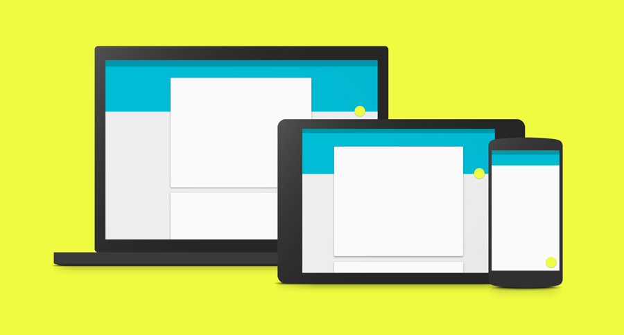
All Operating Systems have their own graphical user interface elements that are easy to recognize. Android has the modern Material Design all over its user interface. We see it right away and recognize it by the bold, beautiful colours, big buttons and flat style. Every OS has its own human interface elements and you simply need to make use of them. Sometimes you might design an app for iOS and would like to use Material Design. Not such a good idea to be honest. Leave your preferences to the side and make sure you follow the guidelines of the OS you design for. This makes it easier for users to understand your app because the controls, gestures and look & feel are the same as all the other apps on their phones.
Usability Before Aesthetics
Sometimes it’s difficult to make a choice between having to leave some design out just for the sake of usability. Keep in mind that usability is what makes your app easy to use and keeps the users coming back. I have more than 30 apps on my phone that I opened once and never ever since. Some of them are just not useful enough or they have poor usability.
Big Interactive Elements
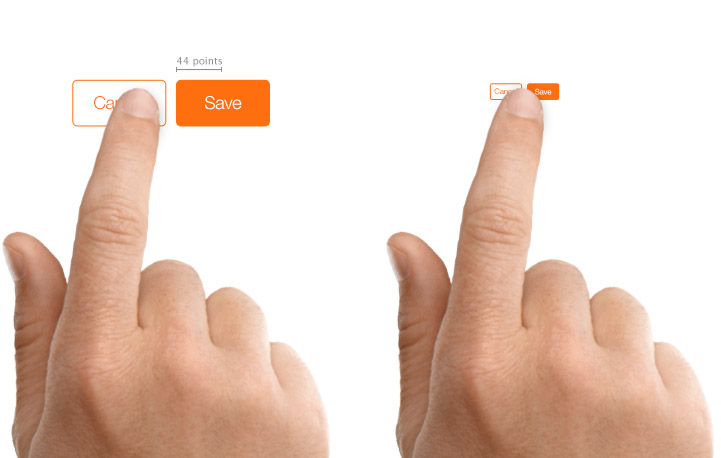
Most UI designers are good at this, but some still lack the basic skill of creating big interactive elements. If you have any buttons or elements that people have to click on, don’t hesitate to make them big. App users usually do not complain about buttons or UI controls being too big – but I’ve heard the opposite a lot of times.
Keep Navigation In Sight
If you want your app to have higher engagement rate, it’s important to keep the navigation visible in the viewport. Hamburger menus are ideal if there are lots of elements in the navigation, otherwise you can opt for a bottom navigation if your app has less than six elements.
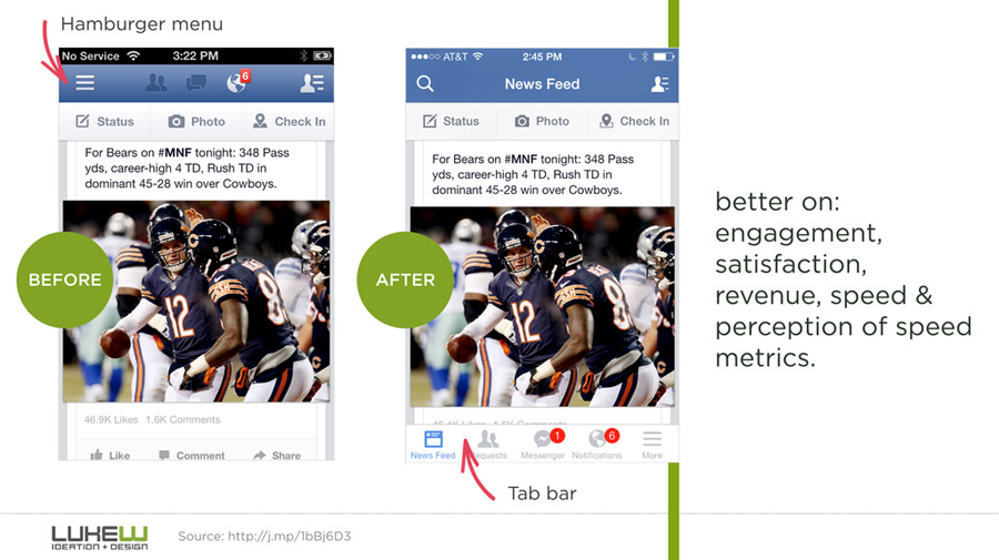
When users have the navigation in sight all the time, their engagement rates will also be higher.
Make Use Of Icons
It’s known all over the Internet that a “house” indicates home. Three horizontal lines indicate a side menu. A plus sign indicates “add”. All these icons are known regardless of what language people speak.
If you create apps that are used in several countries, you can use English as the interface language, but you can also overcome language barriers by making use of icons.
As long as you don’t reinvent the wheel (and I don’t recommend you to), icons usage is one of the best and quickest ways to indicate interaction to the users.
Bottom Line
Any app needs a purpose and the right timing to become a success. If you believe that you have a great idea and want to turn it into a mobile app, the above tips should help you on your way. Make sure you understand your users and their needs. With this in mind, you are one step closer to developing app with great competitive edge.
Do you like this article? Support our blog with a small donation.
We keep our contents authentic and free from third party ad placements. Your continued support indeed can help us keep going and growing. By making a small donation would mean we can pay for web maintenance, hosting, content creation and marketing costs for the YDJ Blog. Thank you so much!