
The first time I heard about typography, I presumed it to be related with fonts. My notions about typography changed once I got well-acquainted with the basic concept and began experimenting with typography designs to learn how to design fonts.
As kids, we all learnt English starting with alphabets and eventually stepping on to words, sentences, paragraphs, and later, stories. Likewise, it is essential to know the lexicon to master the art of typography. Many of us might not be aware, but typography is present everywhere. You see them daily on the web, TV, posters, books, etc. Before getting into the basics, let us walk through the context of typography.
Taking The First Step Towards Typography
There are thousands of articles talking about typography, but the most common attribute defining them is their artistic flavour. Today, if you have two options to watch a movie, either through a black and white television or colour television, which one will you opt for? I believe it is the latter, coloured television, as it is more appealing and gives a better viewing experience.
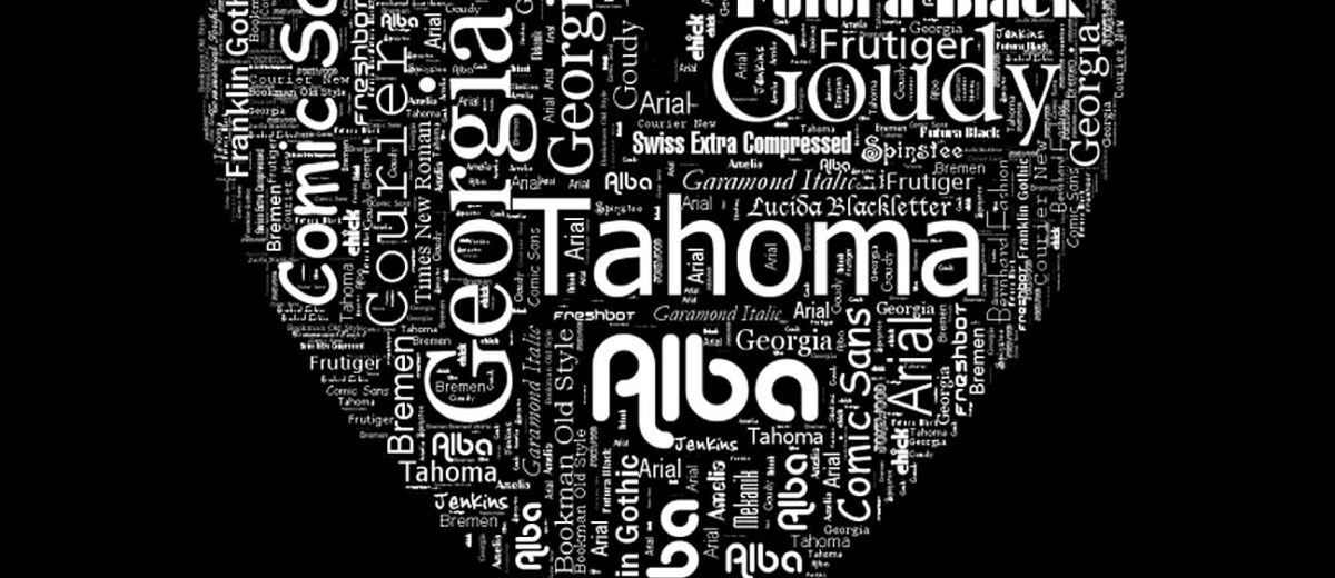
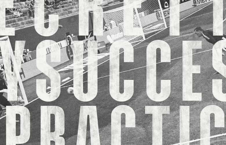
Typography is a beautiful art that draws the attention of the audience and captures their interest in the product and brand. It simply becomes a medium of transmission to deliver the visual content on the various spaces of media. Even a plain, boring font can be brought to life through interesting patterns and designs like the one below:
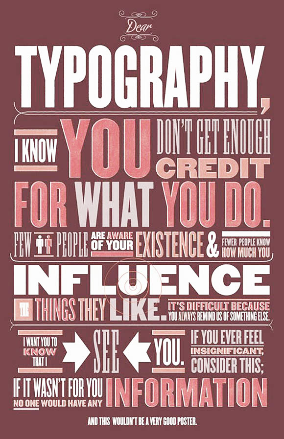
A fantastic combination of font arrangement, size, shape, spacing and layout relevant to the theme will always make the content visually attractive. With the power of internet, it is now possible to learn typography from anywhere. Remember, typography is not just about modifying different fonts but an art to channelize your message. It builds the face of your brand and identity.
Ways To Progress With Typography
A vast pool of resources are available to learn typography; but I highly recommend starting with a bunch of blank pages and a pencil. Learn to draw and design your fonts on a piece of paper first. You will understand the different sections of a character precisely, and later it will be easier to get your designs on the web.
In short,
- Learn to design the font on paper first
- Know principles and standards of typography
- Use graph pages to draw precisely at the initial stage
- Pay attention to the theme and stay relevant to it
- Dissect the typeface (font) to understand the geometry from inside out
- Practise, practise and only practise if you want to master this art
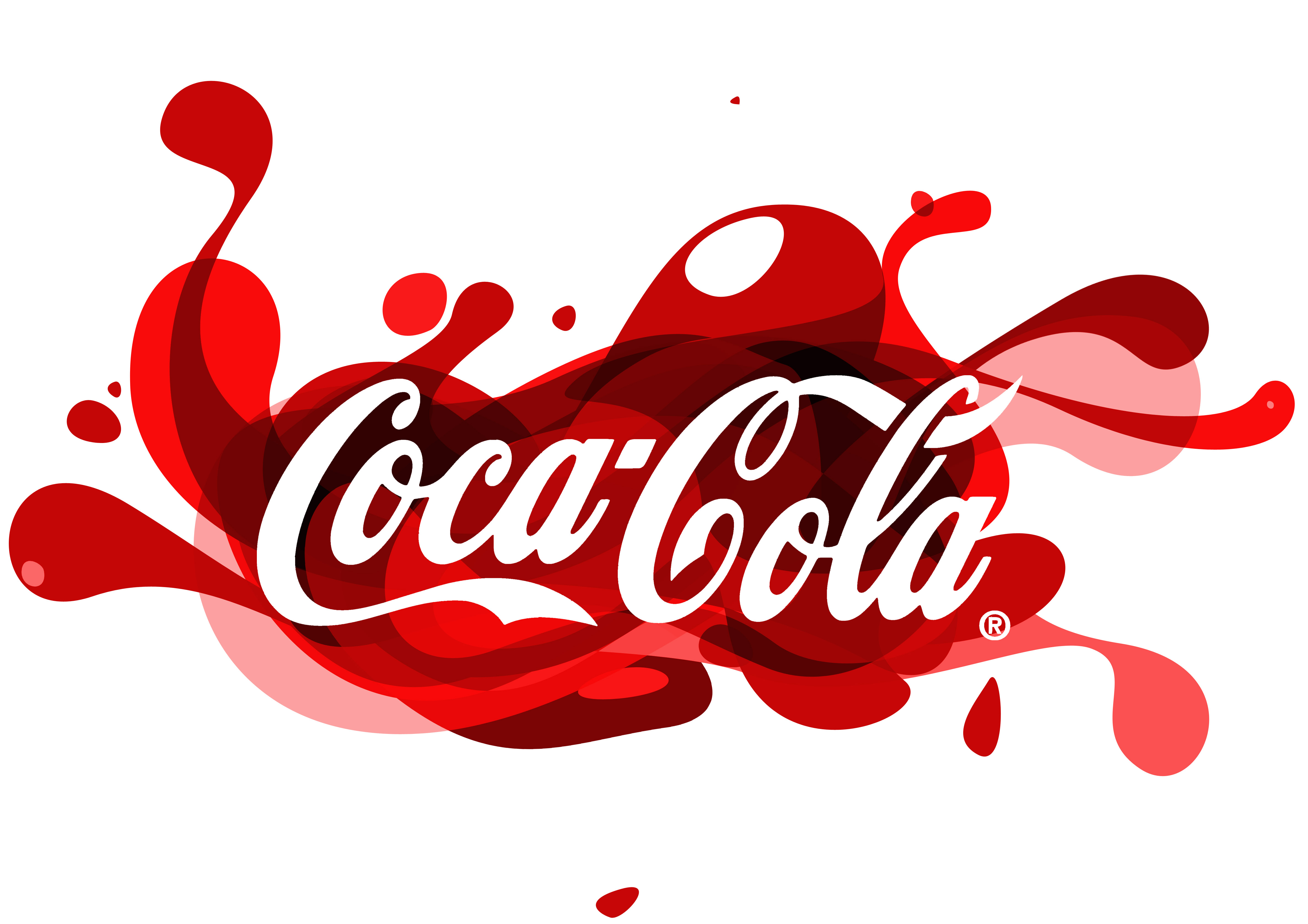
I bet typography won’t be any less easier than literature. But the result of your practice will yield beautiful designs if you know how to convey the message through a relevant visual presentation. Many esteemed brands like Coca-Cola, Cadbury and Yahoo! would not have been the same without their recognizable logos.

![]()
 The design of their logo is so distinct, that you can instantly recognize them with the brand. That’s the power of typography!
Jargon Theory
Let us now go through some basics to quickly start the designing. The blue colour highlighted in the character illustrates the attribute of each terminology.
Apex


Image source: TypographyDeconstructed.com
It is a point where two strokes connect with each other. The intersecting point may be acute or mild.
Ascender


It is the upper half of the stem found on lowercase letters like b and h.
Beak


It is a sharp, enhanced edge located at the top and bottom of a letter. Letters T, S, E, G, and t are a setting example for the beak.
Bowl


The bowl depicts the circular section of the typeface which includes letters like O, d, b, D, g and B.
Counter
It is the blank space around the closed dimensions of letterforms. Letters like o, a, b, pand q have a void space inside the enclosed structure.
Crossbar
It is a horizontal line situated at the middle of a letter. It is also called a “bar”. The uppercase letters A and H display the cross-bar perfectly.
Descender
It is the lower section of a letter, extending below the baseline. Letters such as q and y slide down the baseline.
Ligature
It is a format where two neighbouring letters are joined to create a single character.
Loop
The loop is the circular section below the baseline, enclosing the letter g.
Link
The small mark connecting the upper and lower sections of the lowercase of the letter g, is called a link.
Serif
It is a small stroke to mark the beginning and end of a character.
Shoulder
It is another curve extending downwards from the stem. The letters n, m, h, r and a depict this element.
Spine
It is the curve extending from left to right in the specific character like S.
Spur
It is a small representation off the main line.
Stem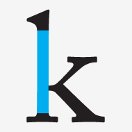
It is a vertical line strongly supporting the letters like h, b, k. It is also known as “stroke”.
Tail
It is a slash extending below the baseline that appears diagonal to the structure. Letters like Q, k and R form a tail at the right lower-end.
Terminal
The self-explanatory term “terminal” indicates the curved end of a lowercase letter without a serif.
In addition to the lexicon, remember to focus on the elements listed below:
- Headings
- Letter spacing
- Bold or Italic
- Index
- Colour
- Combination of fonts
- Borders
- Page margin and length
- Underlining
Choose an appropriate background before proceeding with the design. The work can be designed for any of the documents listed below:
- Visiting cards
- Posters
- Websites
- Résumés
- Presentations
- Newspapers
- Books
- Packaging
Since we’ve got the essential terminology in place, we can now perfectly blend our ideas onto paper, and get ready to roll.
Useful Links For Instant Learning
- 82 top-quality typography tutorials
- Typography Training Tutorials
- 50+ Top Resources for Learning Hand Lettering
Learning typography is a valuable addition to your skillset bank. The next time when you work on any visual presentation, you will know the exact style and methodology to render.
Remember, typography is an effective form of communication. The key to success is held by good communication skills in different walks of life. Now since you know one of the key ingredients to success, strive and strike your goals precisely.
Do you like this article? Support our blog with a small donation.
We keep our contents authentic and free from third party ad placements. Your continued support indeed can help us keep going and growing. By a making a small donation would mean we can pay for web maintenance, hosting, content creation and marketing costs for the YDJ Blog. Thank you so much!
As a typographic designer, I really loved this article. This informative blog post about the foundation of new typography is so helpful for me.