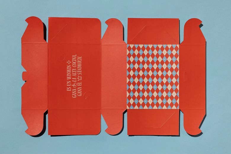
Welcome to our mid-year roundup of the best prints and packaging design work of 2026.
This collection brings together standout projects from talented designers around the world, from playful kombucha labels and handsome coffee bags to elegant perfume branding and gourmet food packaging.
Along the way, you’ll also find a striking artbook and bold feature illustrations. Scroll through, get inspired and happy designing!
KRYNYA | Kombucha | Label Design by Yana Atlasner


Portfolio: behance.net/gallery/251219231/KRYNYA-Kombucha-Label-Design
Good菇的™ | 包装设计 宠物 食品 蘑菇 汤罐 by DXD studio, cz 蔡, Huiling Fang, 腻 腻腻 and dobi 杜


Portfolio: behance.net/gallery/230363327/Good-
画蛇添福 · Adding Blessings with Snakes by XEE 朱恩


Portfolio: behance.net/gallery/230288275/-Adding-Blessings-with-Snakes
OUD MOOD – PERFUME by Achraf Akroud

Submitted by: Achraf Akroud
Portfolio: x.com/SKIPO3D
ANTRE GOURMET – Rebranding Packaging by Studio Born, Ipek Eris Studio and Ebru Sile Goksel


Portfolio: behance.net/gallery/232807191/ANTRE-GOURMET-REBRANDING-PACKAGING
The Bake Lounge Packaging by Type08 (Alen Pavlovic)


Portfolio: dribbble.com/shots/27013596-The-Bake-Lounge-Packaging
Branding & Packaging Design for a Perfume Brand by Veronika Kulish and PacPac Studio


Portfolio: behance.net/gallery/204604907/Branding-packaging-design-for-a-perfume-brand
Jammed by Sunnie Kuan


Submitted by: Sunnie Kuan
Portfolio: behance.net/sunniedesigns
I’ve always been fascinated by Chinese packaging, especially how even the smallest details can carry so much personality and cultural meaning. The colours, patterns, typography, illustrations… there’s always so much happening, but somehow it just works.
As a Chinese Malaysian, I’ve also been wanting to explore what contemporary Chinese packaging could look like through my own lens. So when I came across this jam packaging brief, I thought… okay, this is my excuse HAHA.
I wanted to challenge myself to step outside of my usual visual language and experiment with Chinese cultural references while still making sure the final identity felt like me. I played around with colour symbolism, patterns, typography and illustrations, taking inspiration from more traditional visual details and reinterpreting them in a way that feels playful, contemporary and suited to a modern jam brand.
It ended up becoming a really fun little passion project and a chance for me to explore a part of my own cultural background through design. I especially loved seeing how small cultural details could completely shift the personality of something as familiar and everyday as a jar of jam.
RE8 The Lost of Science Artbook by Nguyen Ly Tran Khanh, Lkan, Thiên Thanh, Xuni Nguyen Do and Thien Ba


Portfolio: behance.net/gallery/226899591/RE8-The-Lost-of-Science-Artbook
Black Knight by Moe Selwaye, Abdullah Selwaye, Mpire Branding and Ammar Diems


Portfolio: behance.net/gallery/214856981/Black-Knight
UtahMed / Feature Illustrations by Matt Chinworth


Portfolio: behance.net/gallery/224487949/UtahMed-Feature-Illustrations

Vizzy Mercury Retrograde Edition by Zoë Boudreau


Portfolio: behance.net/gallery/143627631/Vizzy-Mercury-Retrograde-Edition
El Colmo | Packaging by Estudio Nuar, Melisa Rivas, Camila Rios and Manuela Ventura


Portfolio: behance.net/gallery/236938707/El-Colmo-Packaging
Bags for Canyon Coffee by STUDIO L’AMI


Portfolio: behance.net/gallery/168681271/STUDIO-LAMI-designs-beautiful-bags-for-Canyon-Coffee
Pangram by Mary Yurko


Portfolio: behance.net/gallery/195940999/Pangram
Work & Walk Coffee」超级符号下双态共生的咖啡品牌|Coffee Brand by Resauce Studio


Portfolio: behance.net/gallery/234173617/Work-Walk-CoffeeCoffee-brand
Lumere by Cromia Design


Portfolio: behance.net/gallery/230357035/Lumere
Sundae Body Mists by Jo Cutri Studio


Submitted by: Jo Cutri
Portfolio: behance.net/gallery/243956963/Sundae-Body-Mists
Sundae Body Mist Melbourne, Australia
Following on from the success of Sundae’s Body Whip range, Jo Cutri Studio was engaged to create the product and packaging for the Body Mists collection, extending the Sundae brand into the fragrance world.
With subtle nods to Y2K nostalgia, the jellybean inspired form introduces a playful yet considered shape designed for strong shelf presence. Discussions focused on creating a bottle that felt unique yet unmistakably Sundae.
Developed in 3D with Monk Media, the final bottle and packaging system builds on Sundae’s signature aesthetic. Each product palette feels distinct and unique to the scent profile, whilst coming together to form a cohesive collection.
The collection is vegan and cruelty free and available in six scents: Flower Girl, Always Late, Mood Board, Soft Serve, White Tee and Garden Party.
Available at Harrods, Walmart, Cult Beauty, ASOS, Woolworths, Coles and Priceline.
Wana – Confectionary Branding by Ulysses Design Co


Submitted by: Ulysses Design Co
Portfolio: behance.net/ulyssesdesignco
WANA – CONFECTIONARY BRANDING
There are no shortage of confectionery brands. What it was missing was one that felt impossible to ignore, until now.
The existing identity felt dated, lacked distinction, and struggled to stand out against increasingly vibrant competitors.
OBJECTIVE
The challenge wasn’t the product.
It was perception.
The existing identity no longer reflected the energy of the brand or the quality of what was inside the pack. In a category crowded with colourful competitors and bold shelf presence, Wana was fading into the background.
The goal was to create a distinctive brand identity and packaging system that felt fresh, contemporary, and instantly recognisable while unifying the growing product range into a cohesive family.
Caliu by Daniela Barrio


Submitted by: Daniela Barrio de Mendoza
Portfolio: behance.net/danielabarrio
Plusfresc presented us with a clear challenge: to launch a private label across multiple categories, targeting the Spanish market with a special focus on residents of Catalonia who are looking to enhance their lifestyle.
Our goal is to create a fresh, modern brand that inspires well-being and becomes the preferred choice for young families, offering natural products that enrich everyday moments.
This new brand must balance authenticity and naturalness while maintaining a competitive edge in the retail sector, standing out against leading natural brands in the Spanish market.
For the visual design, we drew inspiration from traditional kitchen fabrics and classic tablecloth patterns. From this concept, we developed a flexible and distinctive graphic system for each product category, incorporating unique shapes and label styles for product lines, along with a thoughtful combination of colors and typography to highlight each one.
A deep blue tone serves as the unifying element, bringing visual cohesion and ensuring that the entire packaging family conveys a consistent and integrated brand identity.
Additionally, lines with windows were developed, allowing the product to be visible, following the same guidelines, as well as photography for frozen products, which previously did not stand out well. For packaging with photographs, a modern food art direction was created, featuring strong shadows to enhance the product’s appeal and distinguish it from the competition.
Finally, a strong brand identity and packaging system was successfully developed, designed to be easily expanded into additional product lines in the near future while maintaining the same guidelines and extending a color palette that remains equally vibrant and fresh.
Written by