Freshly squeezed for your inspiration this month of March – gorgeous book cover designs, posters, and unique prints & packaging designs for cool brands and products you’ve not seen before. Featured branding and packaging designers include Korak Studio, Marco Arroyo-Vázquez, Petrikór ℗, Lavernia & Cienfuegos, Thiago Tallmann and many more. Check out their unique projects as follows.
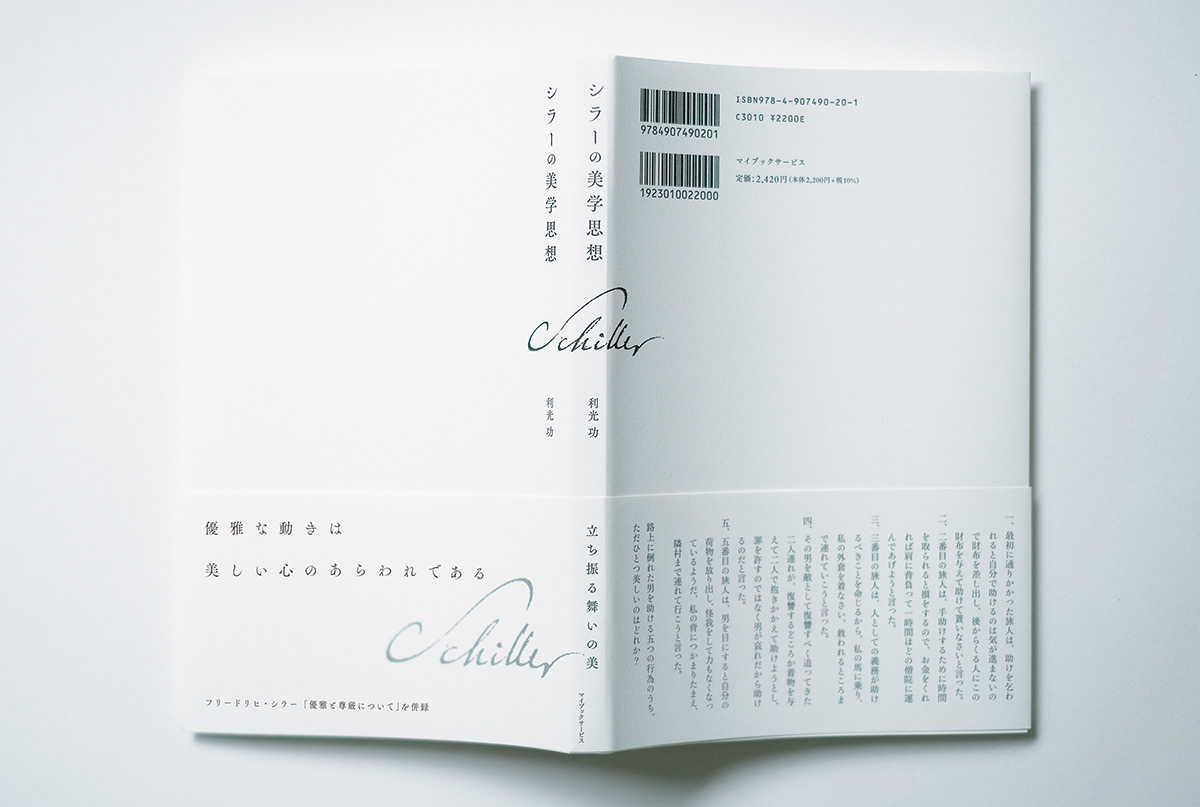
シラーの美学思想 by Fuyuki Hashizume (TOR DESIGN)

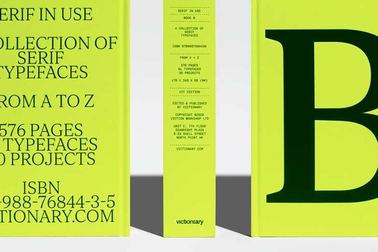
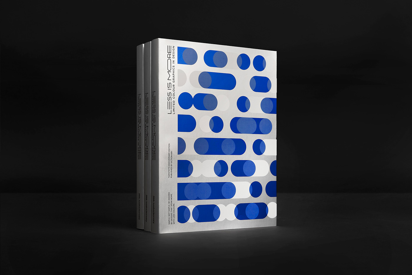
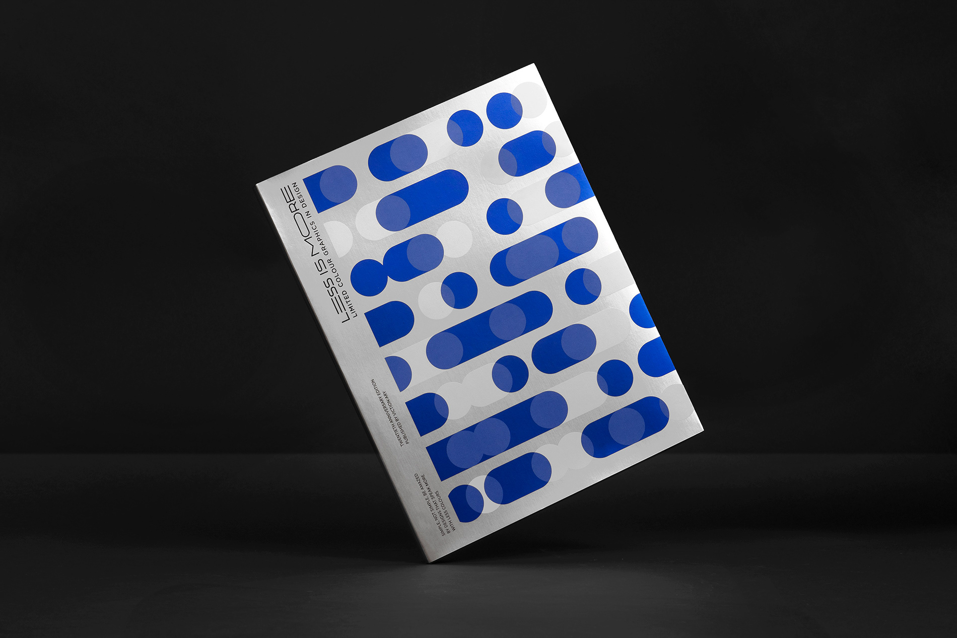
LESS IS MORE: 20th Anniversary Edition by viction:ary .


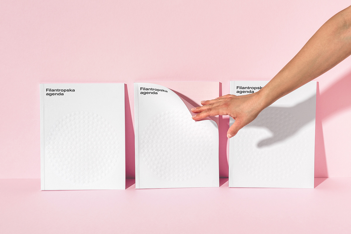
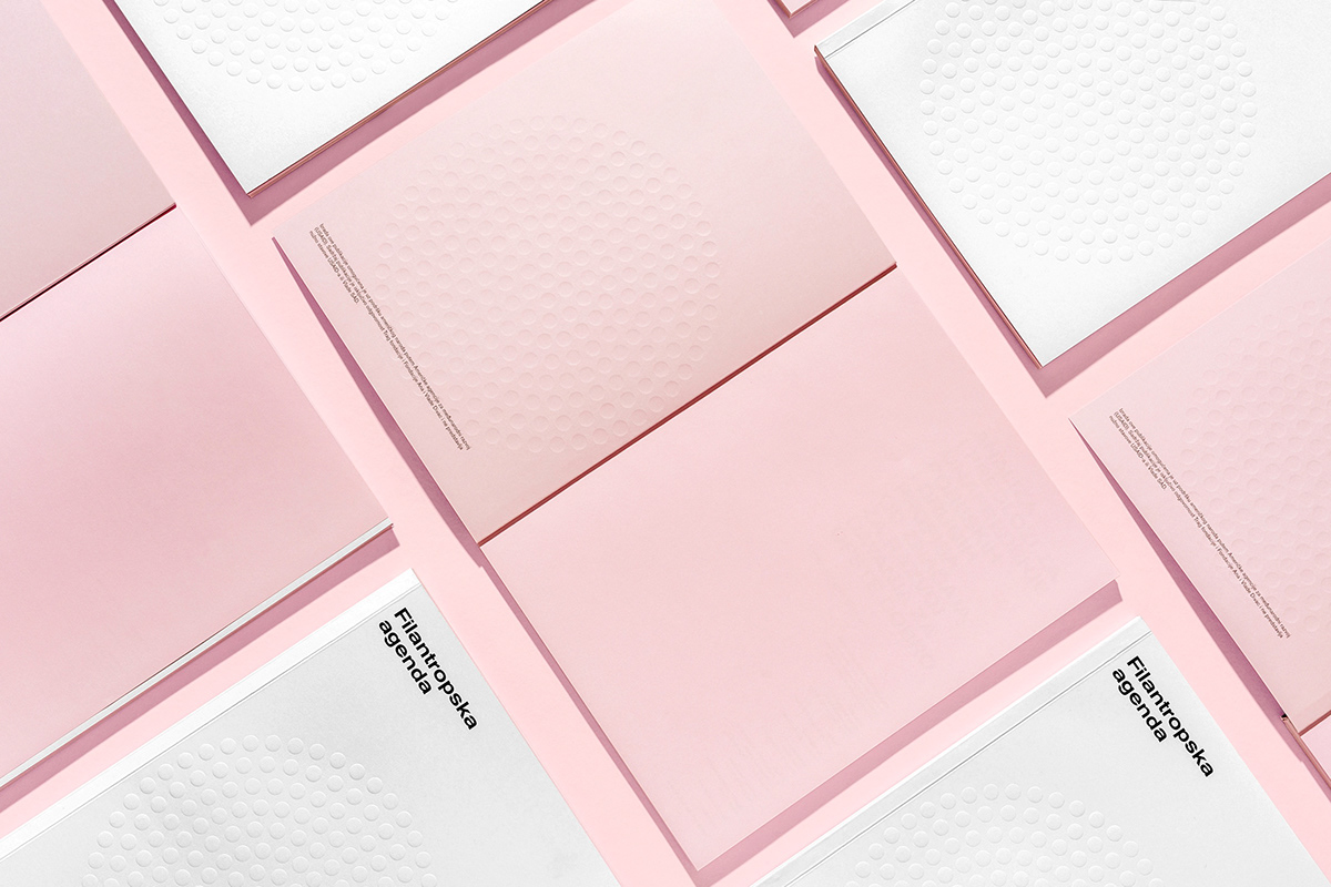
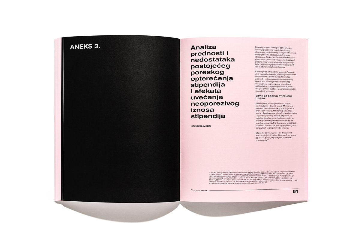
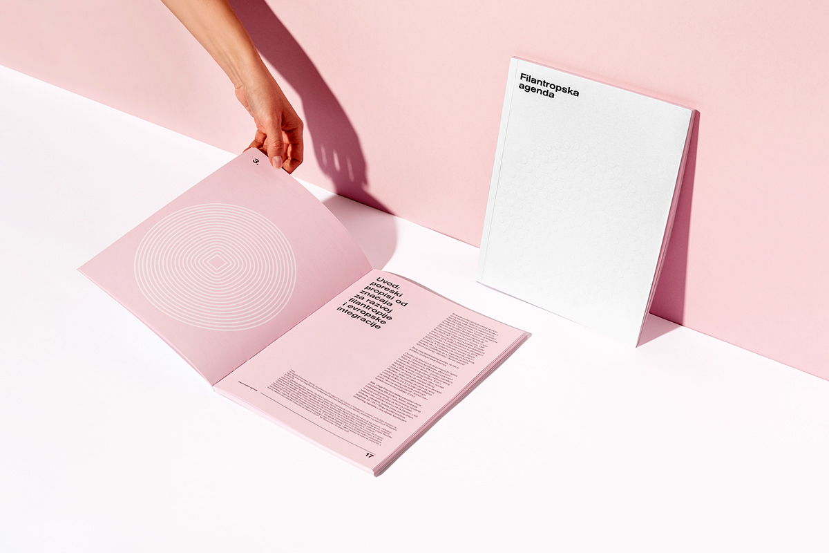
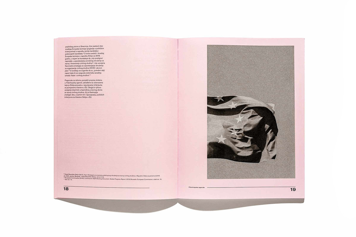
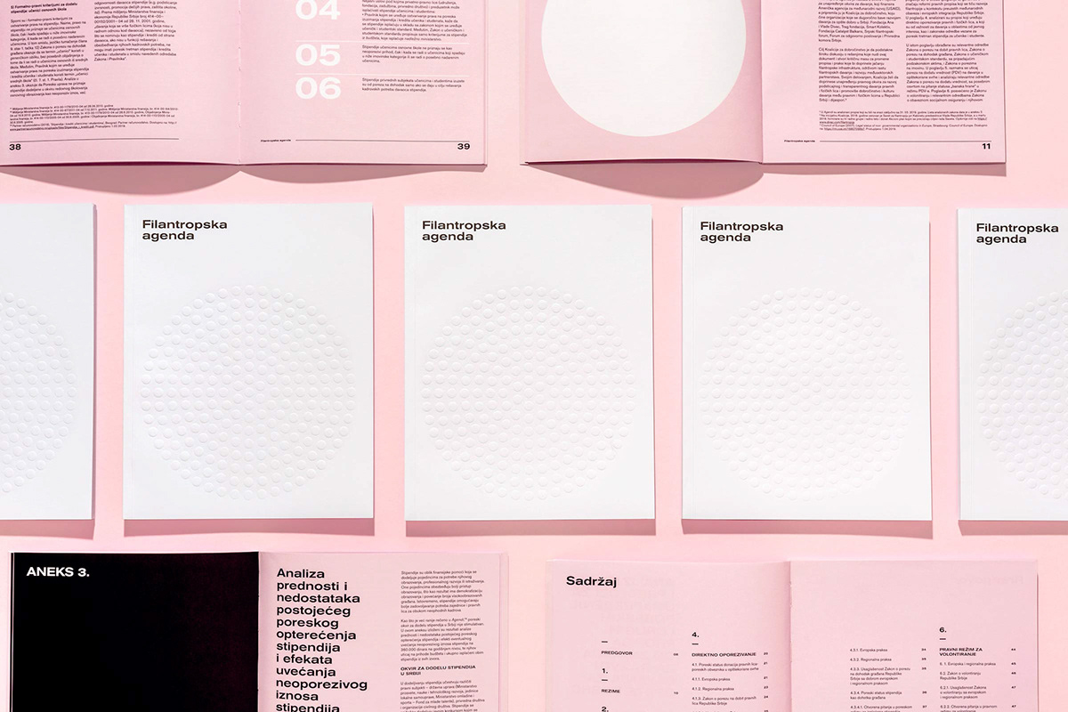
Philanthrophic Agenda by Korak Studio
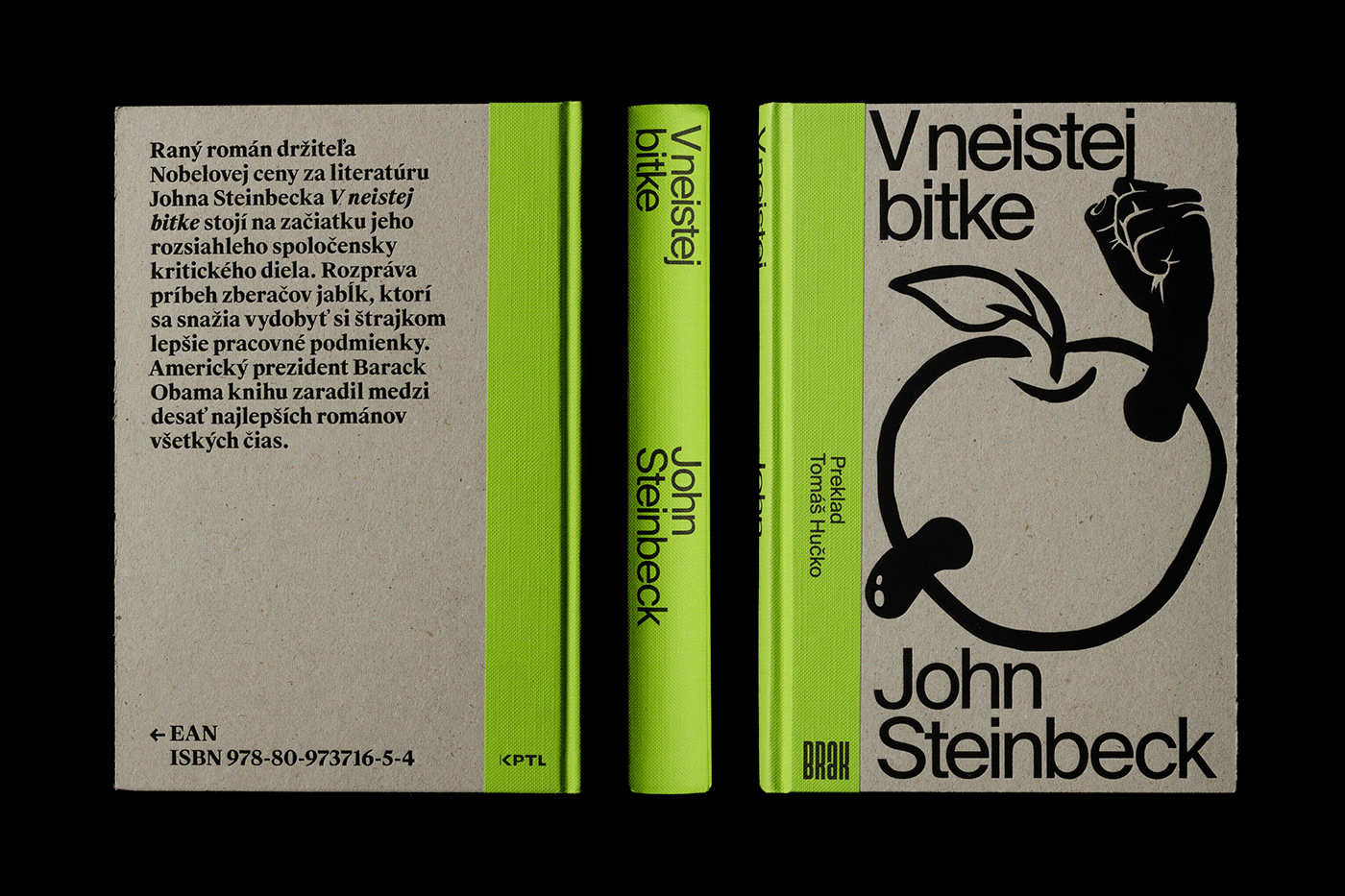
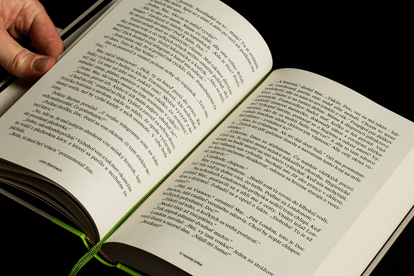
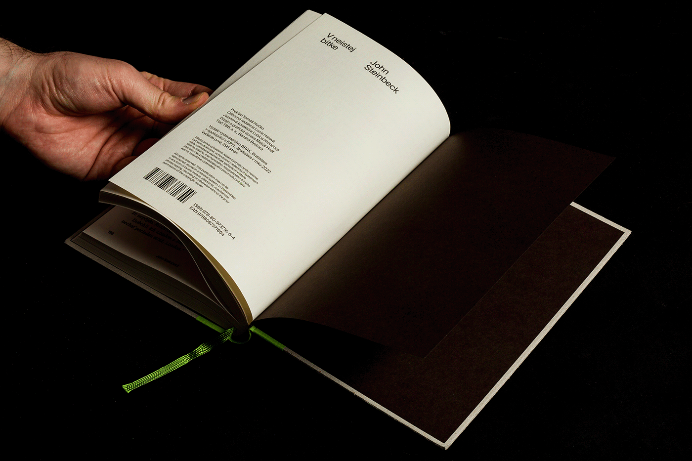
John Steinbeck: In Dubious Battle by Matúš Hnát

Posters 21/22 by Tomasz Majewski


Basic Shapes Poster Design Collection ’23 by Eduardo Arévalo

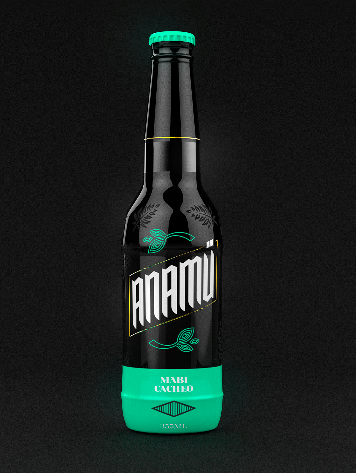
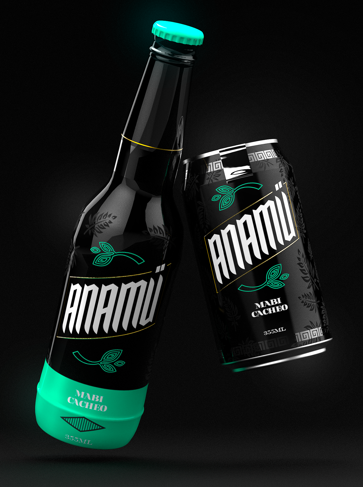
Anamü by Giancarlo Sepúlveda Rosa


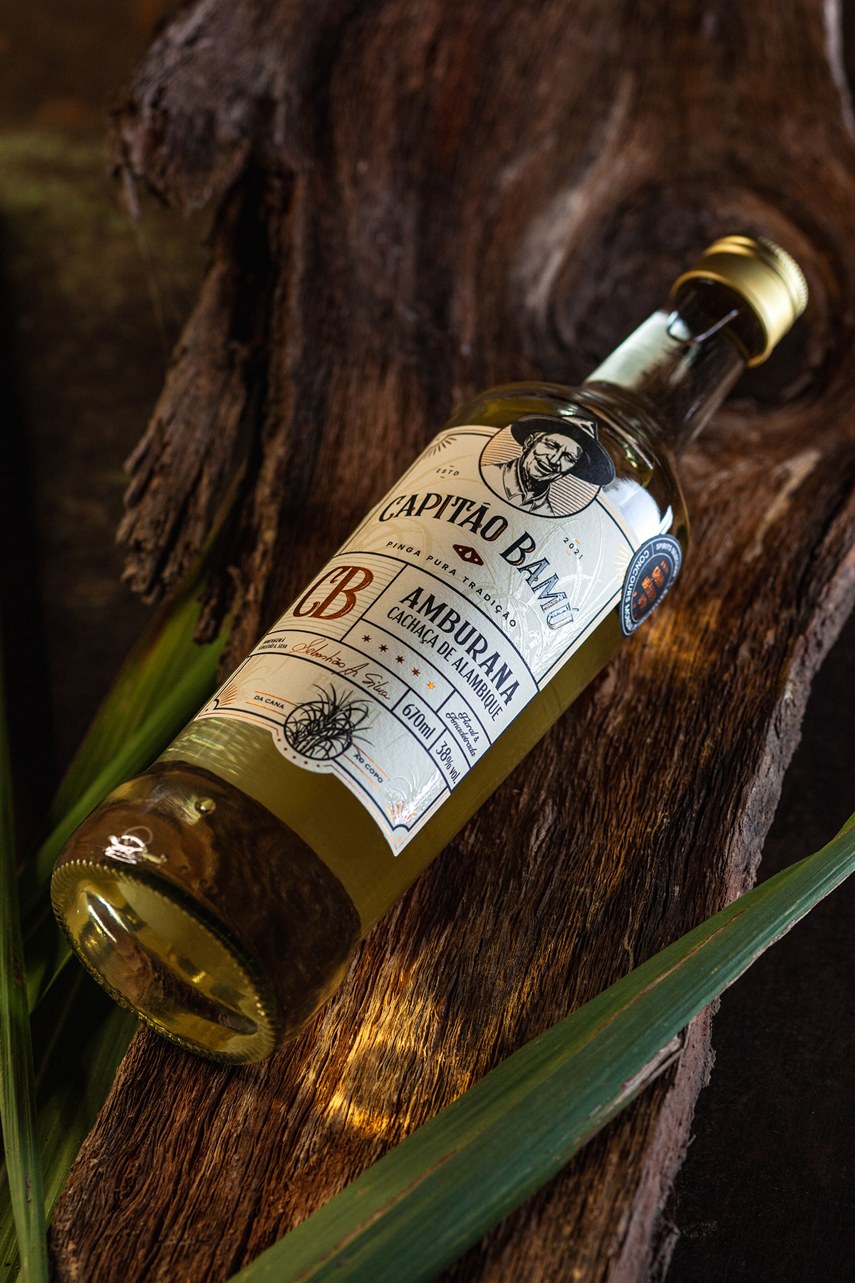
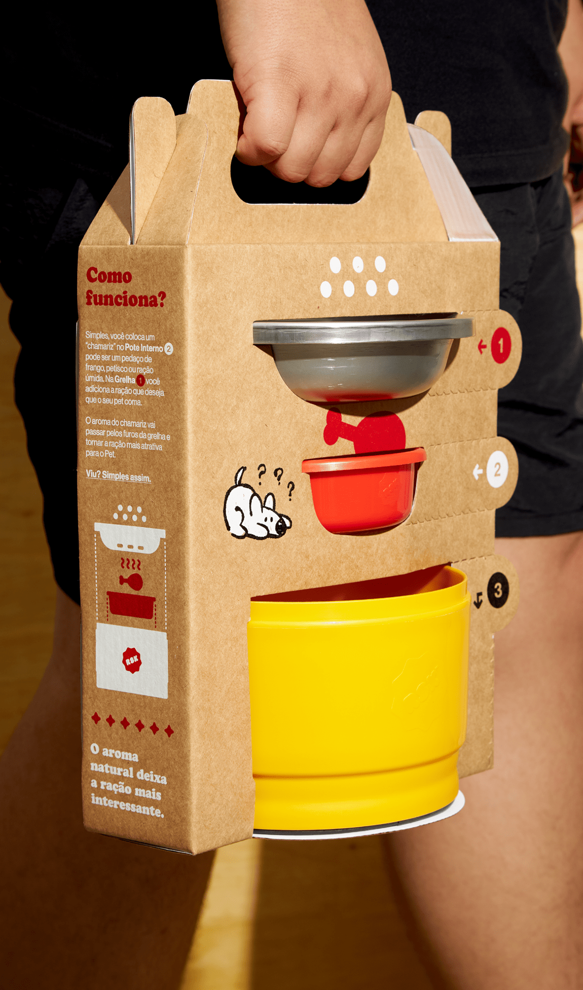
Capitão Bamu | Packaging by Estúdio Arth, Jackson Goestemeier and Andressa Pedrini


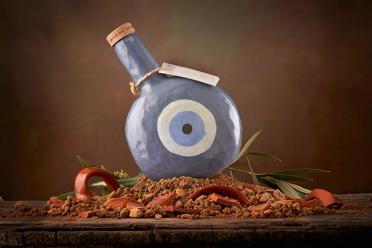
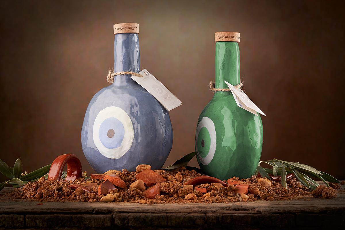
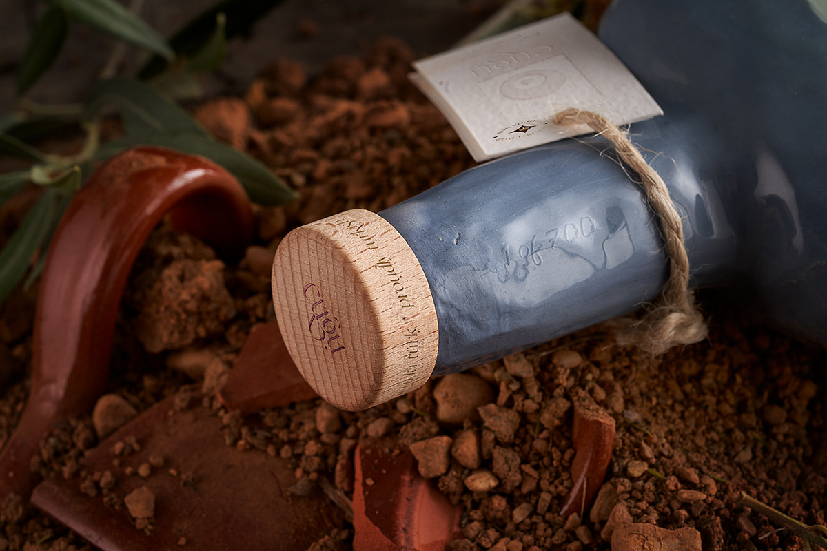
cuğu by Marco Arroyo-Vázquez

Submitted by Marco Arroyo-Vázquez
Cuğu is a contemporary Turkish vision of extra virgin olive oil, which values the connection of EVOO with its ancient roots, represented by the thousand-year-old olive trees of Urla, living witnesses of the beginning of oil production in the world. In Urla, the varieties of Domat (blue bottle) and Memecik (green bottle) olives are currently cultivated and cold-pressed, to turn them into NATUREL SIZMA ZEYTINYAĞI, a 100% crude extra virgin olive oil.
“The oldest traditional olive grove farm in the world (6 a.c)
it was discovered in the city of Klazomenia (present-day Urla, Turkey)”
The Turkish eye was used as a metaphor for the Turkish vision of the traditional conception of oil. Investigating, it was found that its common name was nazar but we find ourselves in the dilemma that it refers to both the Greek and the Turkish eye. . . A deeper research into the origins of “nazar” reveals that grammatically it comes from the Turkish “nazar boncuğu”. To optimize the memorability of the naming, only cuğu was chosen, leaving the “Turkish accent” as a symbol of respect for Turkish culture.
WHAT’S UNIQUE?
“The #Turkisheye was used as a #metaphor for the Turkish vision
of the #traditional conception of #oil.”
_The logo was influenced by the arabic calligraphy present in the Santa Sofia’s medallions.
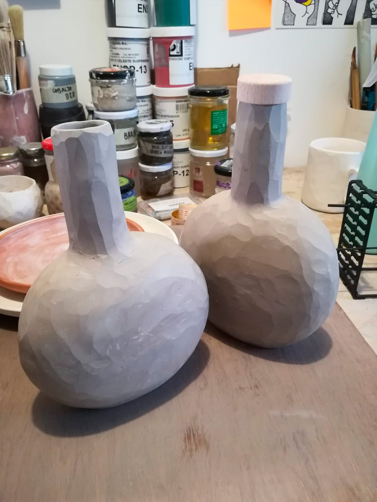
The oil is packaged in 500ML handcrafted ceramic bottles, intentionally shaped to look like a Turkish eye, while being ergonomically sized. In addition, the height of the neck was increased, stylizing to gain presence on the shelf. cuğu, cares about having an impact on the local economy, having ceramic workshops to create the bottles one by one, without moulds. 2 bottles, which are defined as a collector’s item, oriented towards reuse and the circular economy.
The selection of materials was carried out oriented towards sustainability:
1. The ceramic, obtained with materials from the farm itself, prevents the penetration of light, thus keeping the olive oil in its purest form & preserving the valuable aroma and flavor of this Turkish liquid gold, called cuğu.
2. The stopper is created with wood from ancient olive trees, an inseparable symbol of this estate. It is 100% natural and 100% renewable.
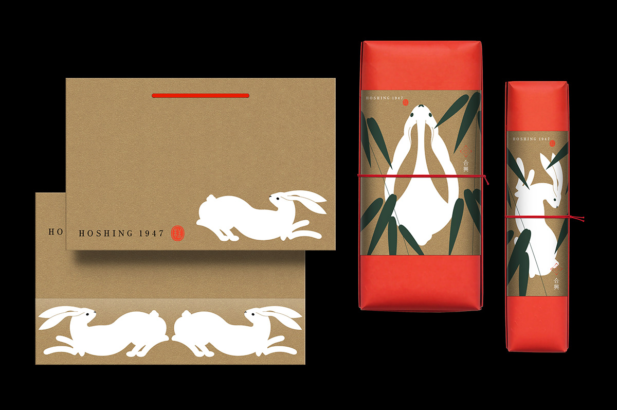
合興 1947 兔年禮盒 by TENG YU


Ruska™ by Petrikór ℗

The Little Houses of Utopick by Lavernia & Cienfuegos
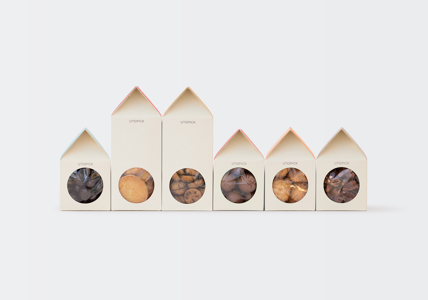
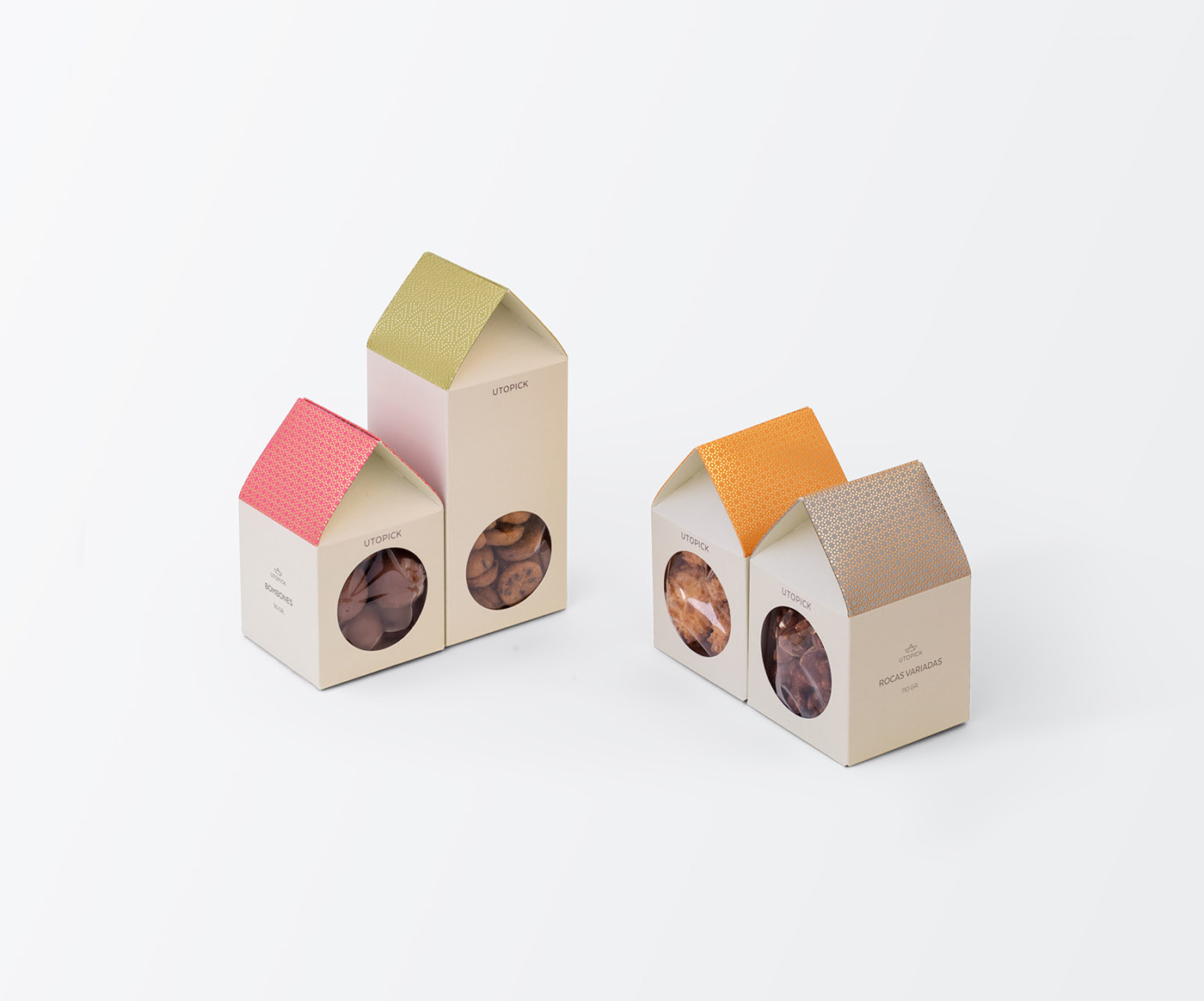

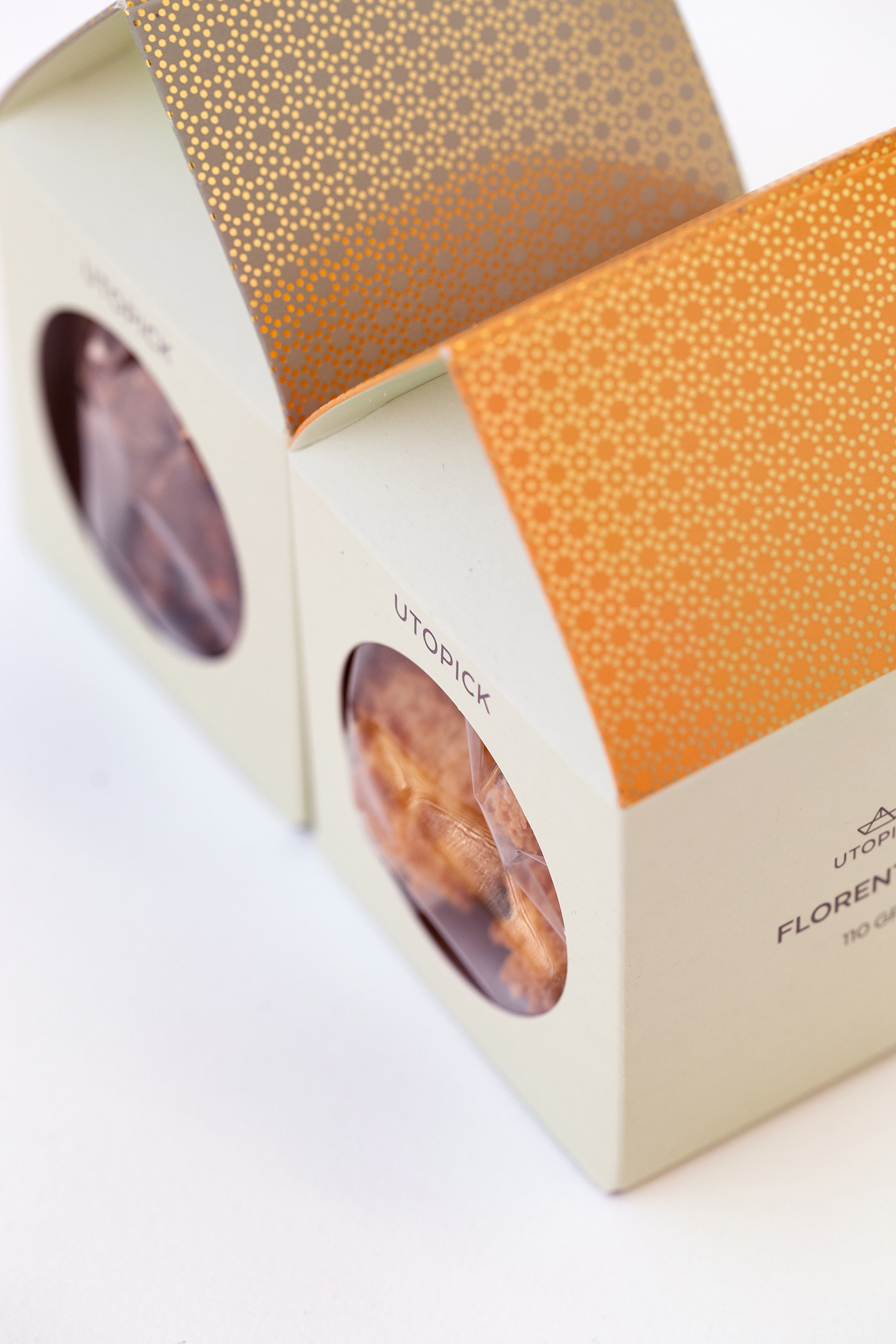
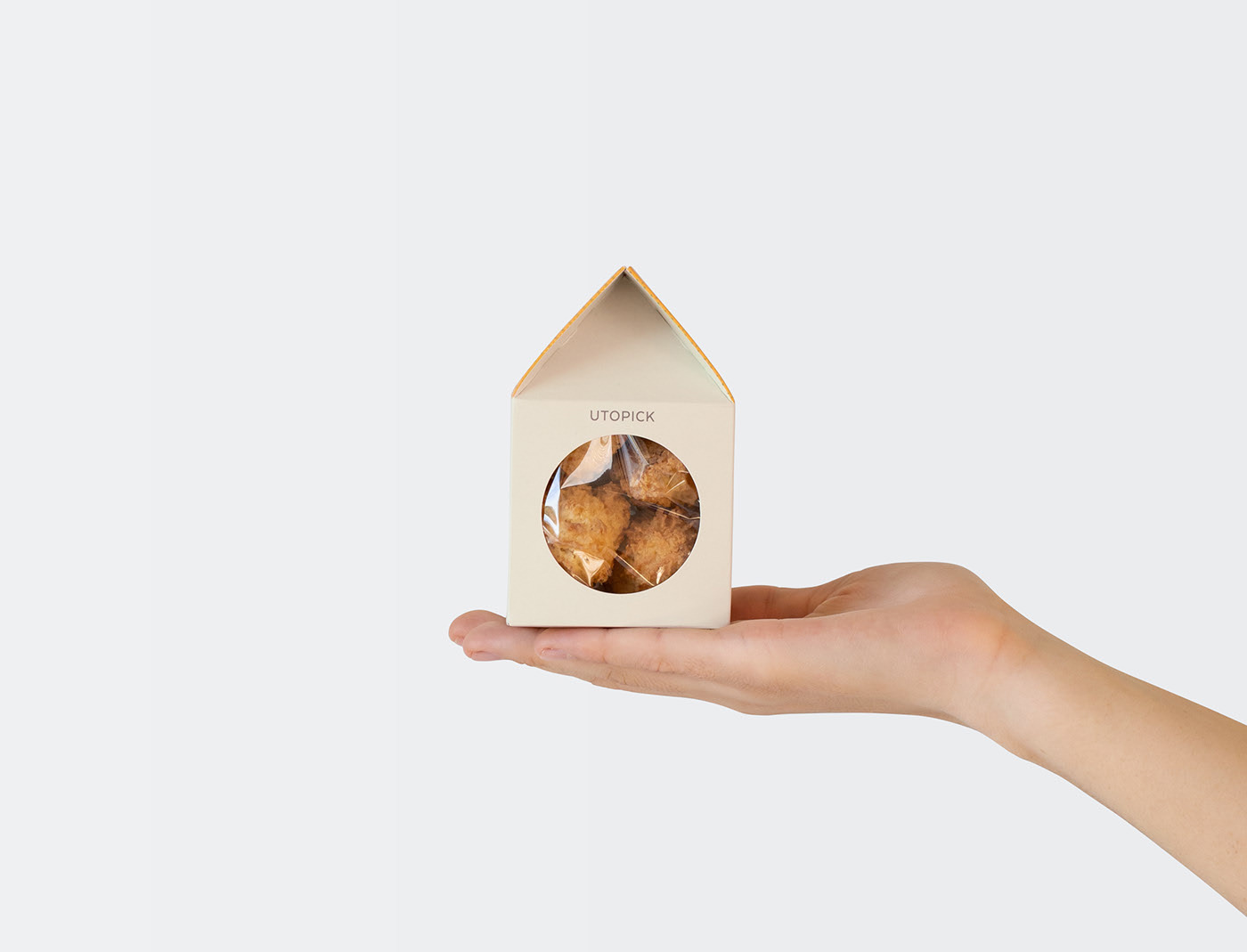
Illustration by Kendrick Kidd
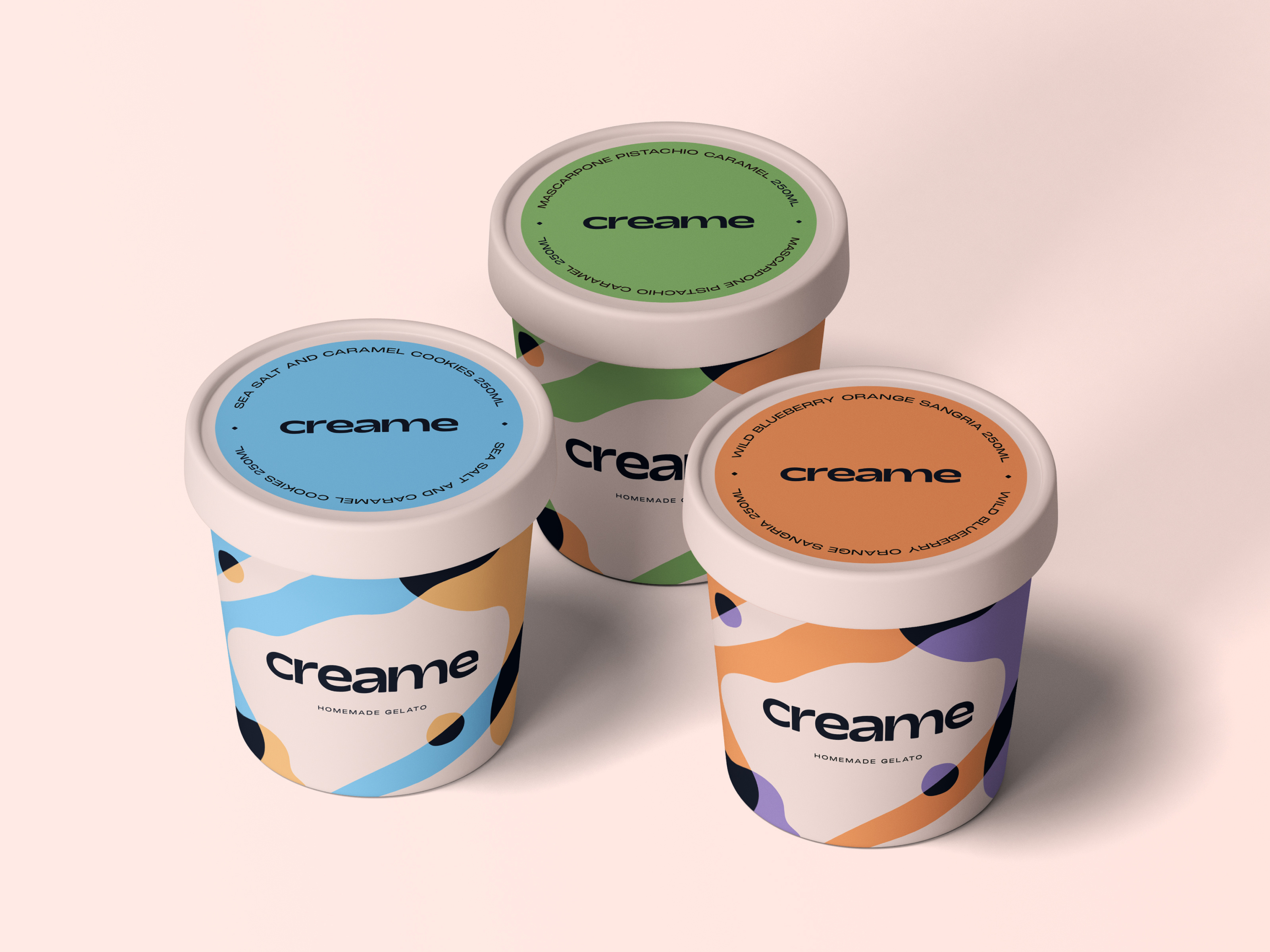
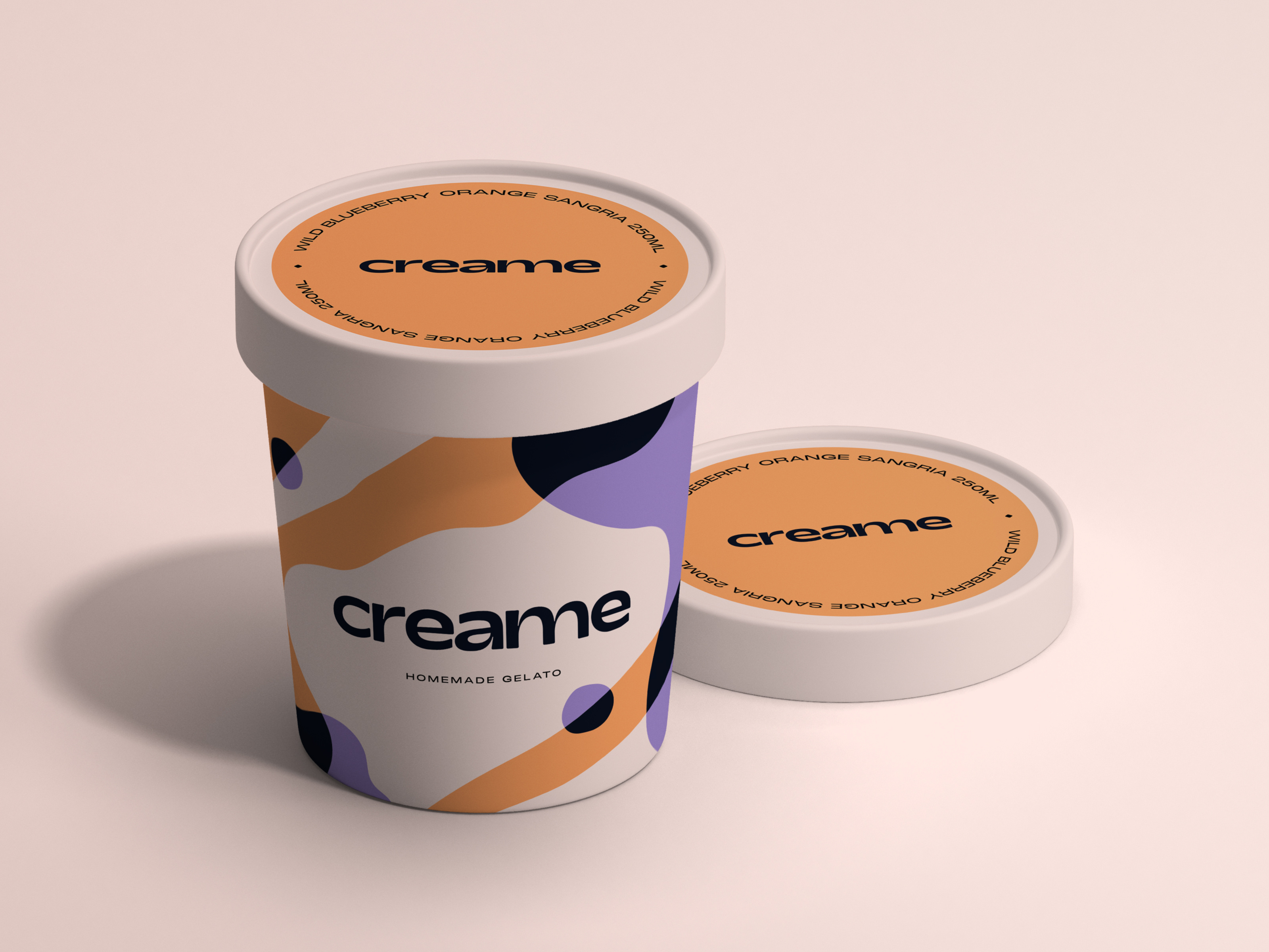
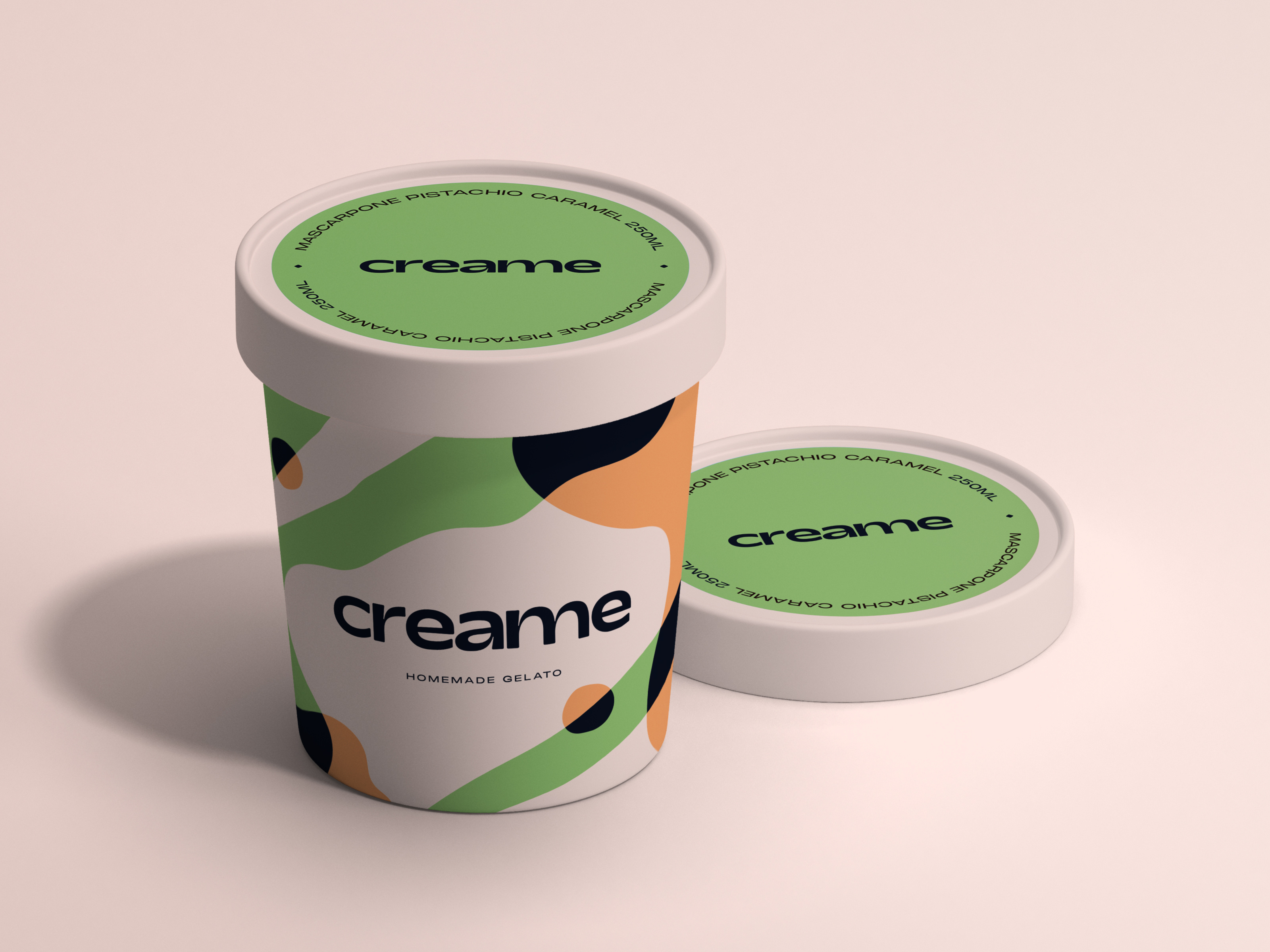
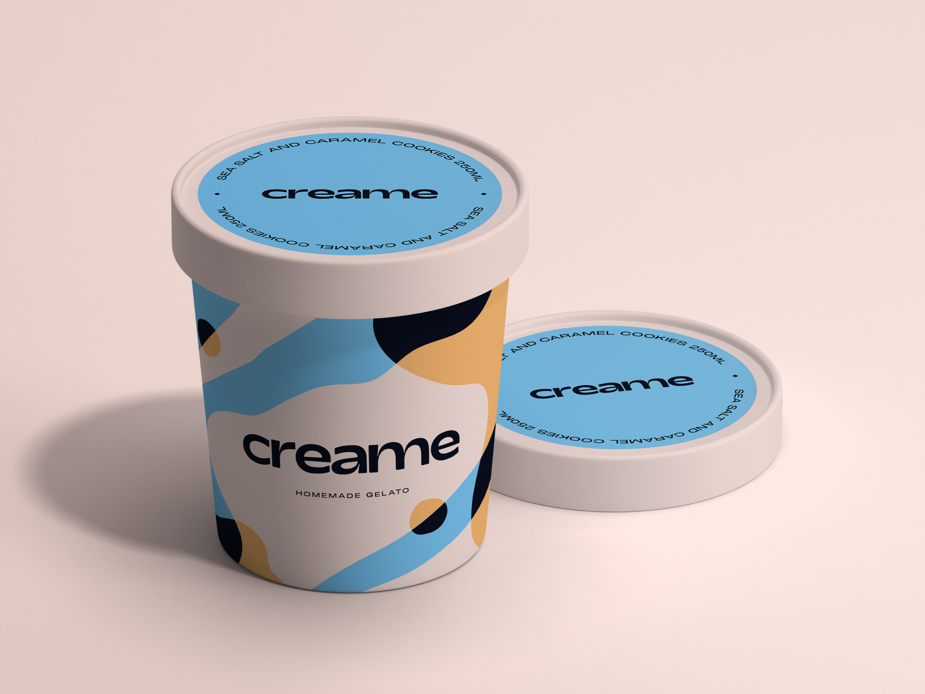
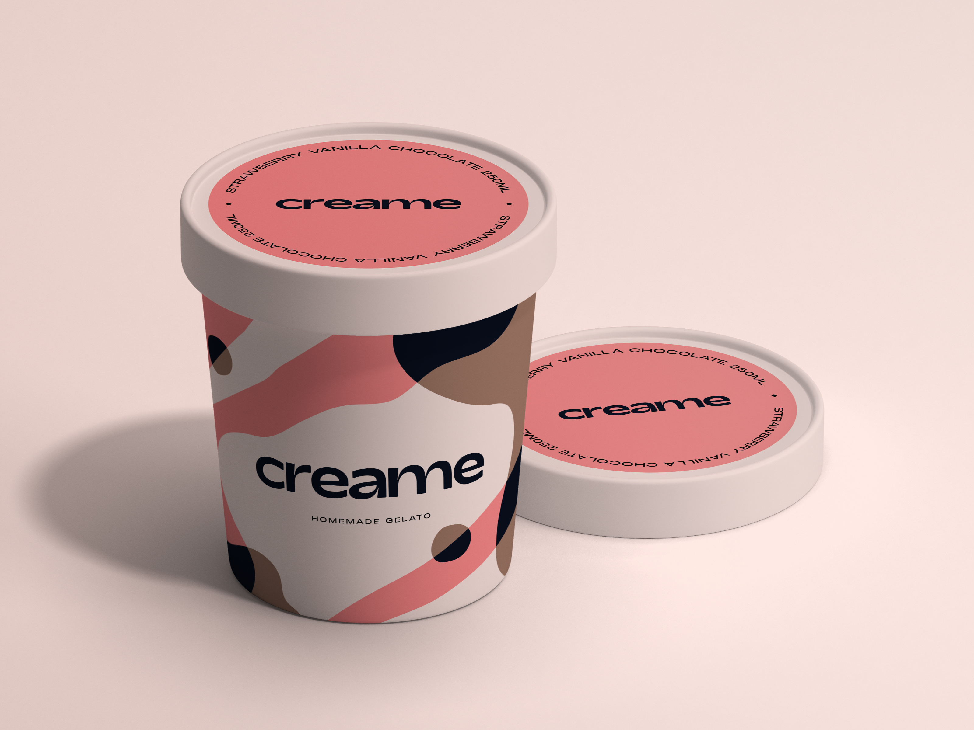
Creame Homemade Gelato – Packaging by Stan Aleyn | Brand Designer
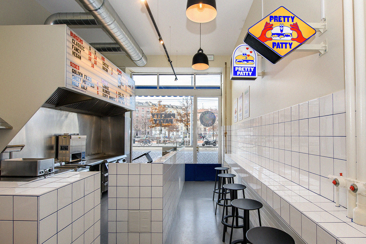
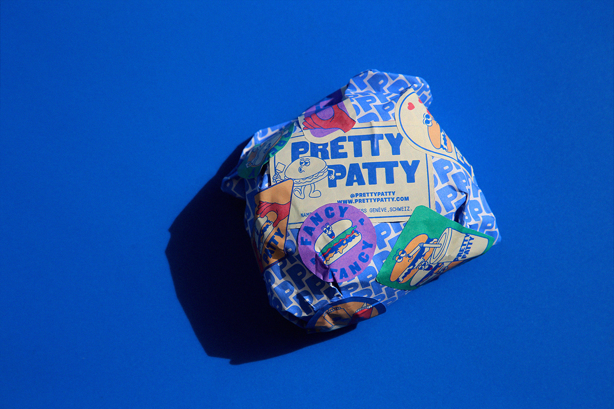
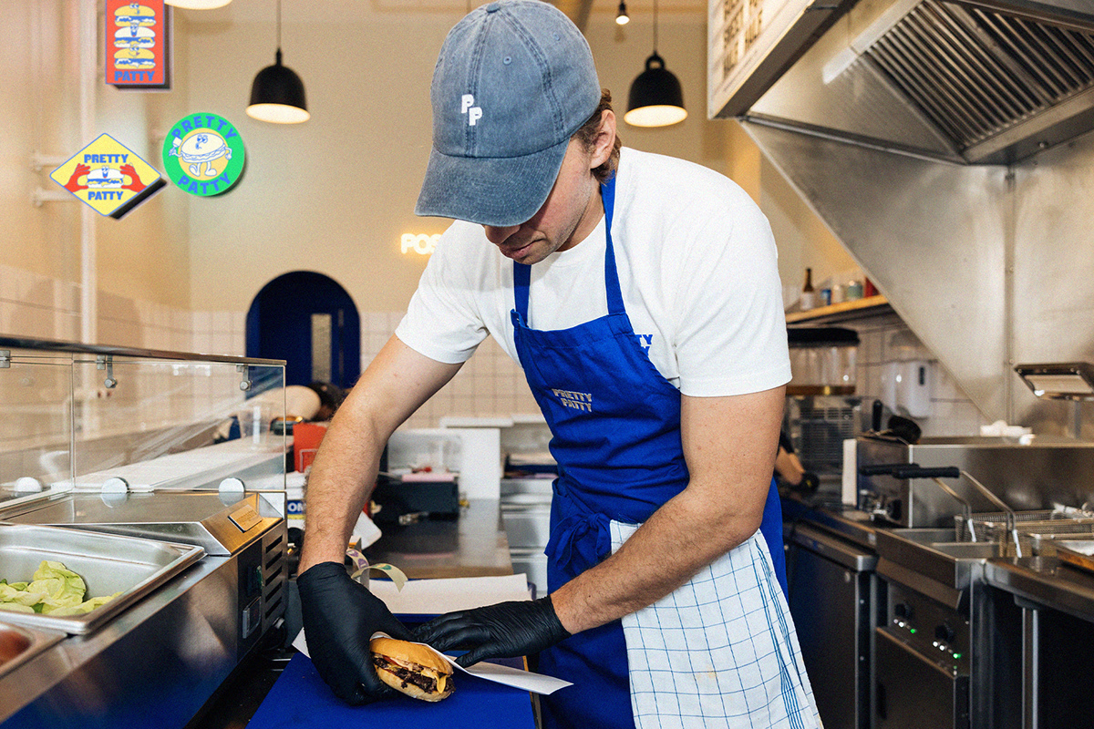
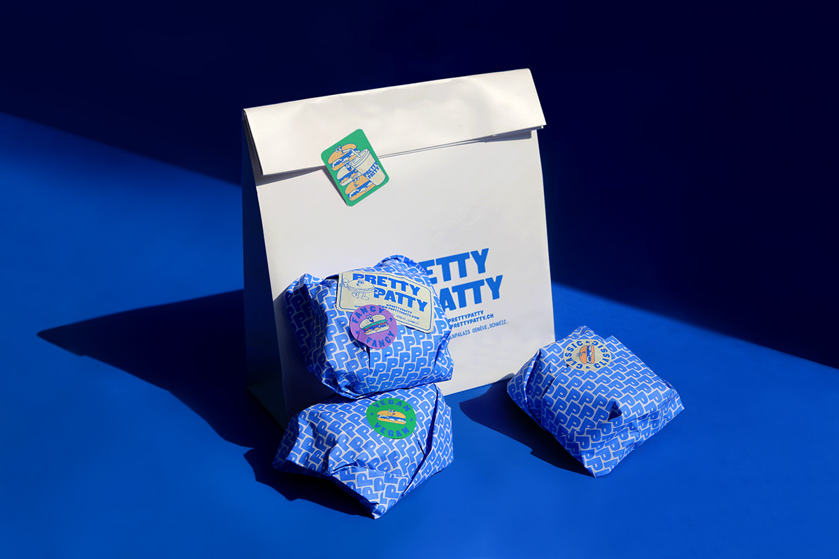
PRETTY PATTY by Karla Heredia

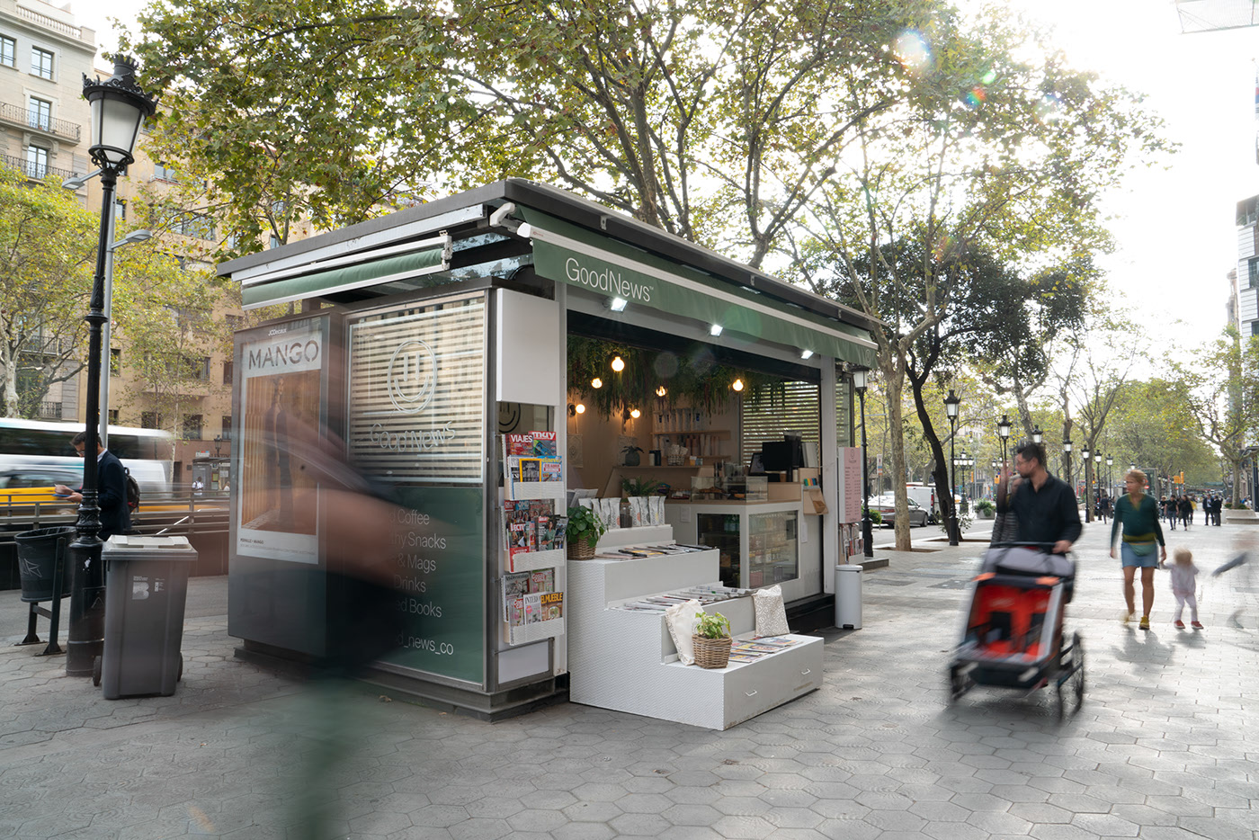
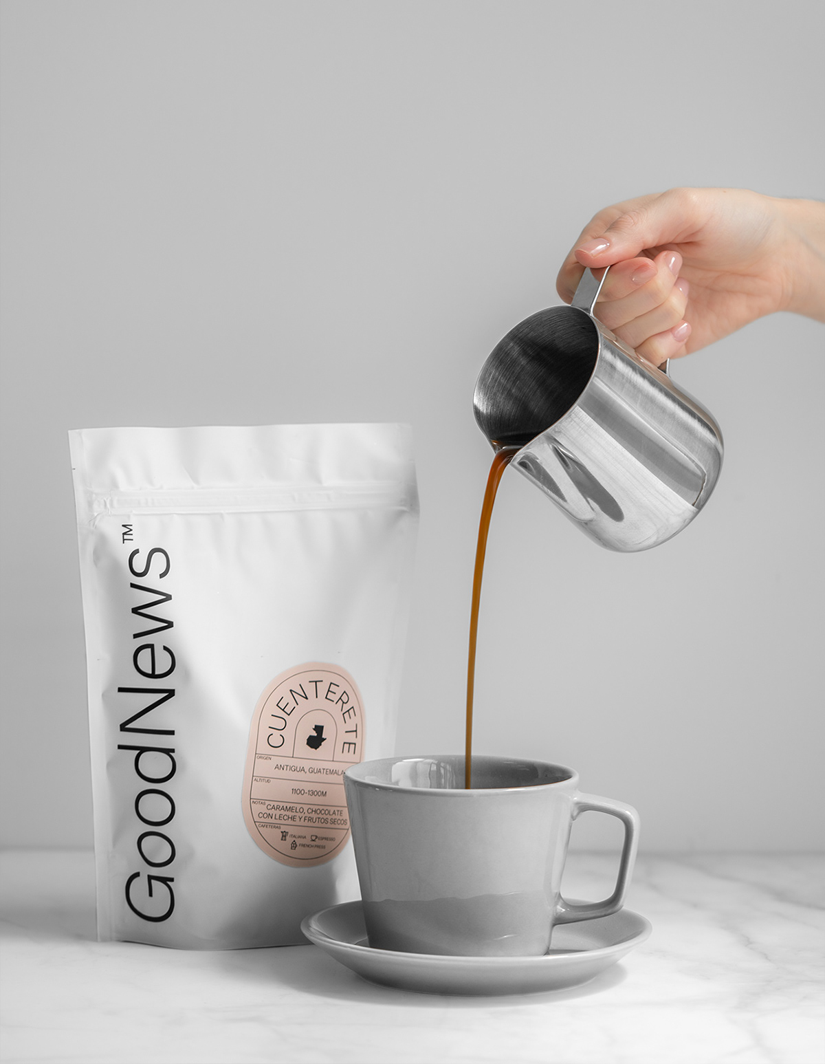
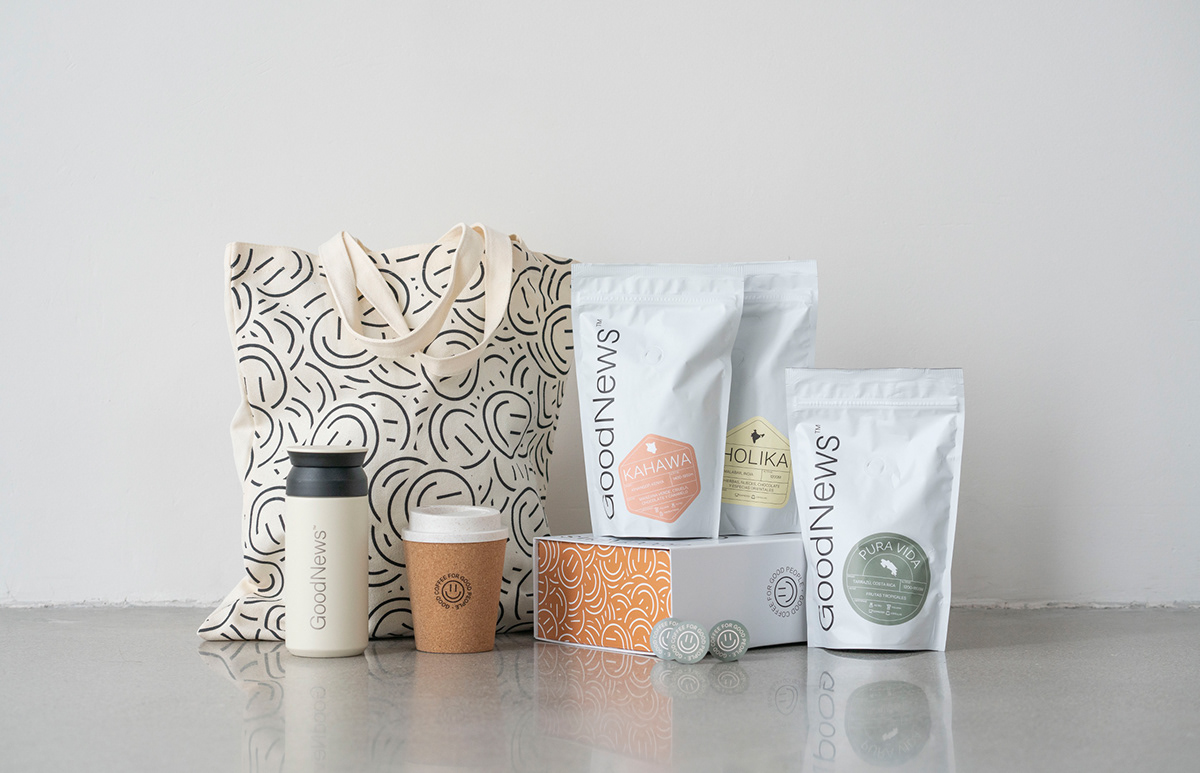
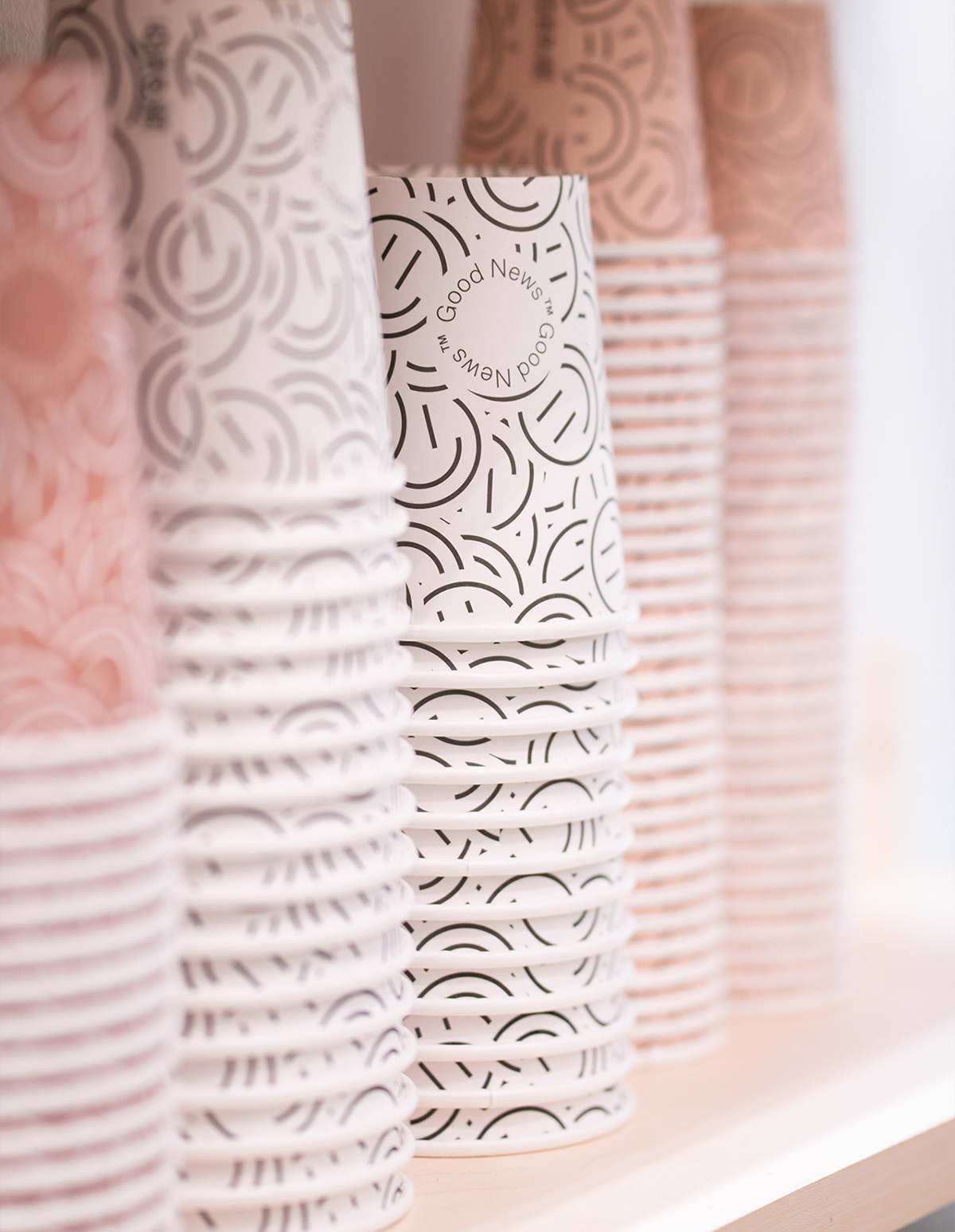
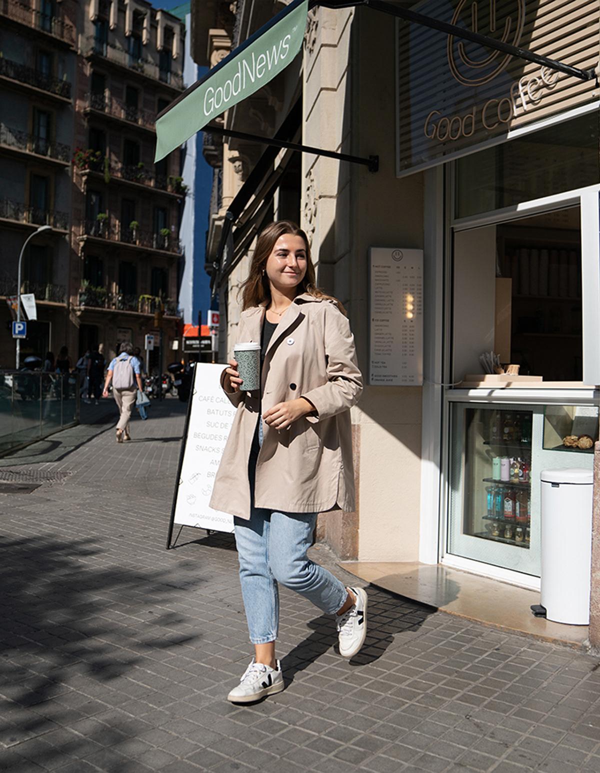
GoodNews™ by Serena Studio, Jose Aponte, Jaume Portella and iam_Angel Ruiz


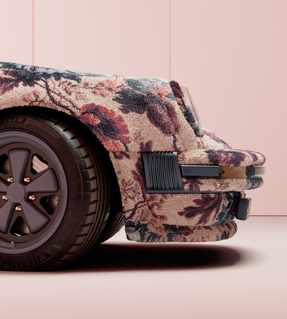
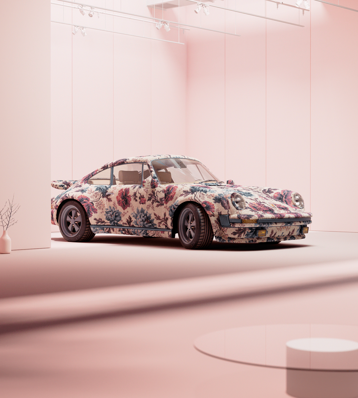
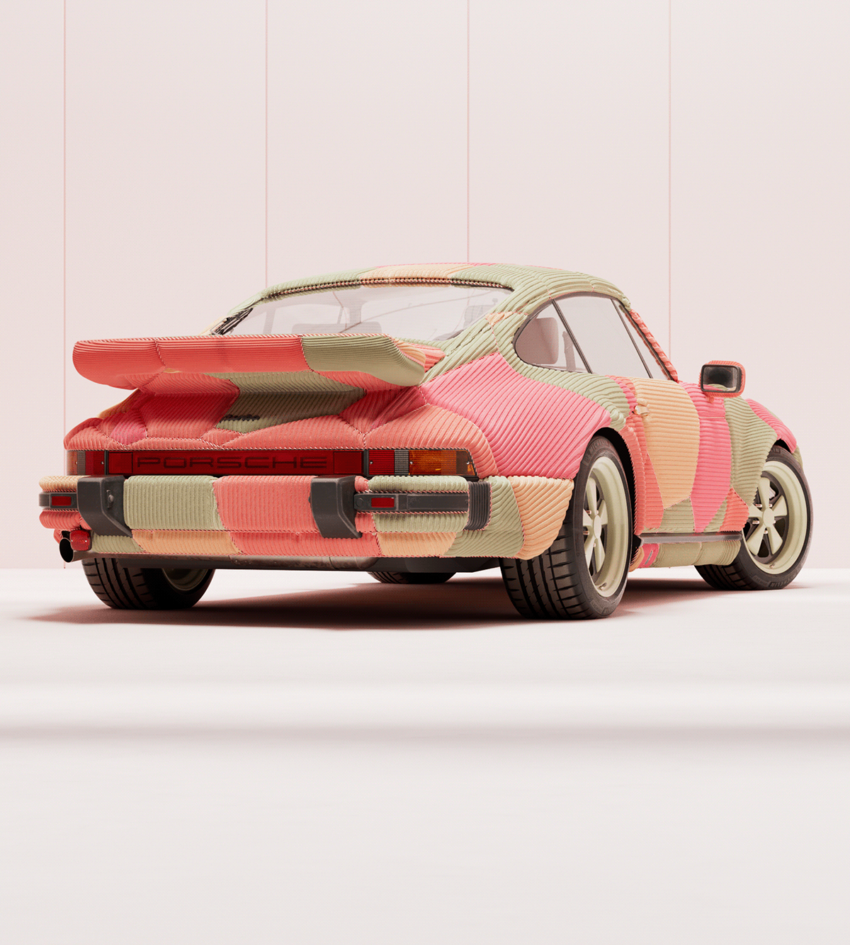
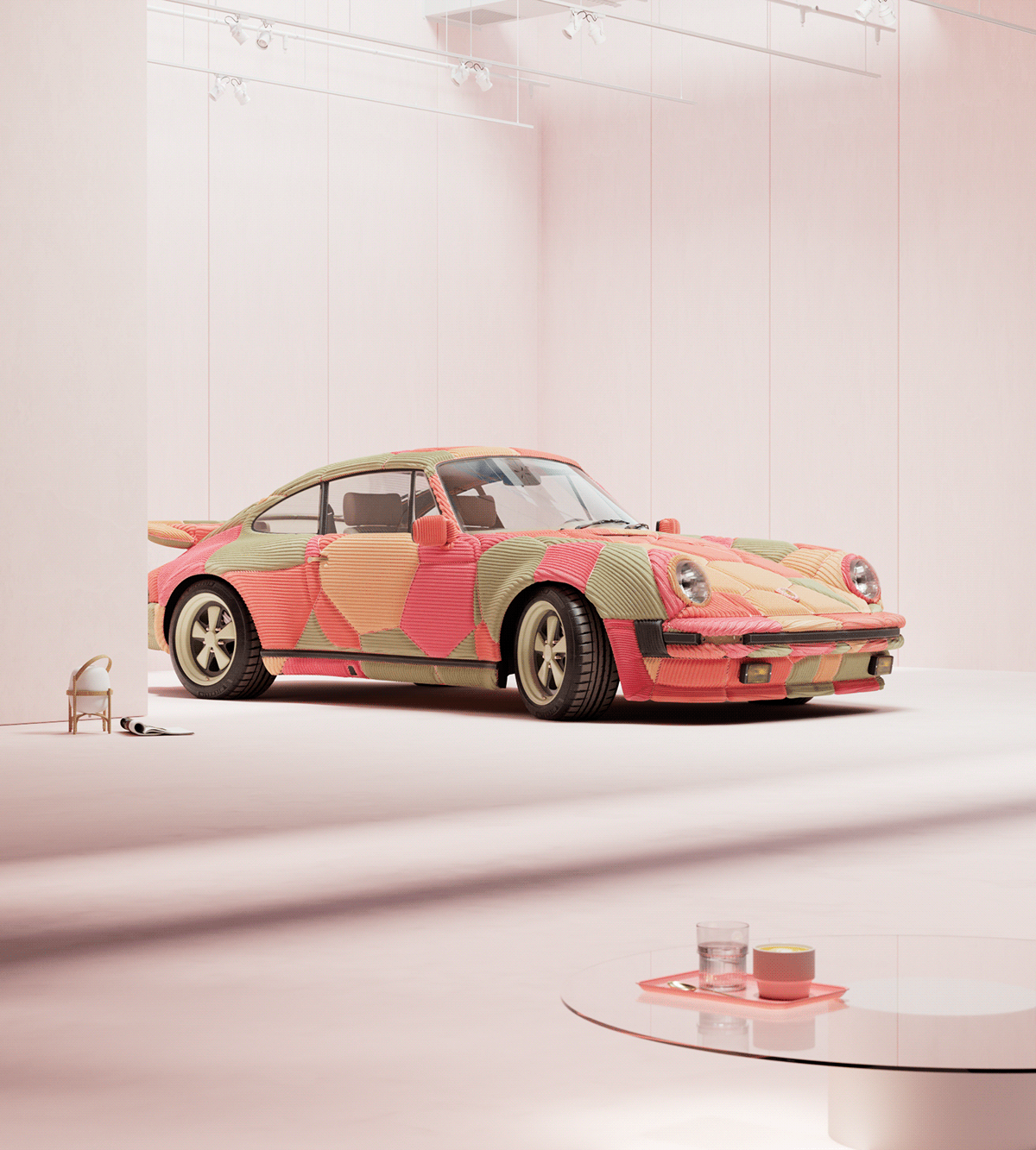
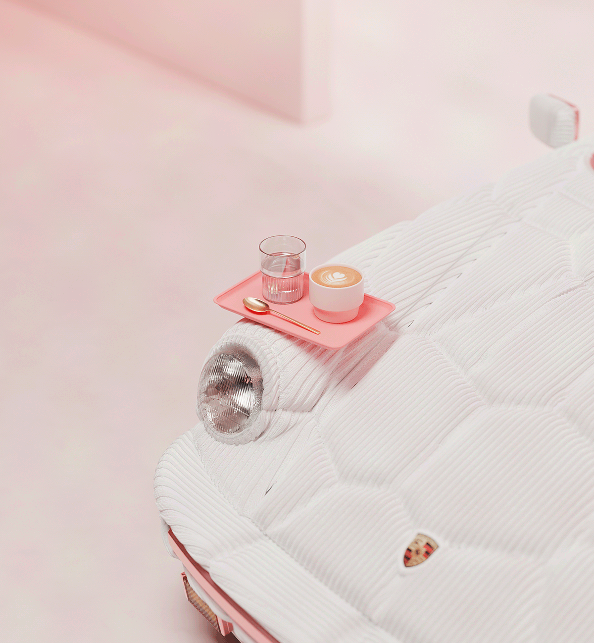
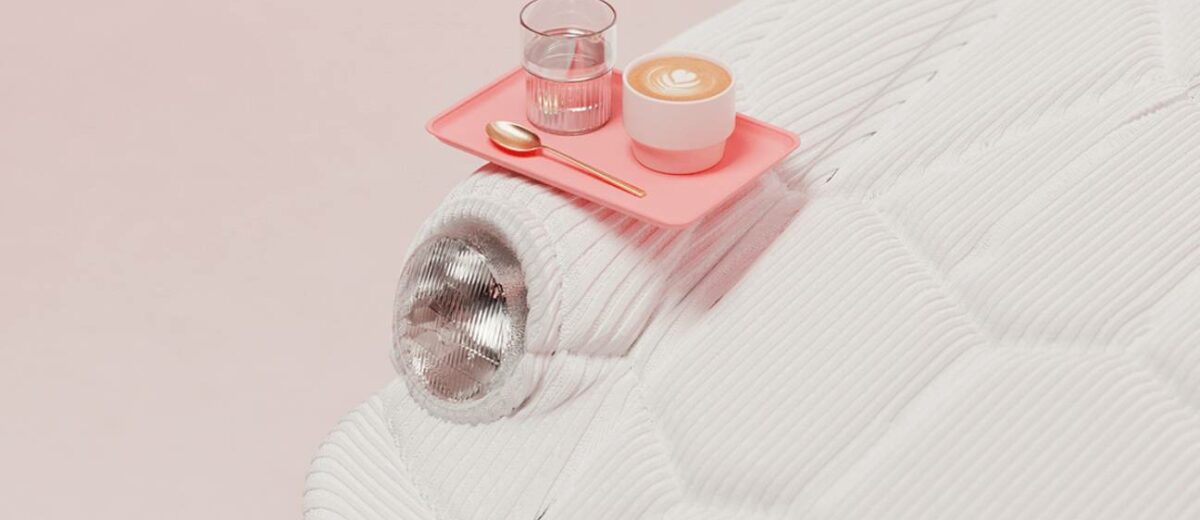
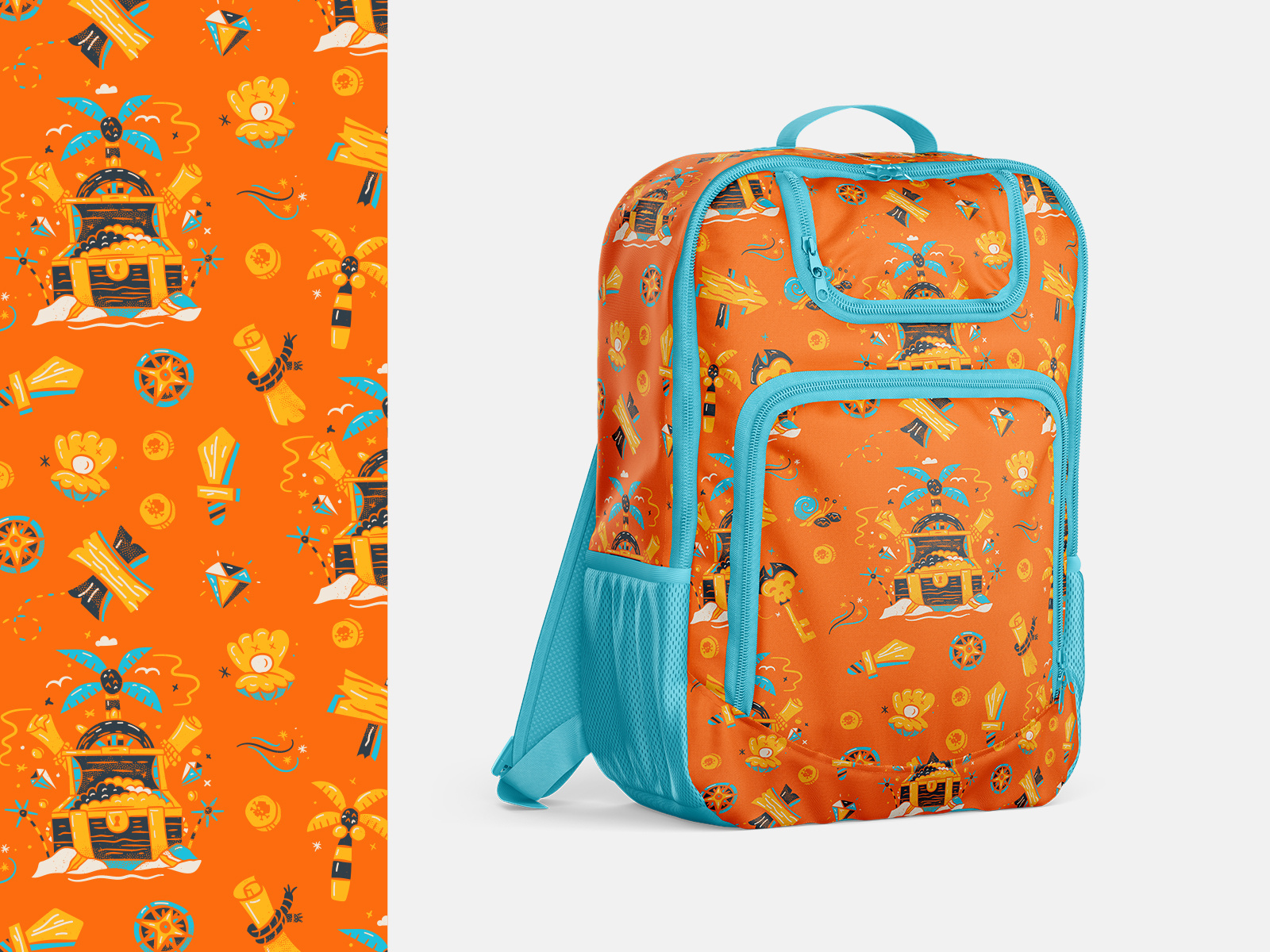
911 in fabrics by Thiago Tallmann