
Check out this month’s curated logo design and branding projects for your inspiration. They are top-notch branding works created by designers from all over the world.
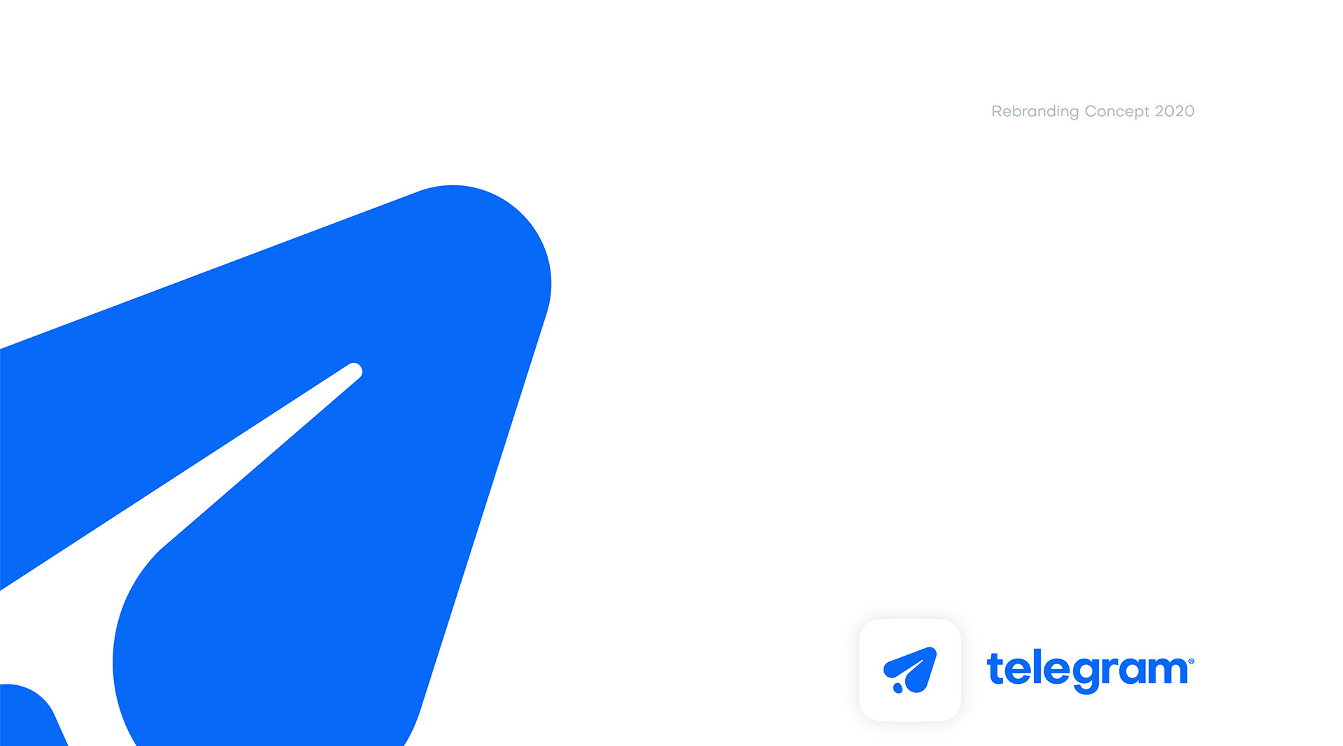
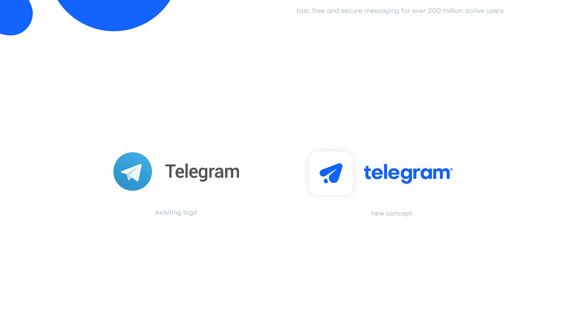
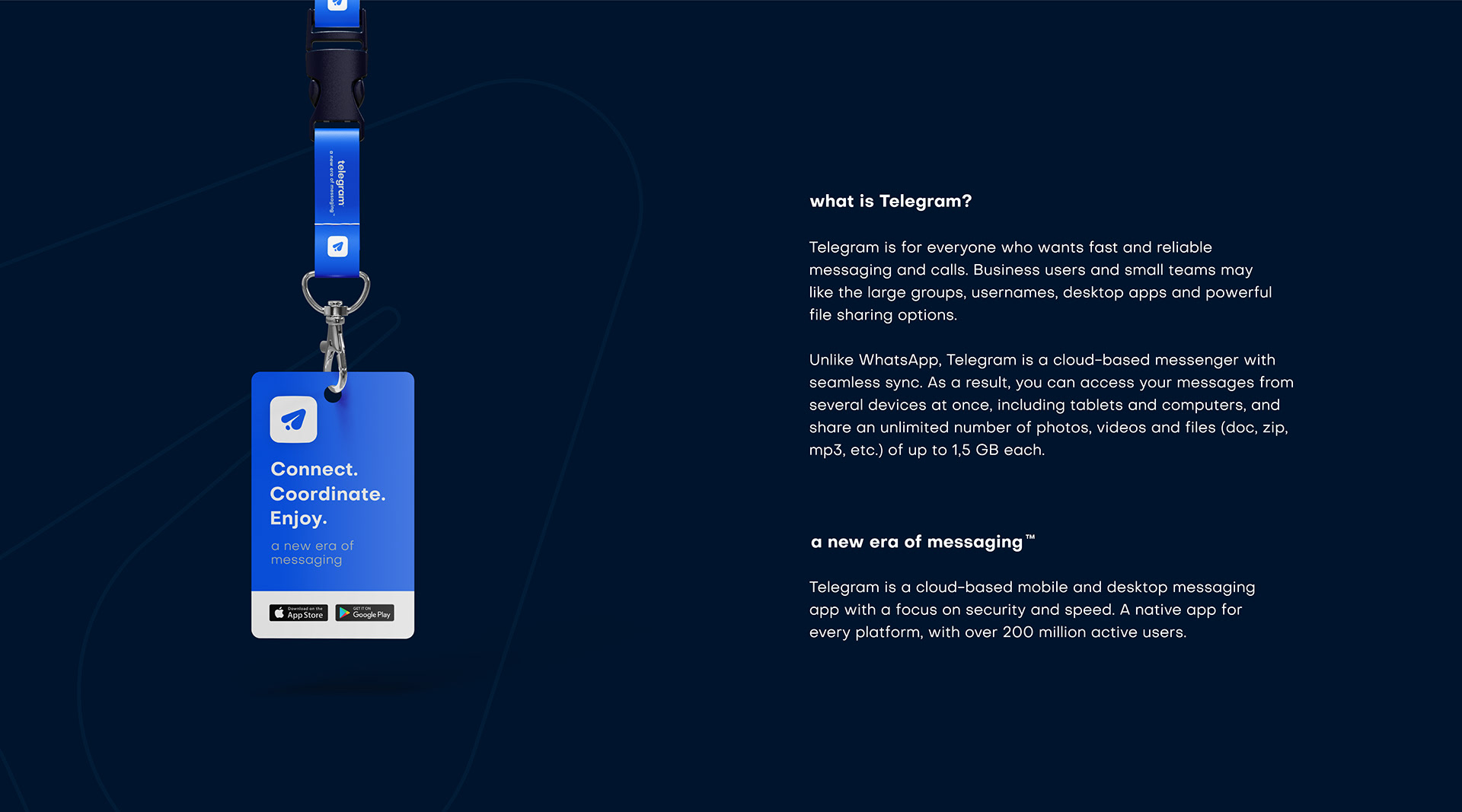
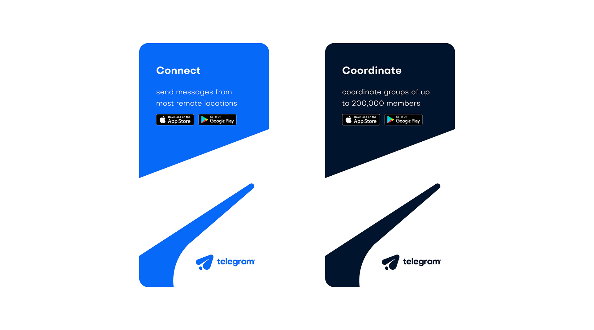
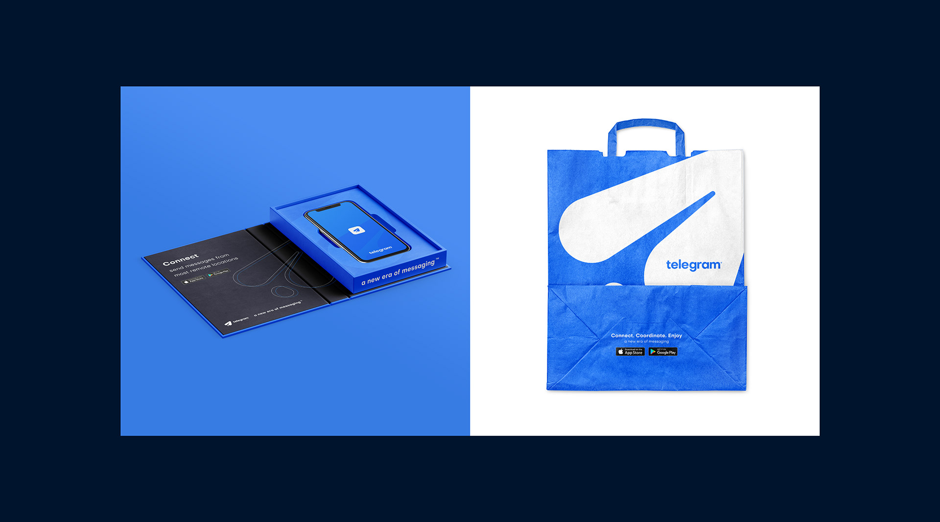
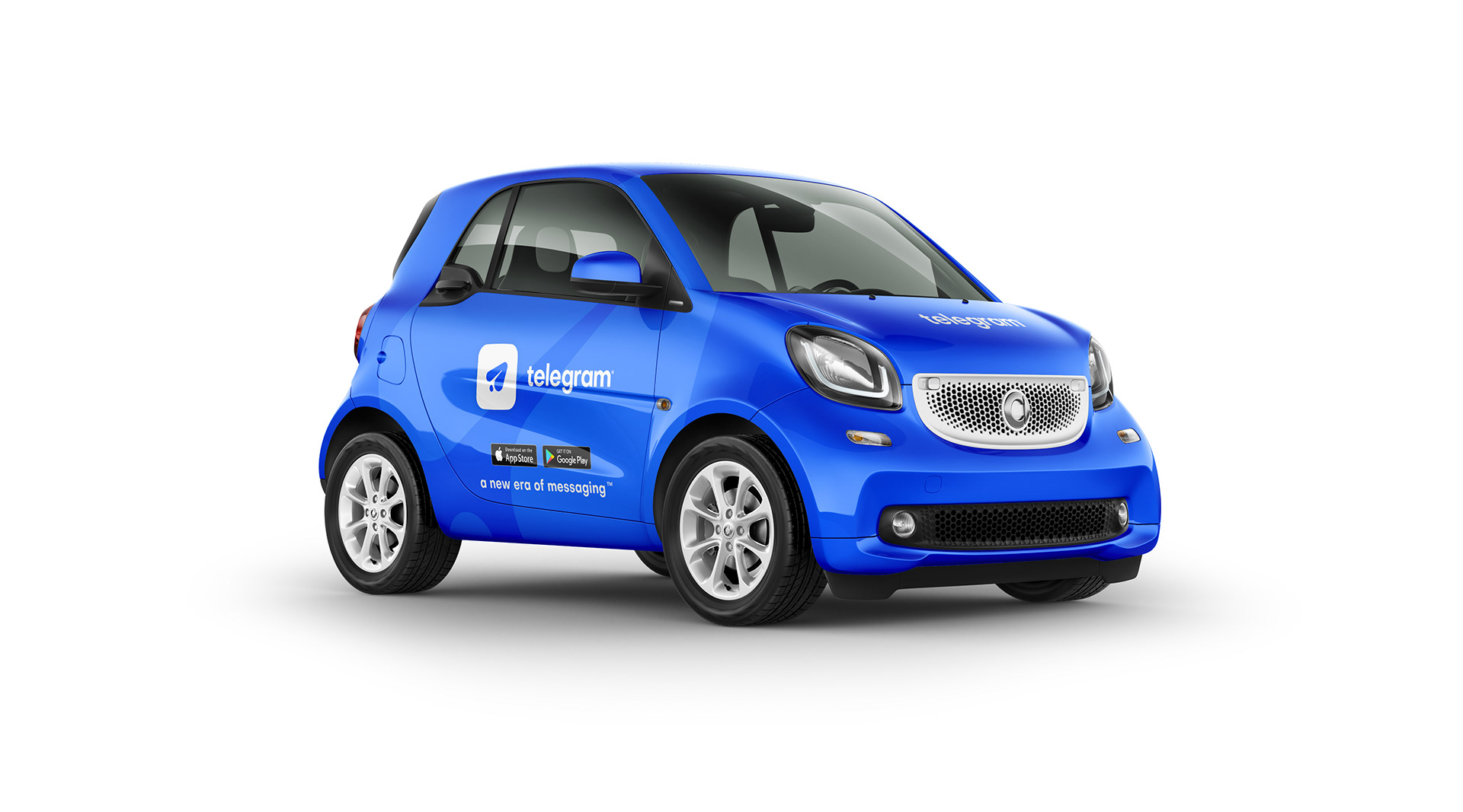
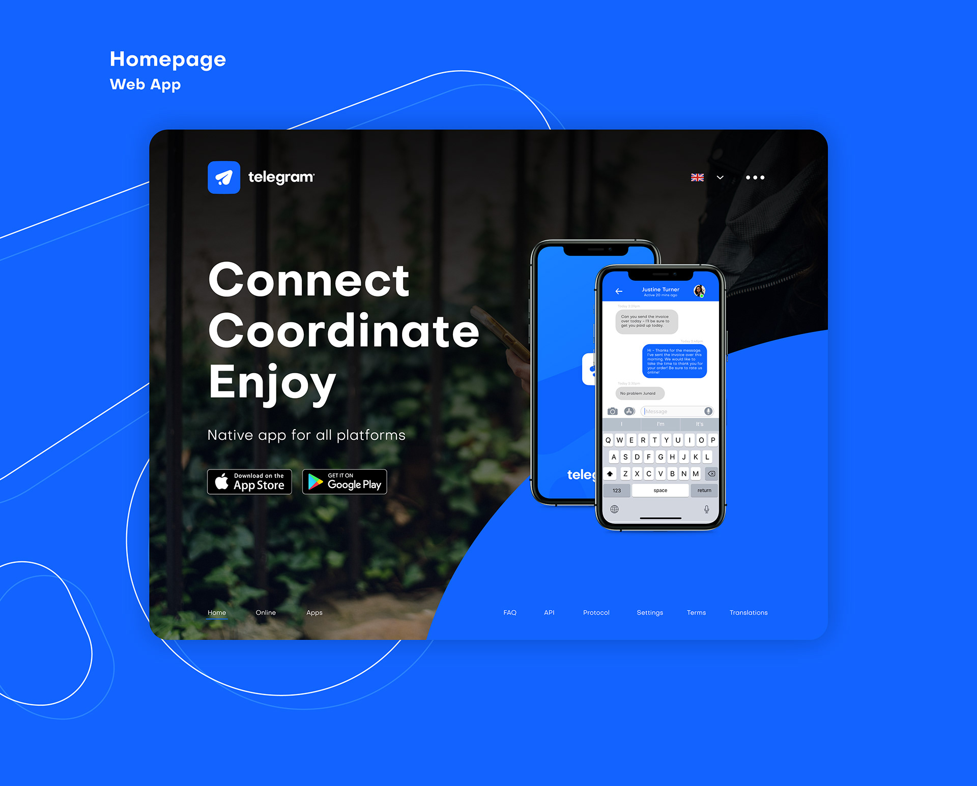
Telegram Branding Concept by George Bishop
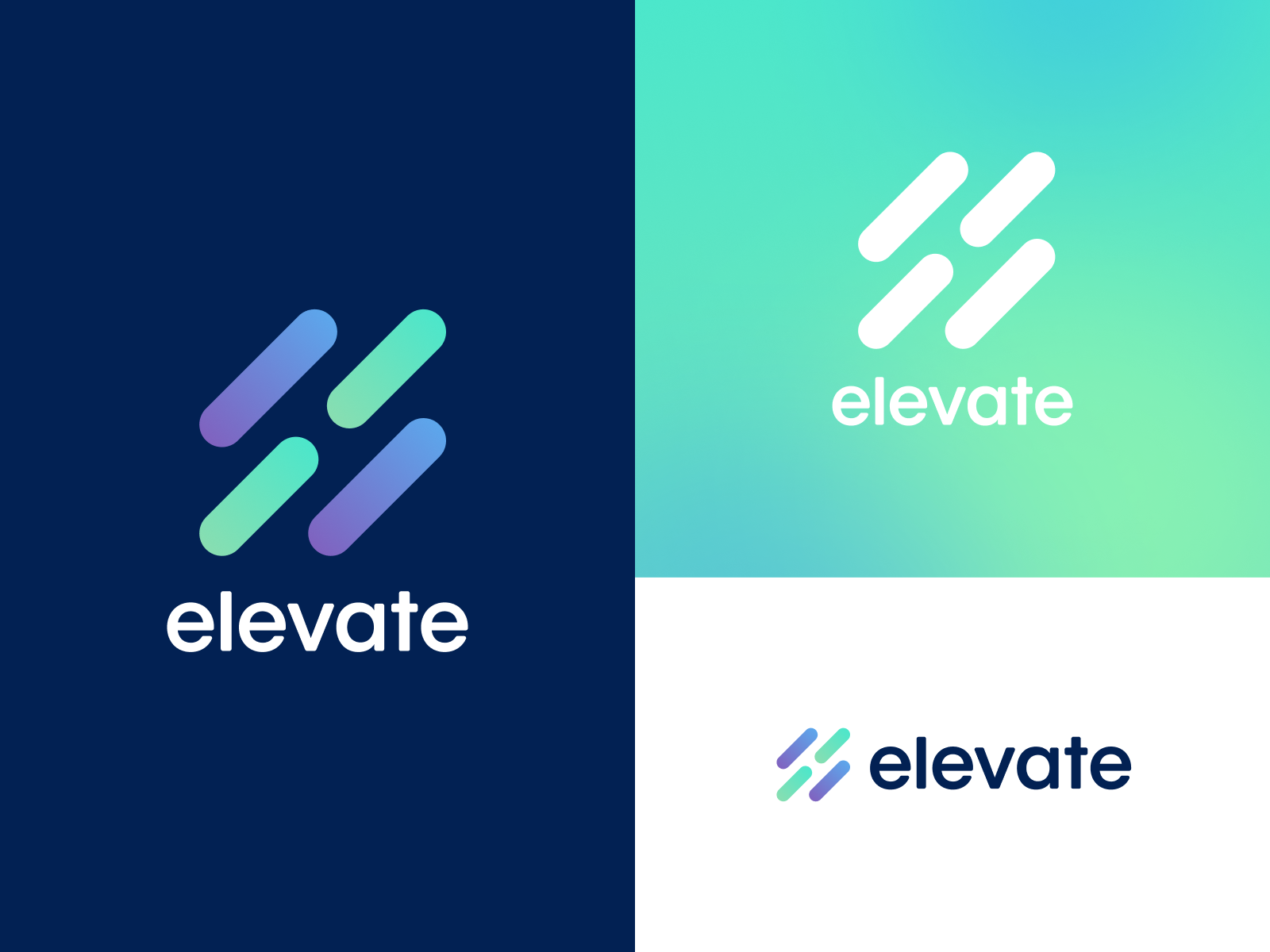
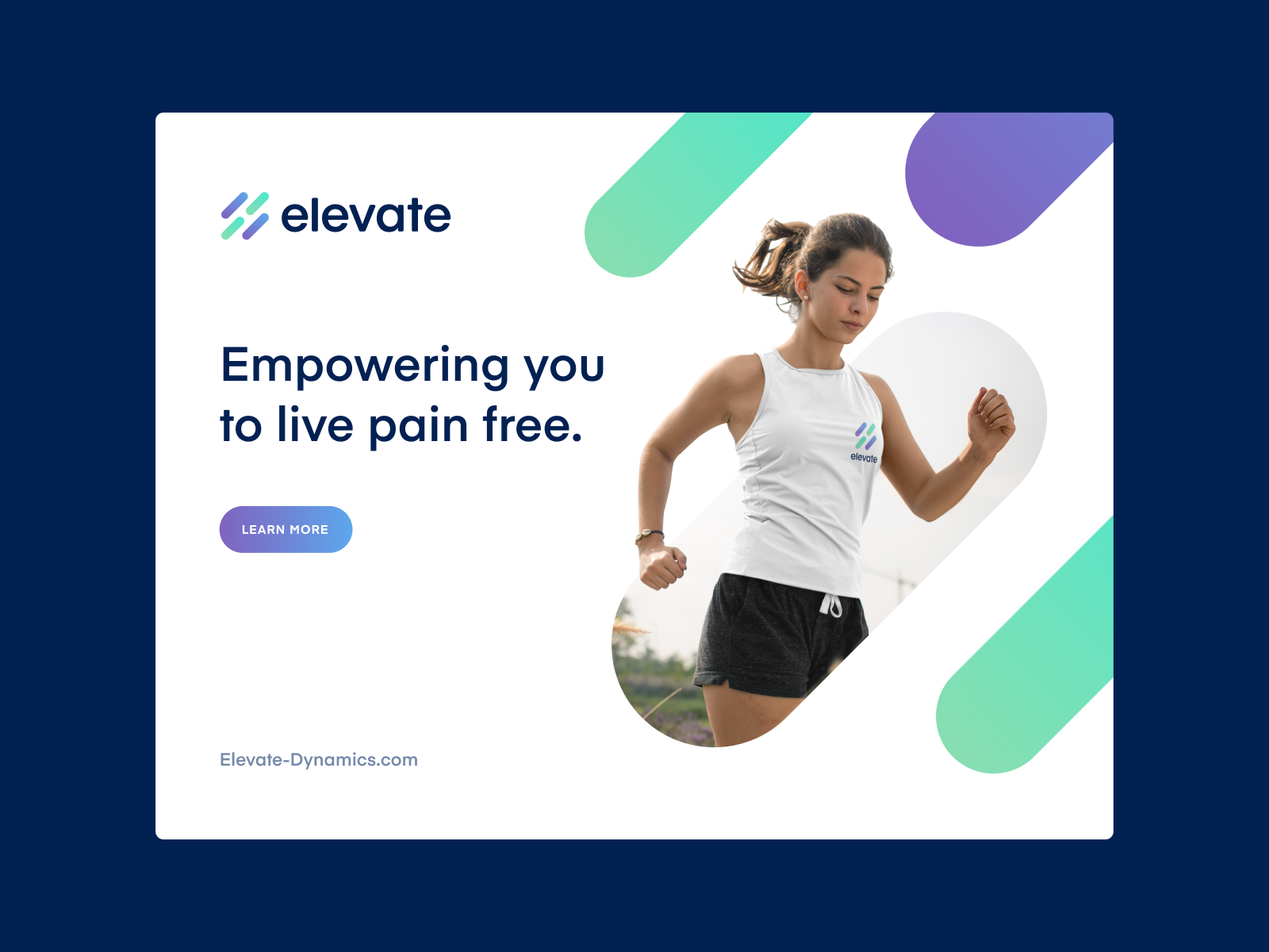
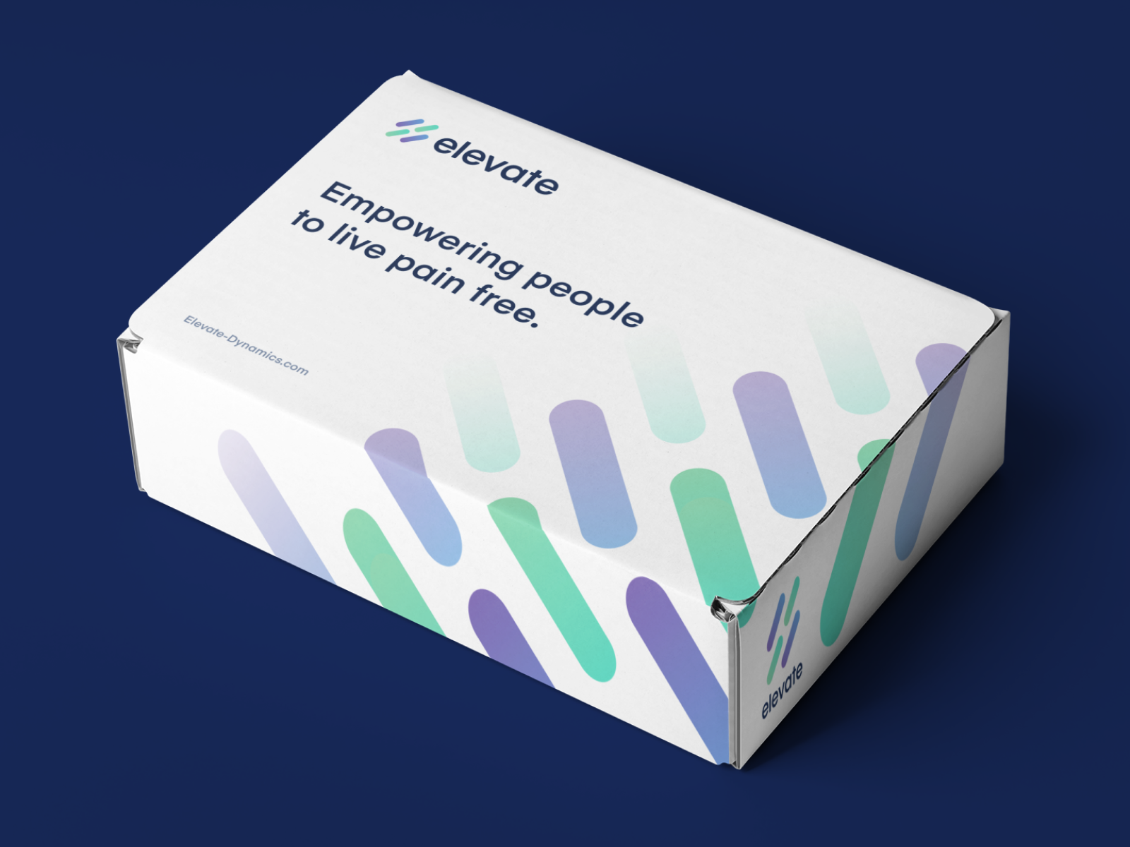
Elevate Brand Refresh by Jordan Jenkins
Better – Logo Animation by Alex Gorbunov for Better
S . M Stone UK by Pantone.Studio
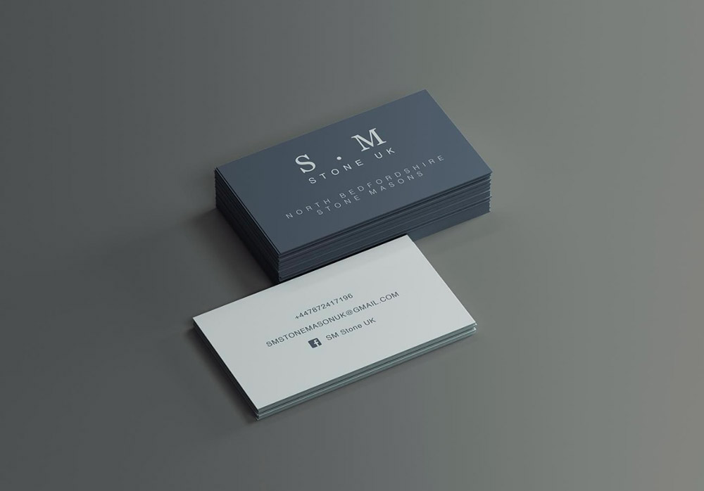
Submitted by Pantone.Studio
Business Card designs for S.M Stone UK.
Designing a logo for the gated community by moye_dsgn
Class Atlas Logo Design by Dalius Stuoka
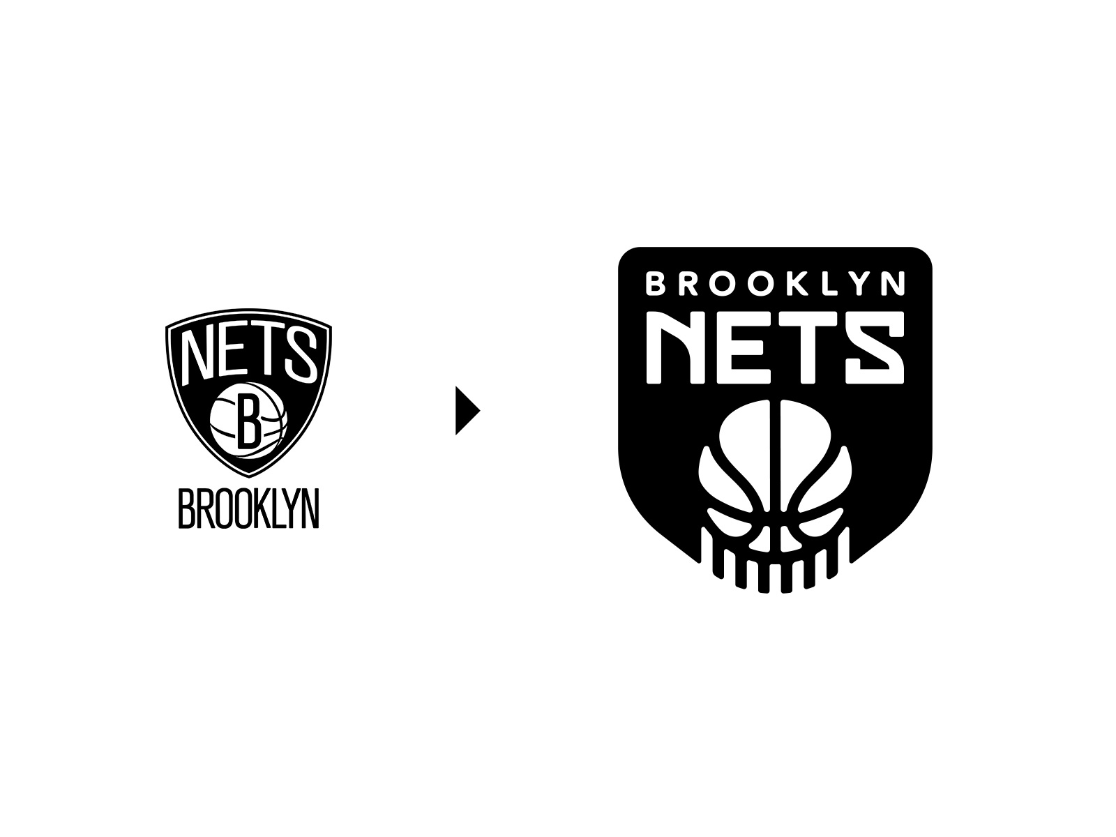
Brooklyn Nets (NBA) Logo Redesign by Dalius Stuoka
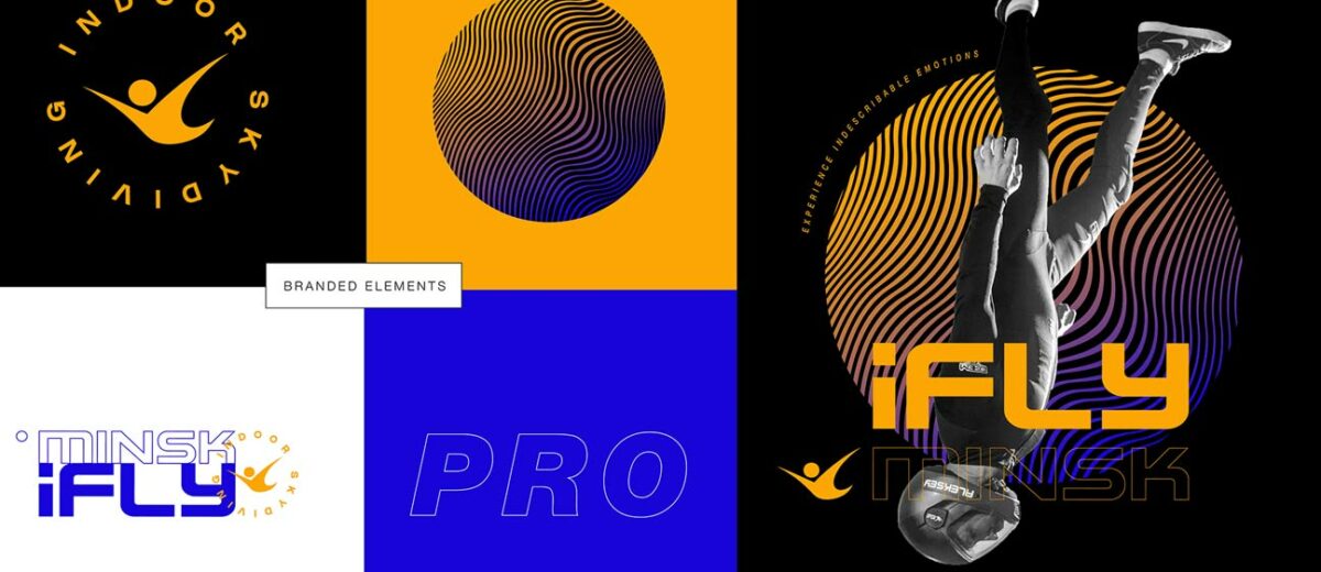
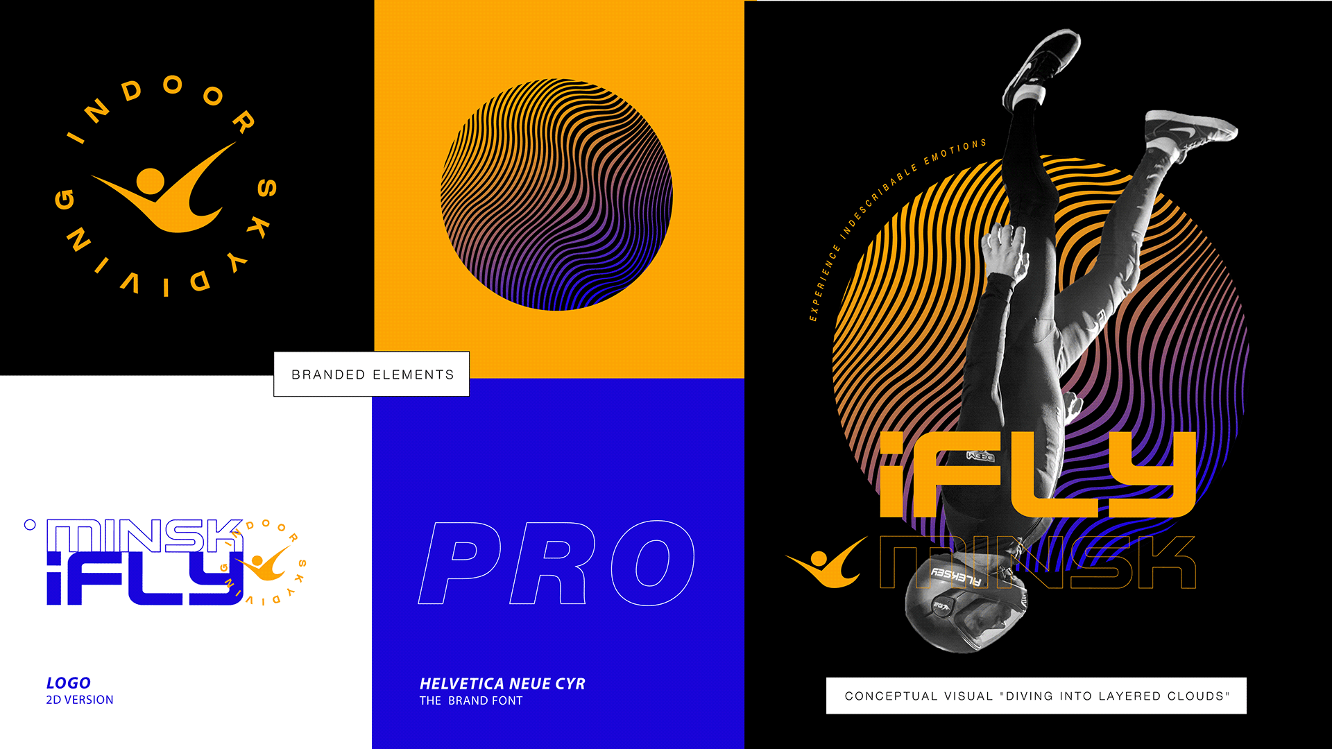
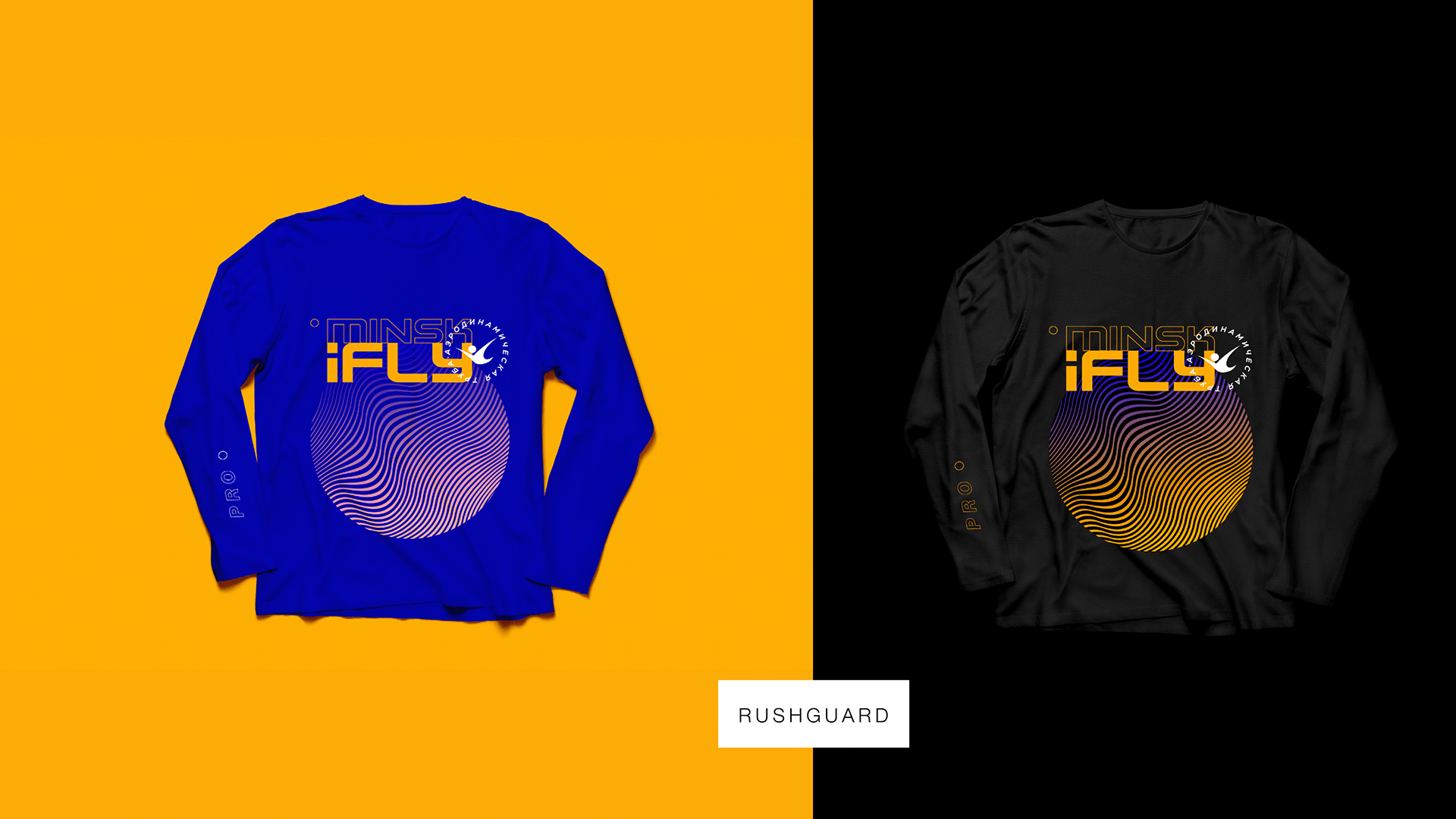
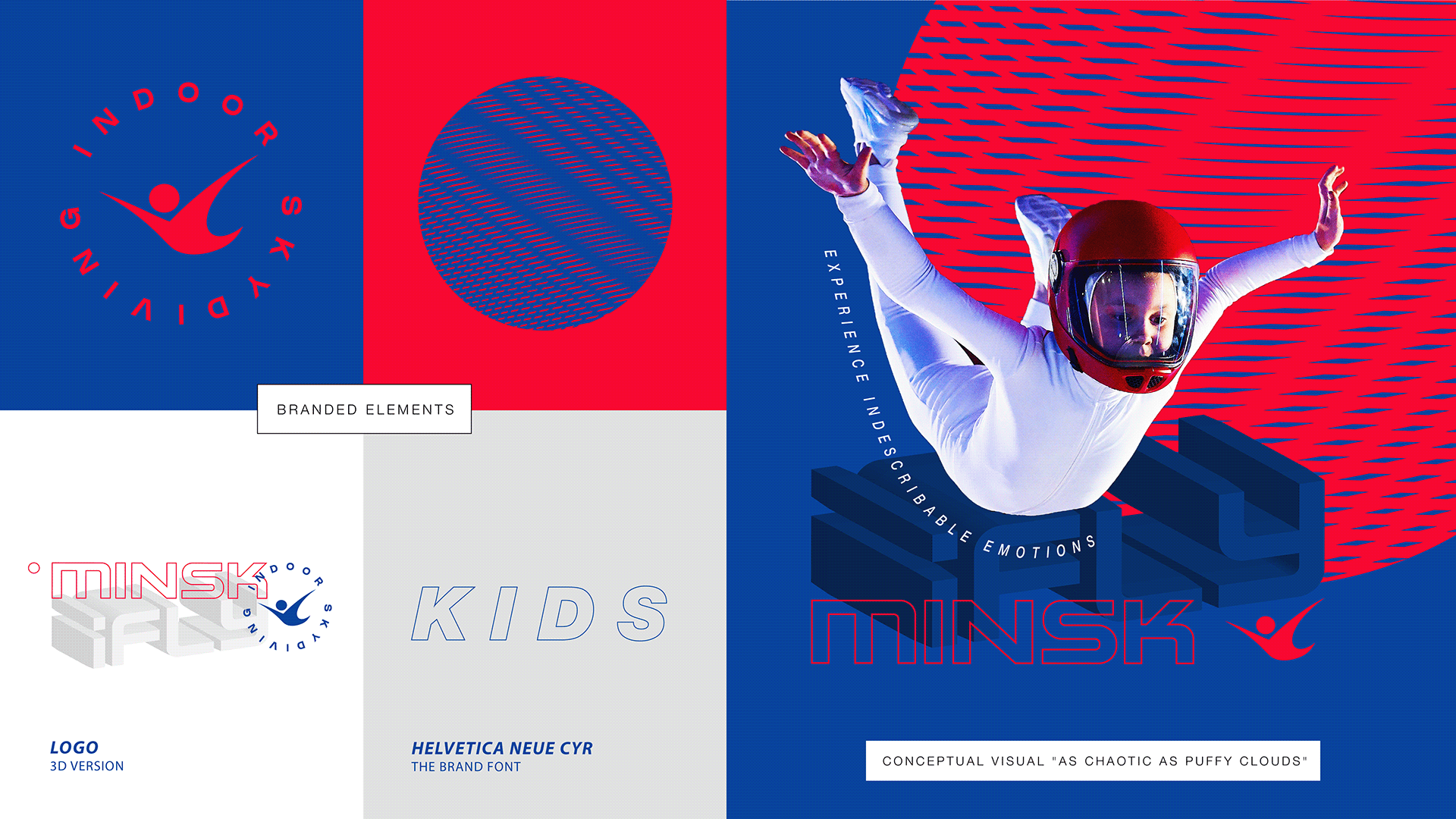
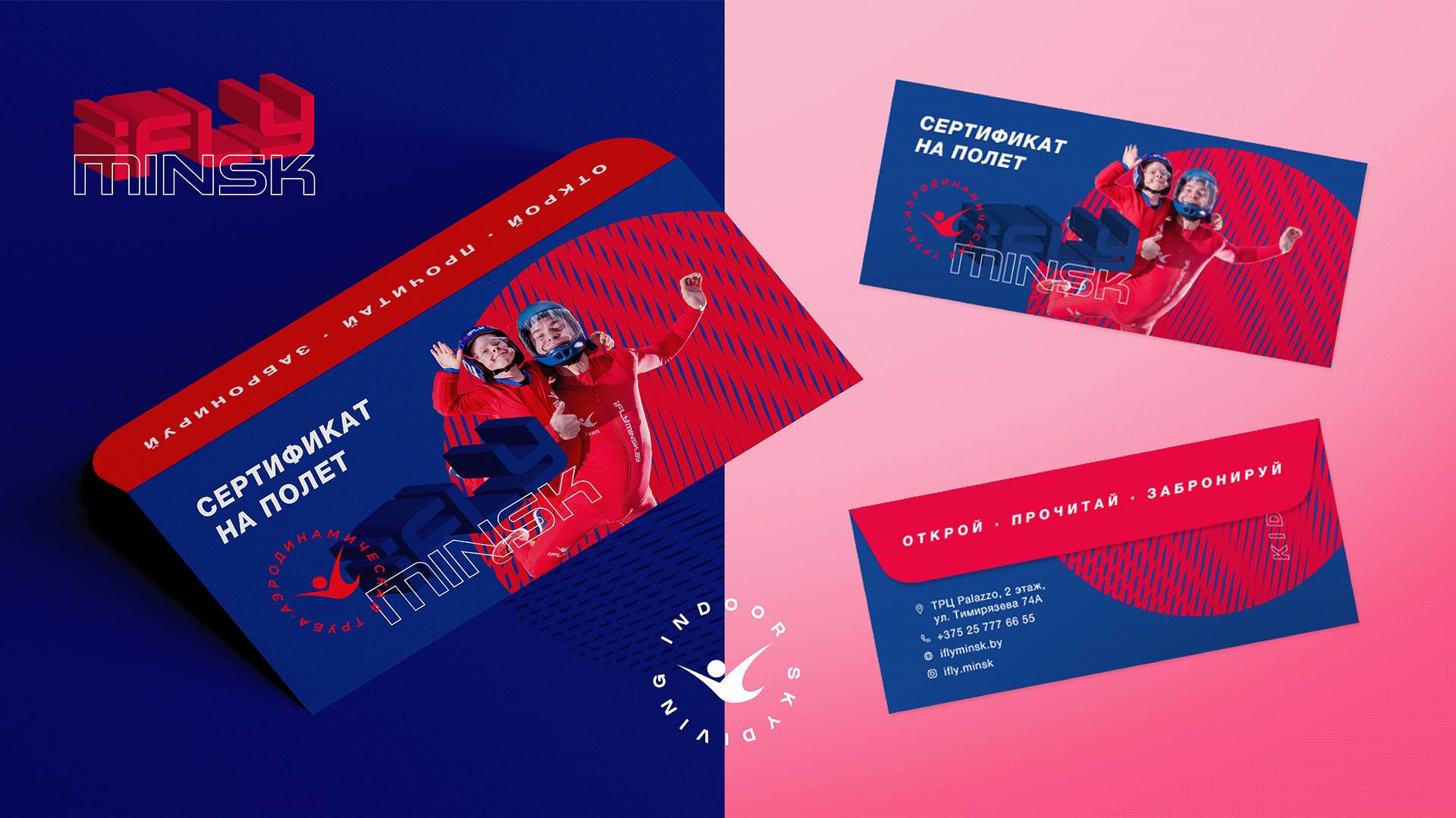
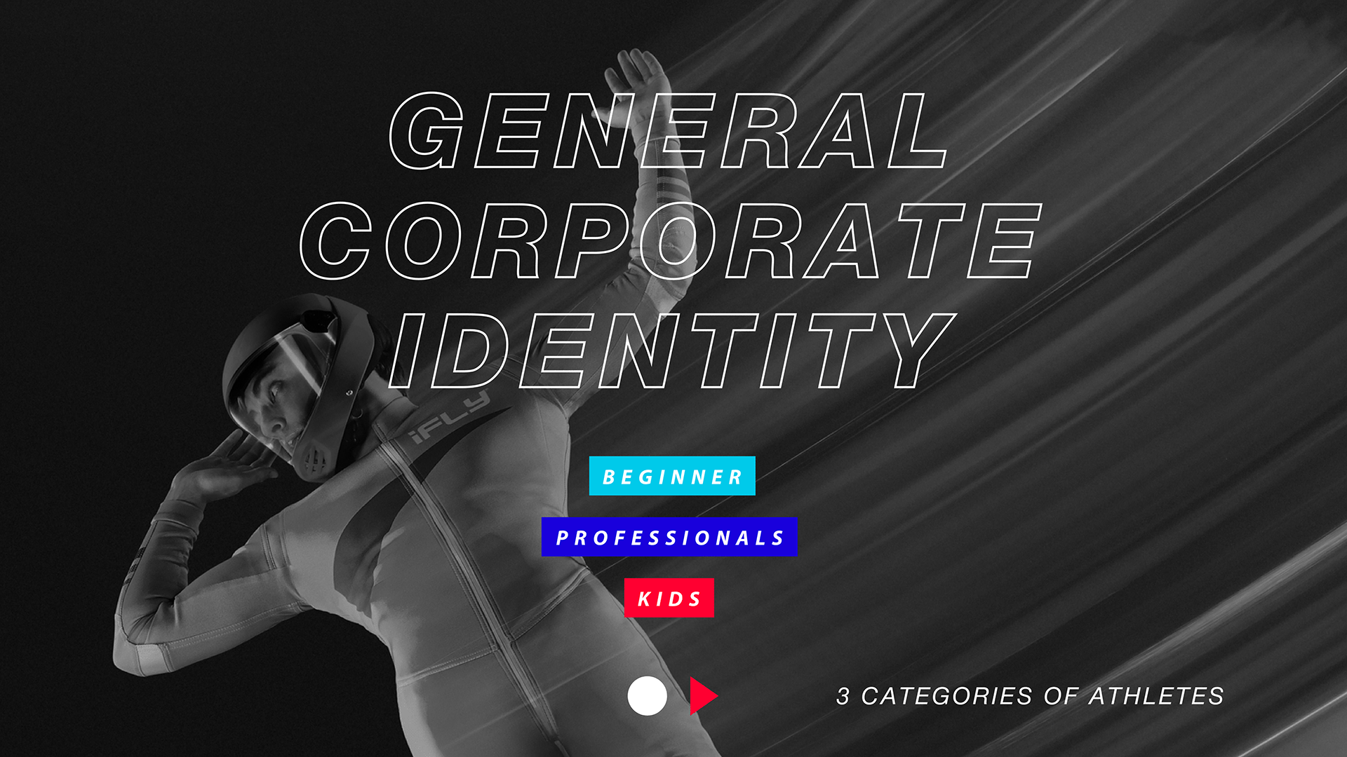
Corporate Identity for iFly Minsk by Moloko Creative


Submitted by Moloko Creative
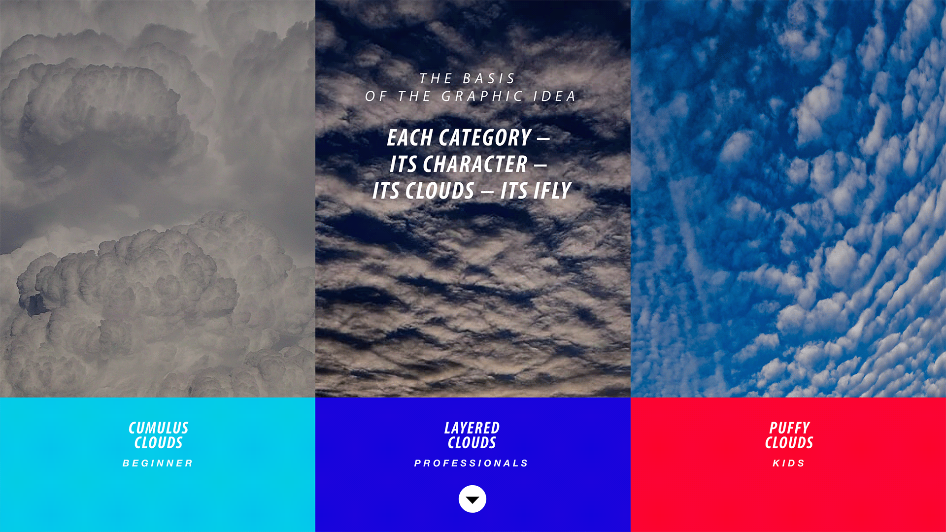
iFly is flight. This detachment from the ground is something that inspires, gives a feeling of freedom and charges with indescribable emotions. This is precisely the main mission of the iFly Minsk aerodynamic tube – a unique high-tech simulator in the center of Europe. Absolutely anyone can experience the delight of free fall with it: a beginner, a professional or a child. The strength of each of them lies in the character and special mood during the flight.
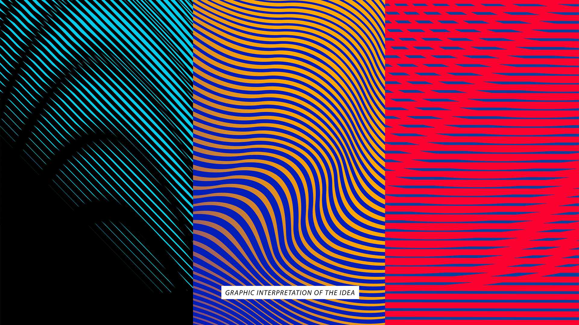
To convey this idea, the new visual identification of the iFly Minsk aerodynamic tube was based on graphic interpretation of three different types of clouds with different shapes and textures. Due to their uniqueness, clouds have become a key visual image for conveying the character and feeling of flying for each category of athletes in iFly Minsk. Thus, with the help of a common symbol – clouds, it was possible not only to create a direct association with flying in the sky, but also to visually distinguish each audience – beginners, professionals and children, emphasizing the main thing: each category – its own character – its own clouds – its own iFly.
Cumulus clouds have become a symbol for identifying the category of beginners. When you get to training for the first time, you are amazed at the scale and just plunge into the whole process, as if overcoming a huge cumulus cloud on your way. A light and calm palette with a predominance of blue was chosen as the base colors for this category. So it was possible to
note that most of the visitors are beginners who want to try new things and this unites them.
The category of professionals is stratus clouds. Professional athletes who train in an aerodynamic tube have no fear. They are confident and create clear trajectories in flight, similar to stratus clouds in the sky. The color scheme for professionals is yellow and blue. Yellow is a reference to gold and winning the competition. Intense blue, gradients and shades of ocher in the corporate identity are associated with status and premiality, emphasizing that the category of professionals is more complicated in comparison with others.
Cirrus clouds are taken as the basis for the graphic idea for the category of children. Children are characterized by activity and courage, and their movements in an aerodynamic tube are sometimes chaotic – like cirrus clouds. The color palette for this category is based on vibrant base colors: deep pink and blue. These rather simple shades personify the naivety, courage and insane tenacity inherent in children during the flight.
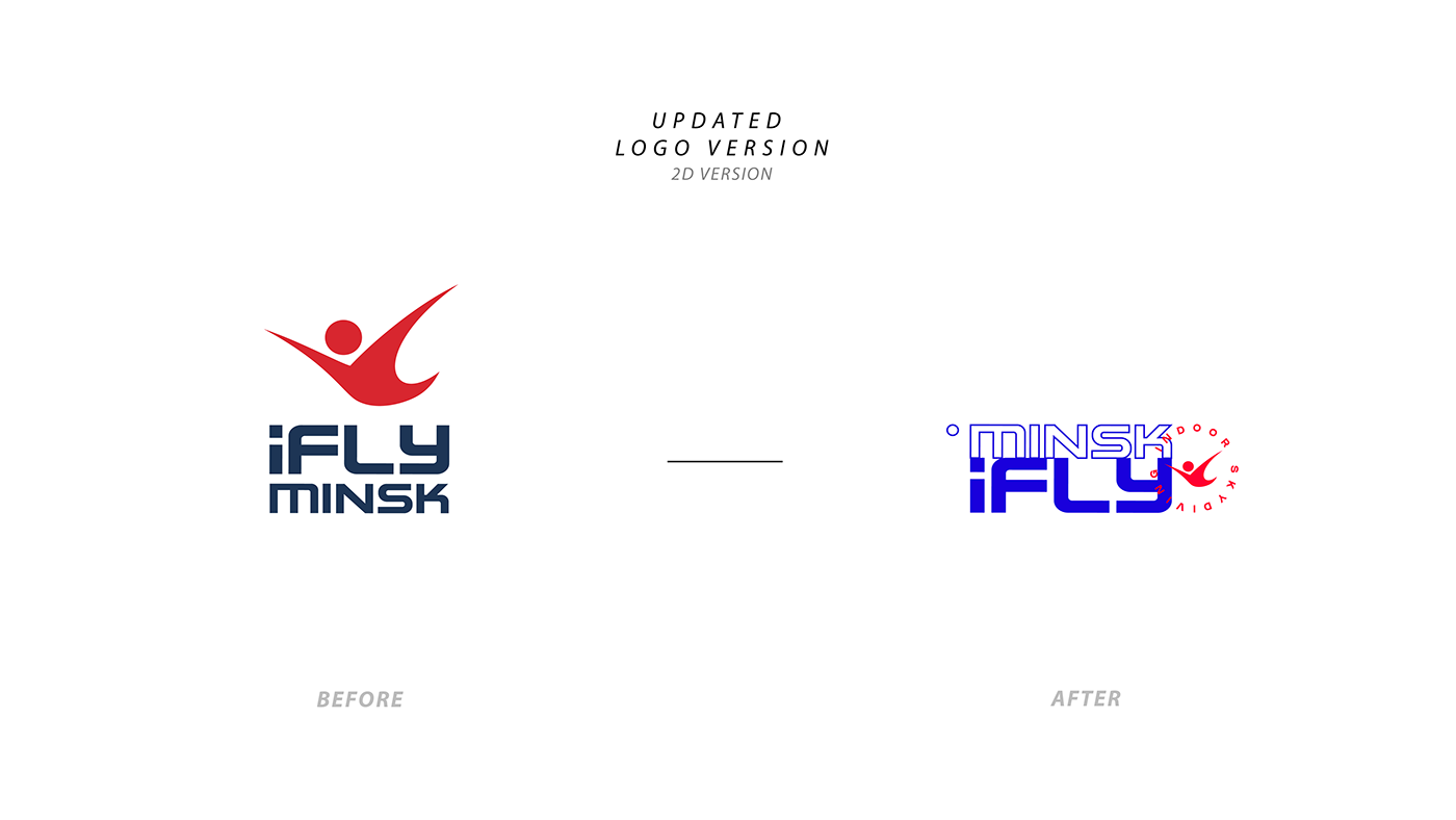
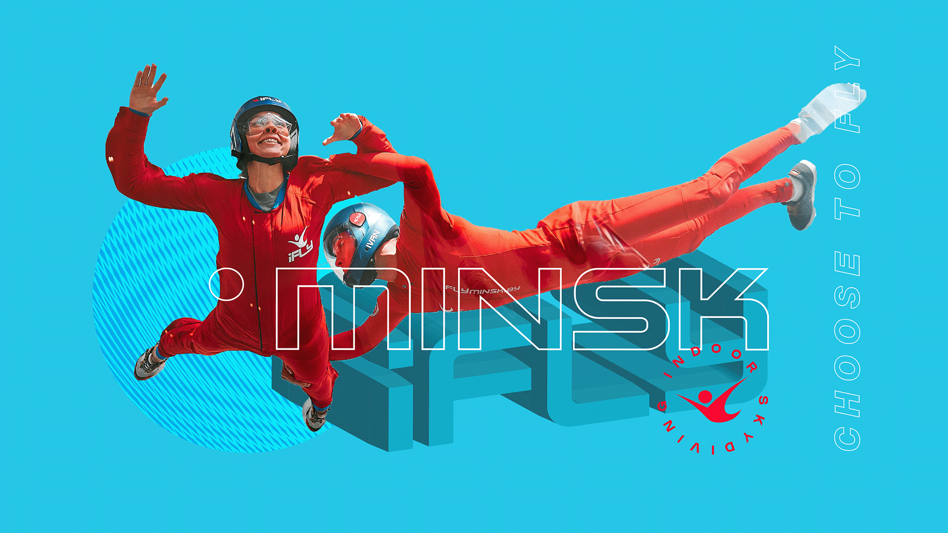
The new corporate identity of iFly Minsk dictated a logical revision of the old version of the logo. The previous flat variation was improved, and as a result of the rearrangement of the elements, it was possible to make the right accents. In addition, an updated 3D version of the logo was created, which perfectly emphasized the theme of volumetric flight, clouds and
immersion.
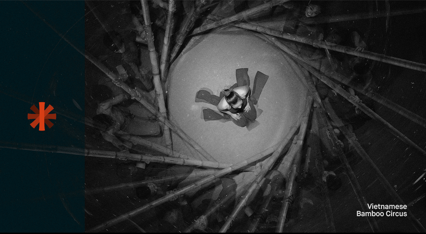
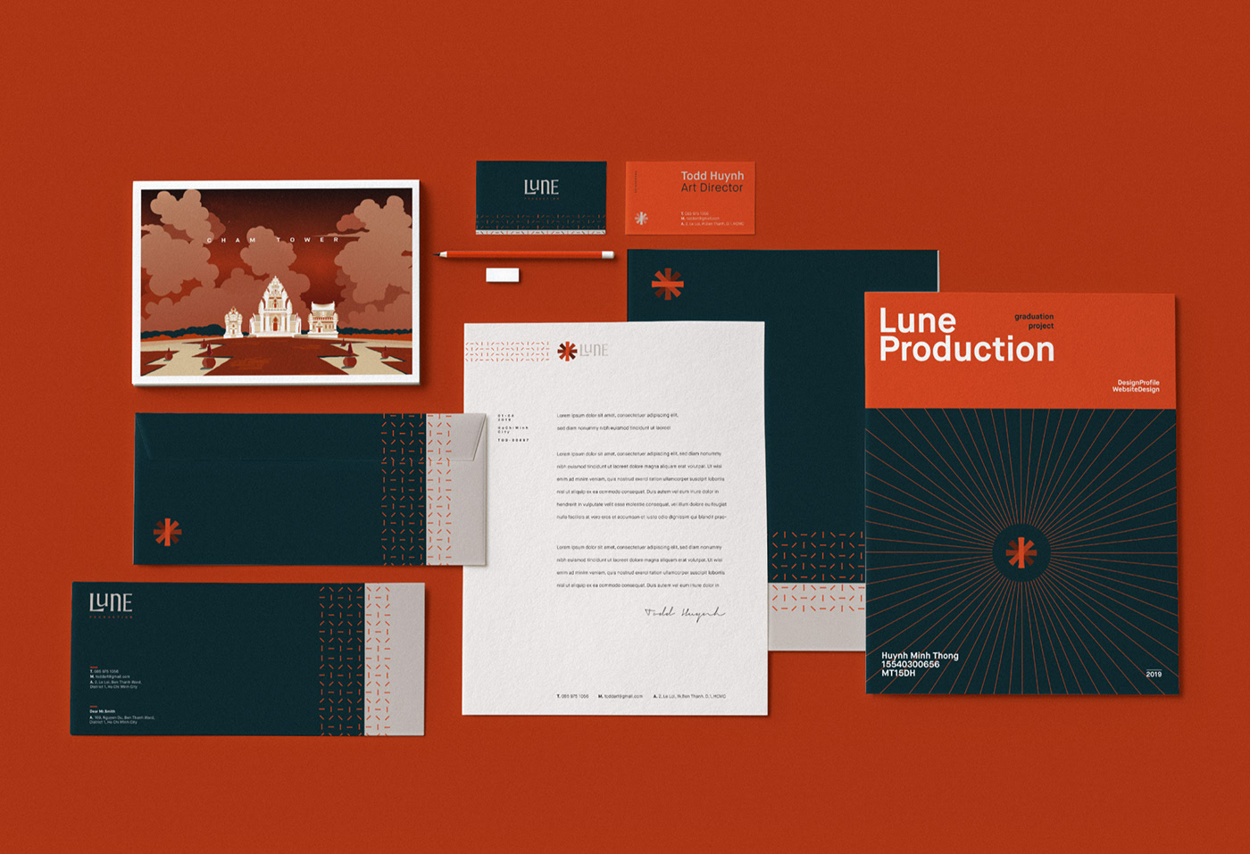
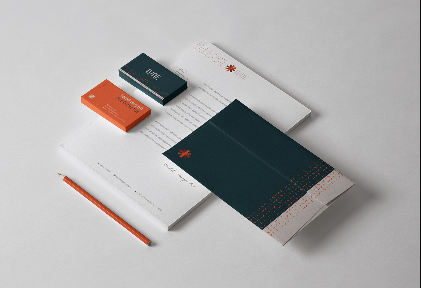
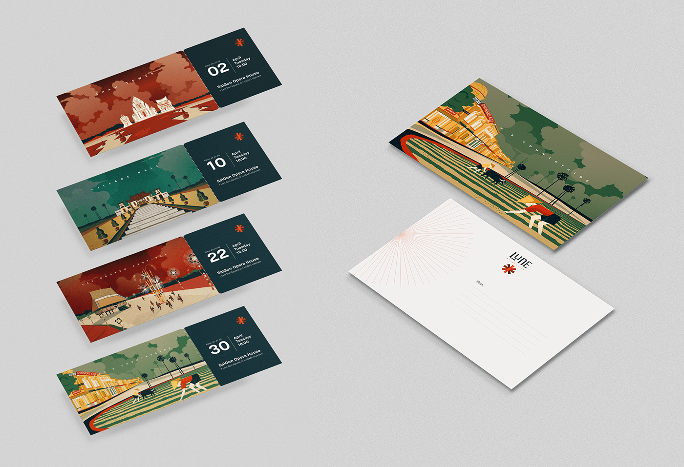
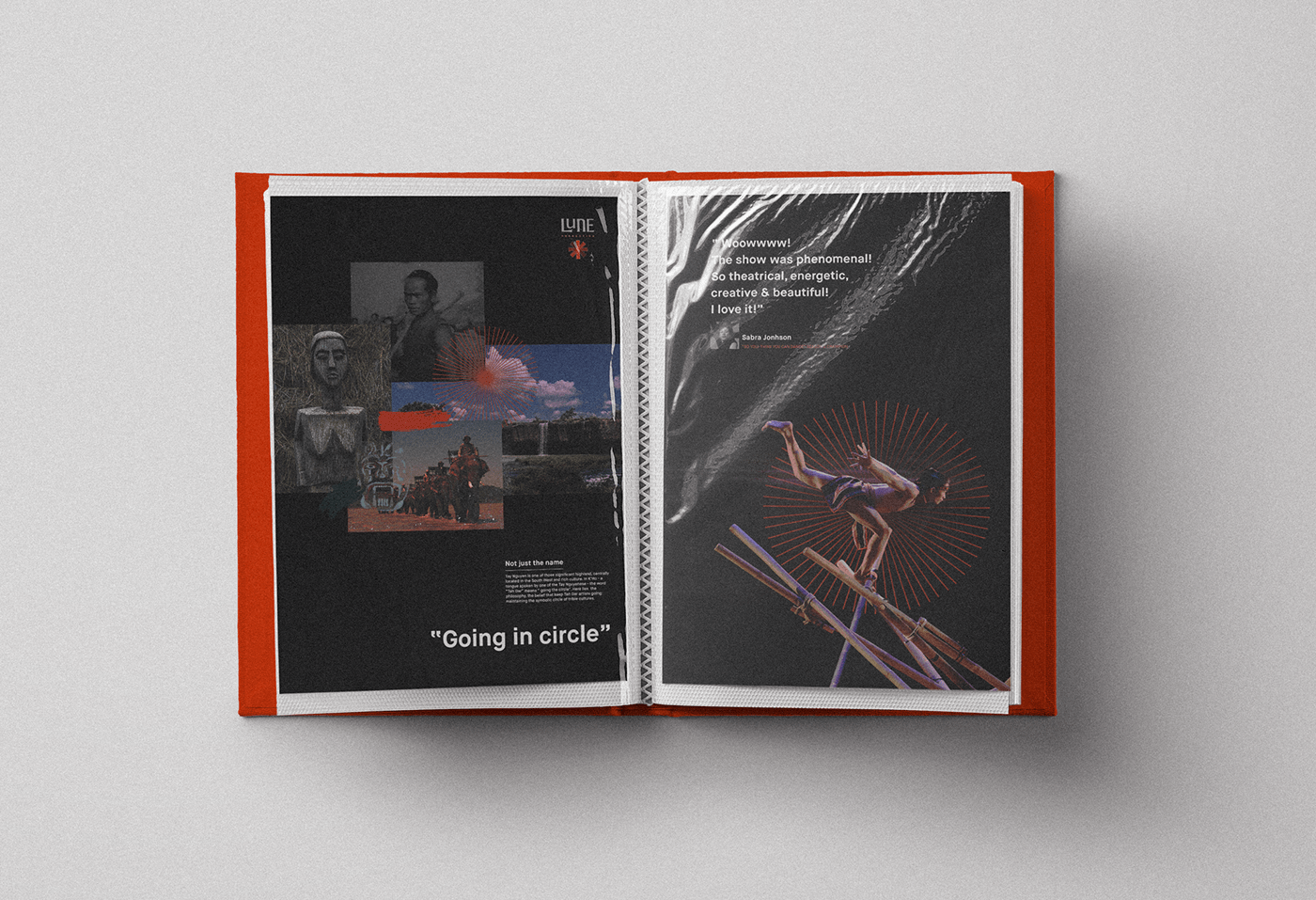
Lune Production – personal project by Todd Huynh


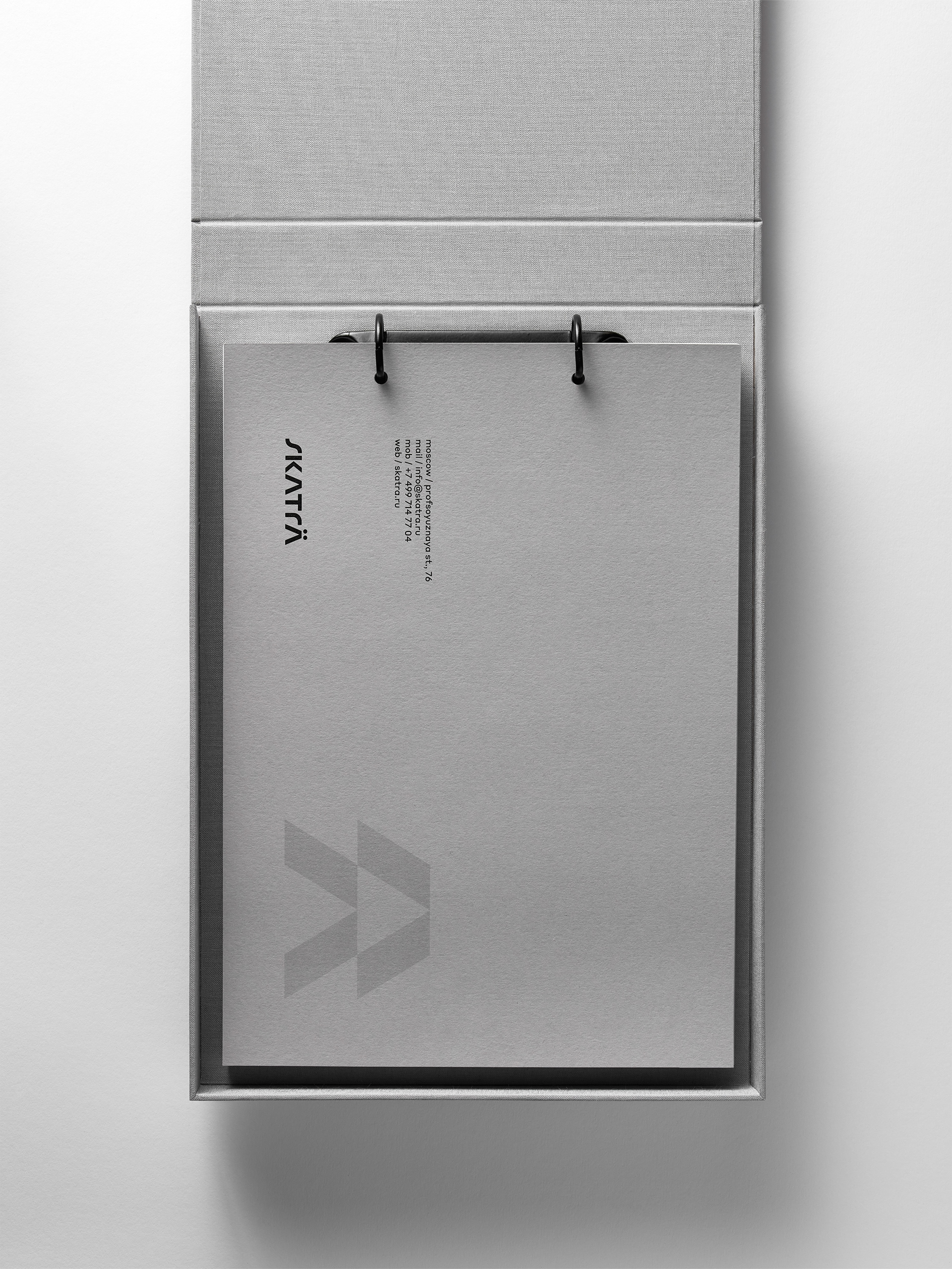
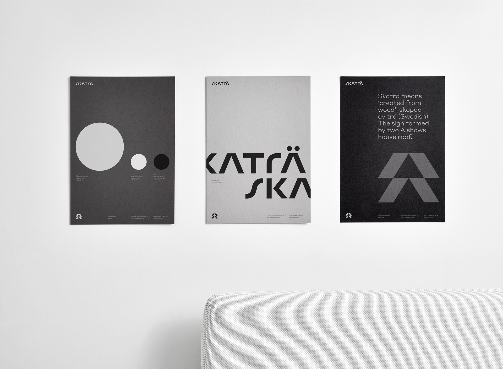
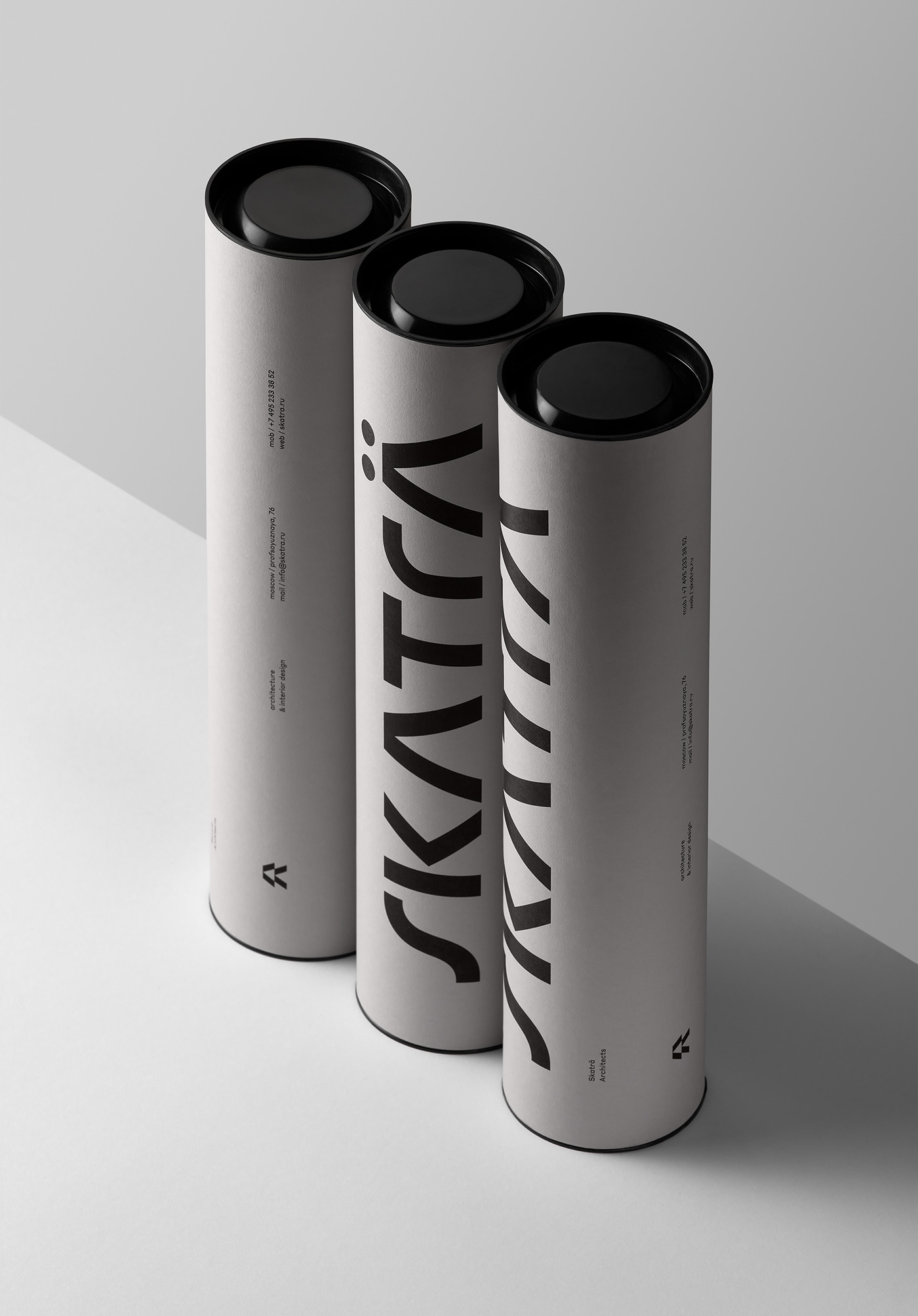
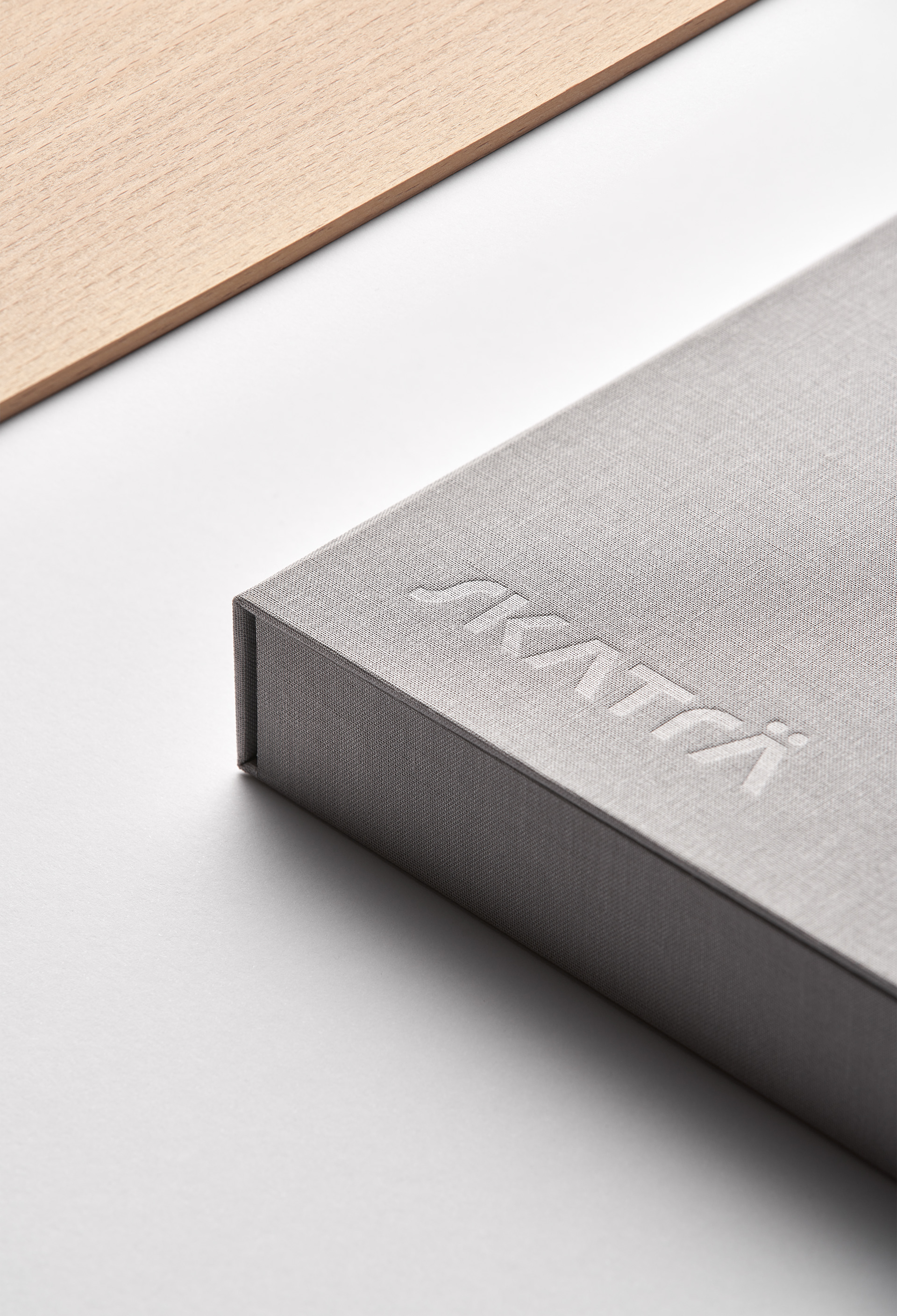
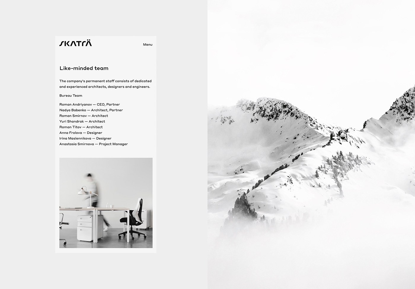
Skaträ by Pavel Emelyanov, Irina Emelyanova and Comence Studio
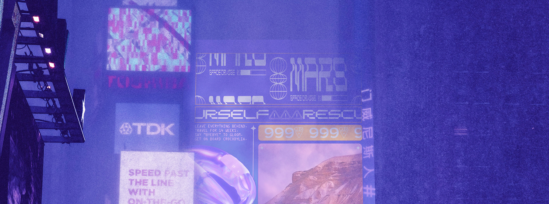
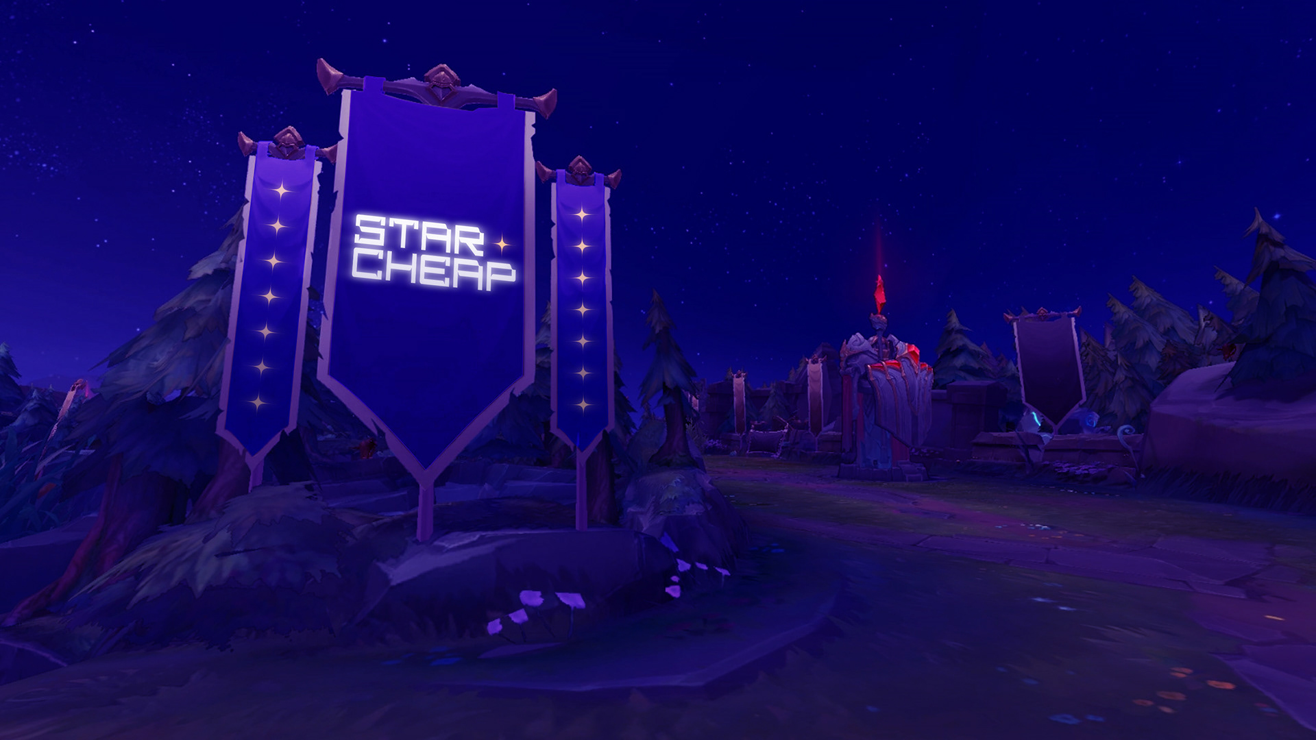
STARCHEAP 2222 by Timur Karamenderes

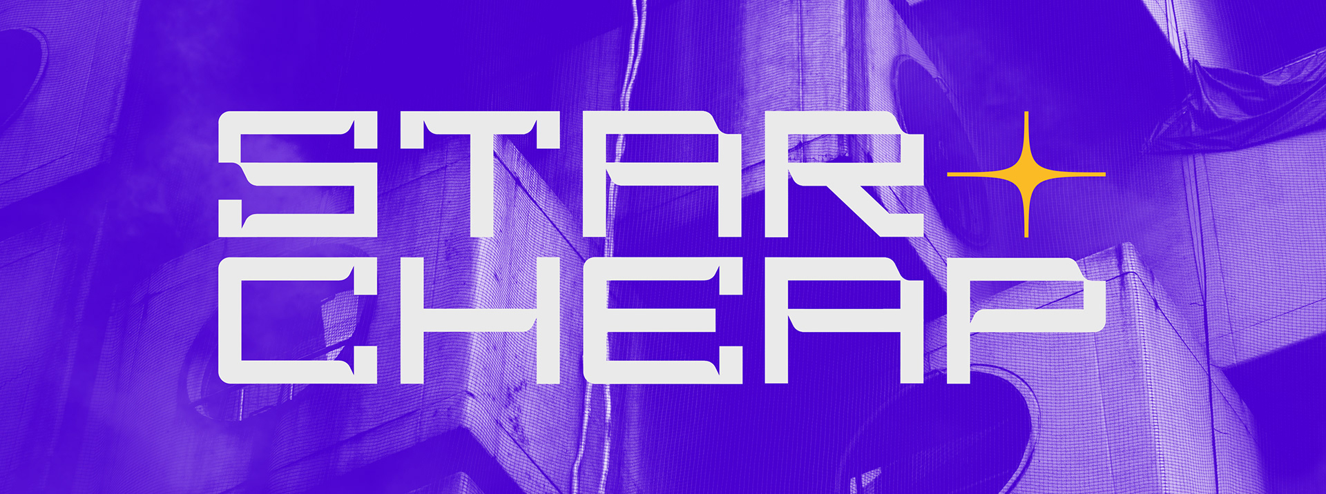


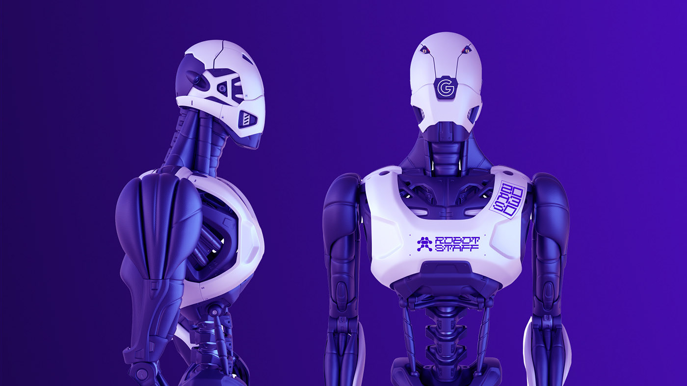

Submitted by Timur Karamenderes
Hi!
I’m Timur. This project is born at the start of COVID-19, and become my degree work.
It’s a branding for a space-cruise compagny who sells interstellar cruise in order to escape glommy earth, in 2222. I wanted to showcase what the world would looks like if we just go in the same direction without learning all the mistakes from the past. It is a criticism.
I made 2 different types, which I animate to look kinetic because I wanted to show that I saw future with informations and advertising everywhere. For me, compagnies will have to stand out with much more colors and animation because there will be TO MUCH. I explain everything on the behance project. Hope you will like it!
I did 3D & animation, 2 types + the logo type, and use a looooot of free ressources for my mockups (except for the ticket)!
Collusion X by Control Studio
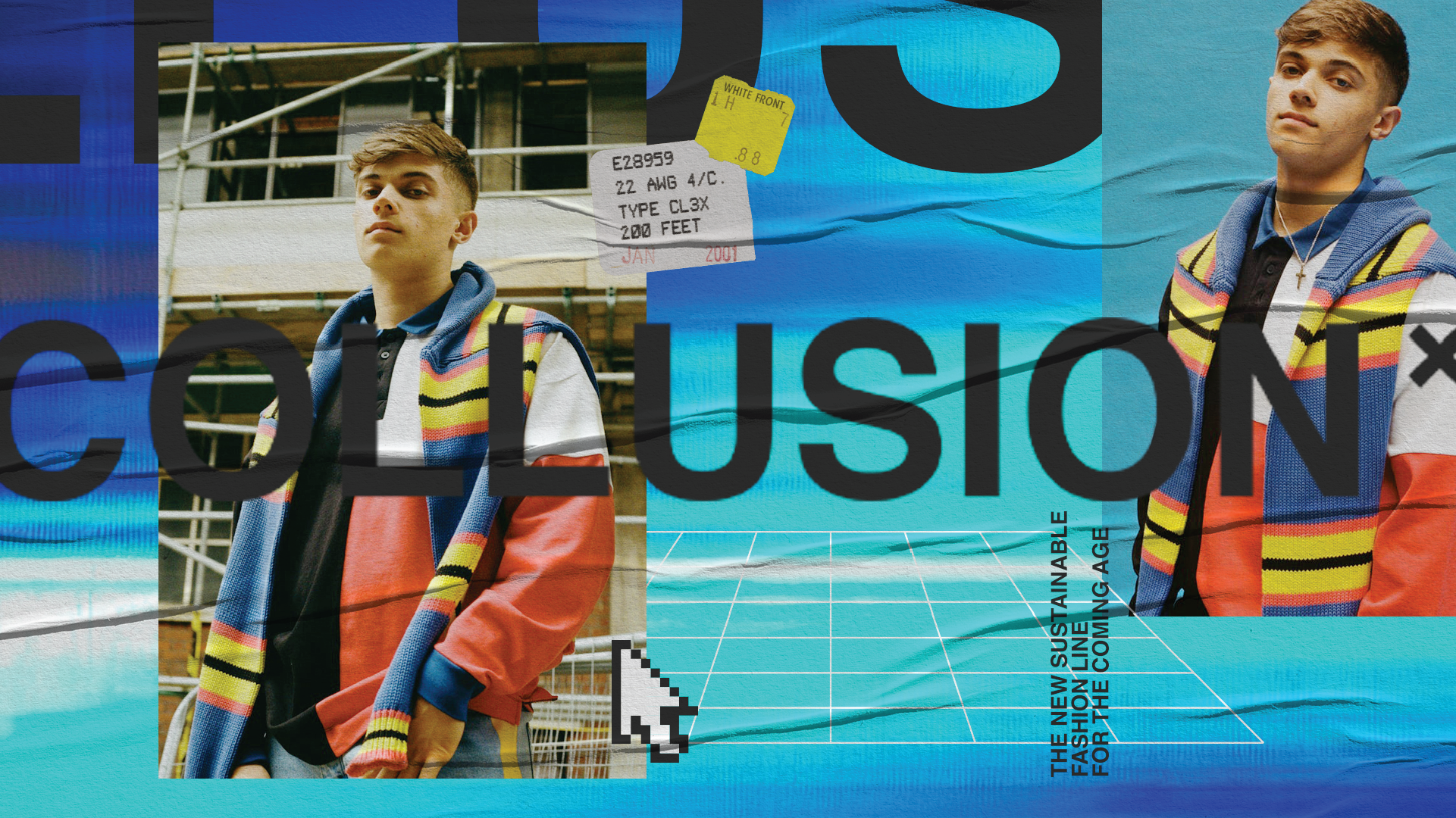
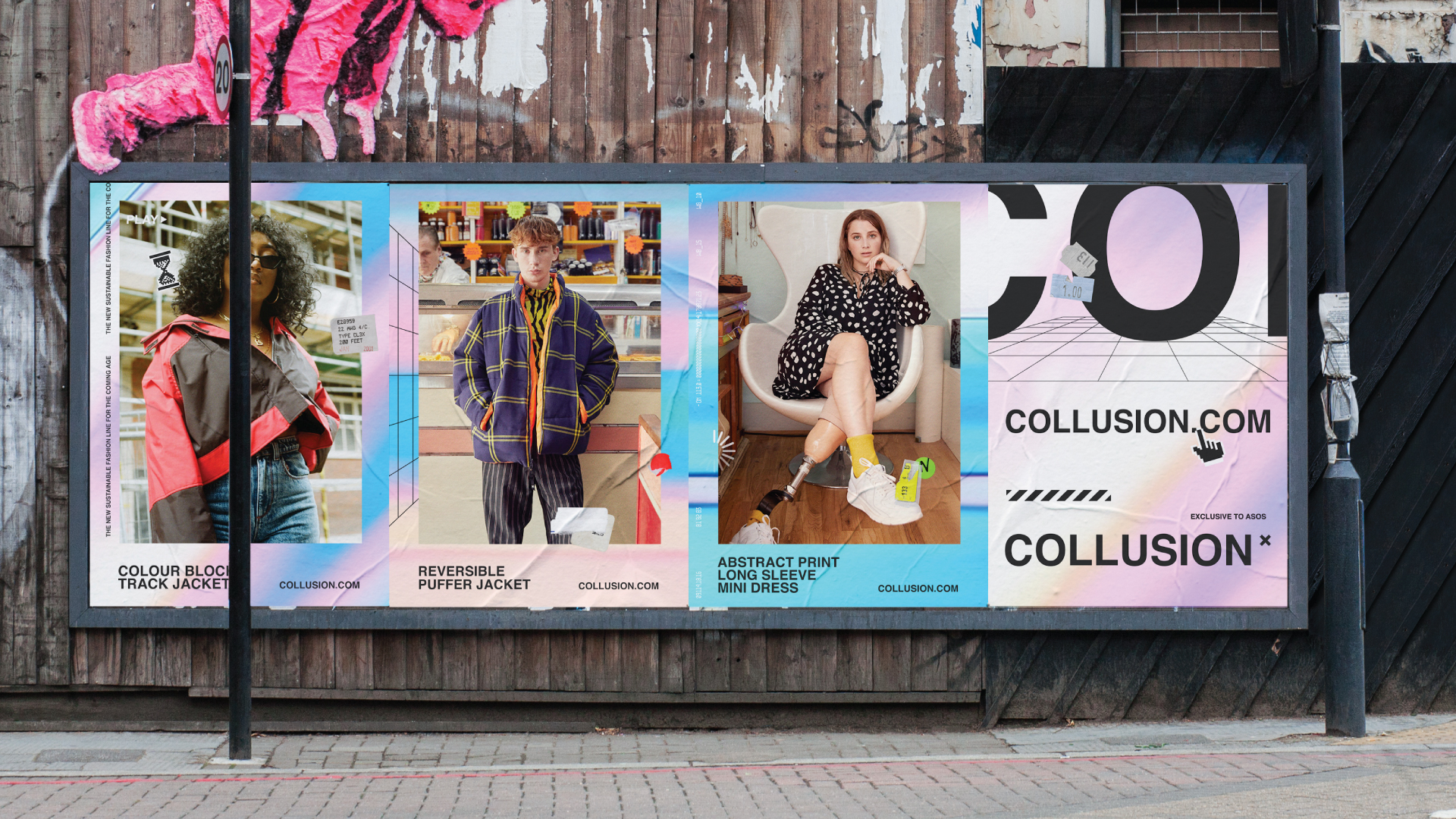
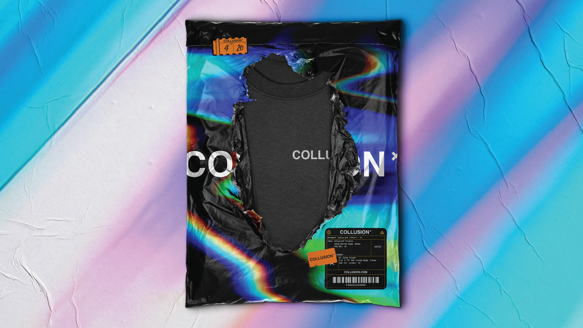
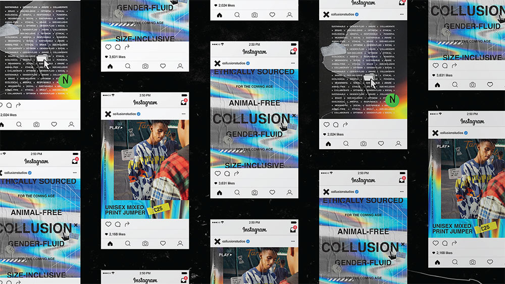
Submitted by Control Studio
Fashion giant ASOS is taking their message of inclusivity in fashion by launching a new sub-brand called Collusion X. Collusion X is for the coming age, shaped by, and for, an audience who demand something different from the fashion industry. Collusion X’s collection is ethically sourced, animal-free, gender-fluid, and more size-inclusive. Six different teenagers, including students, activists, and YouTubers, help shape the label each year.
Collusion X’s brand model sets out to be constantly evolving, and never fixed, with the label aiming to target a new generation, while ripping up the fashion design rulebook and disrupting a dated system, they needed a visual language that echoed this.
Our solution for the visual language was designed to allow the brand to speak through an ever-evolving channel by using mixed media and a collage approach which is representative of how the brand collaborates with influencers to create their fashion for the coming age. The visual language is down to Earth and was designed deliberately not to intimidate or put off people by affordability or a lack of human touch. It is an expressive brand that is story-driven, focusing on the benefits of the brand as well as the personal stories behind certain trendsetters, we wanted to tell a different story, a story that isn’t included in the fashion industry. An e-commerce site was created as an impactful and unique digital experience but whilst still striking a balance of a very useable and functional website.
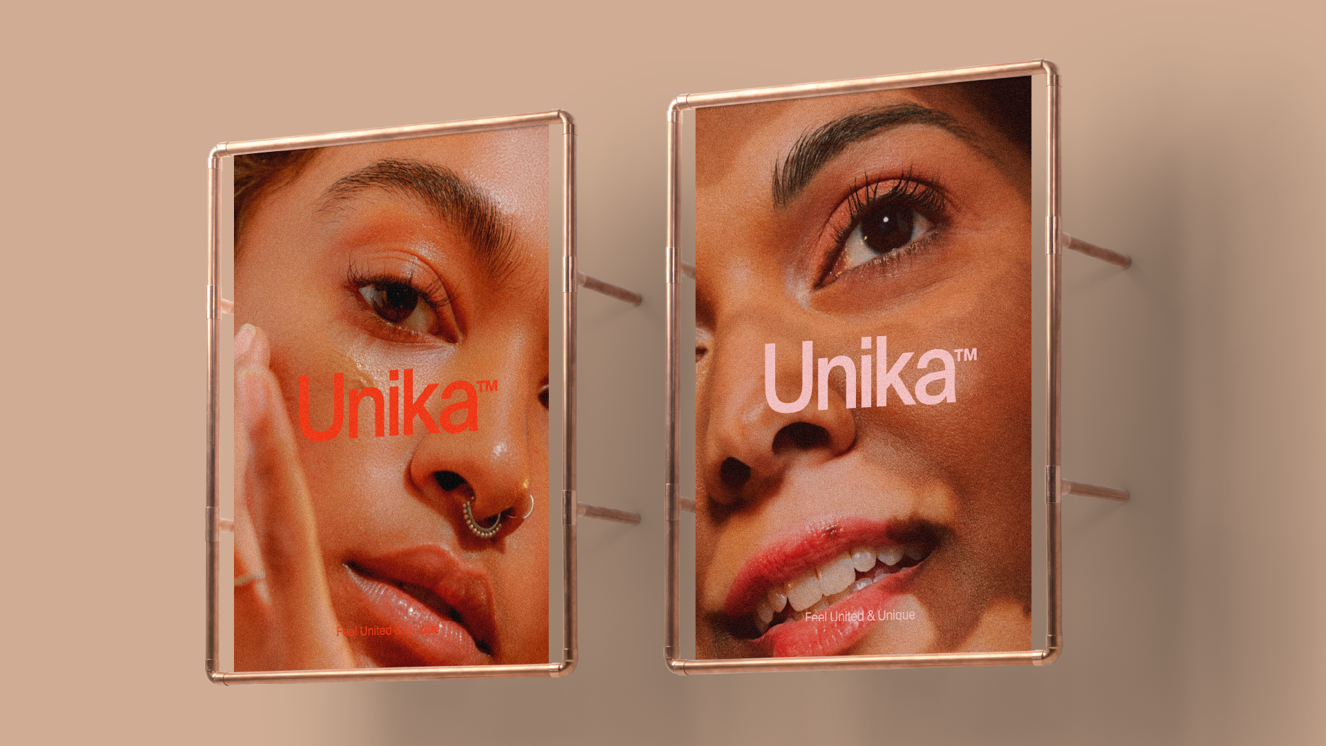
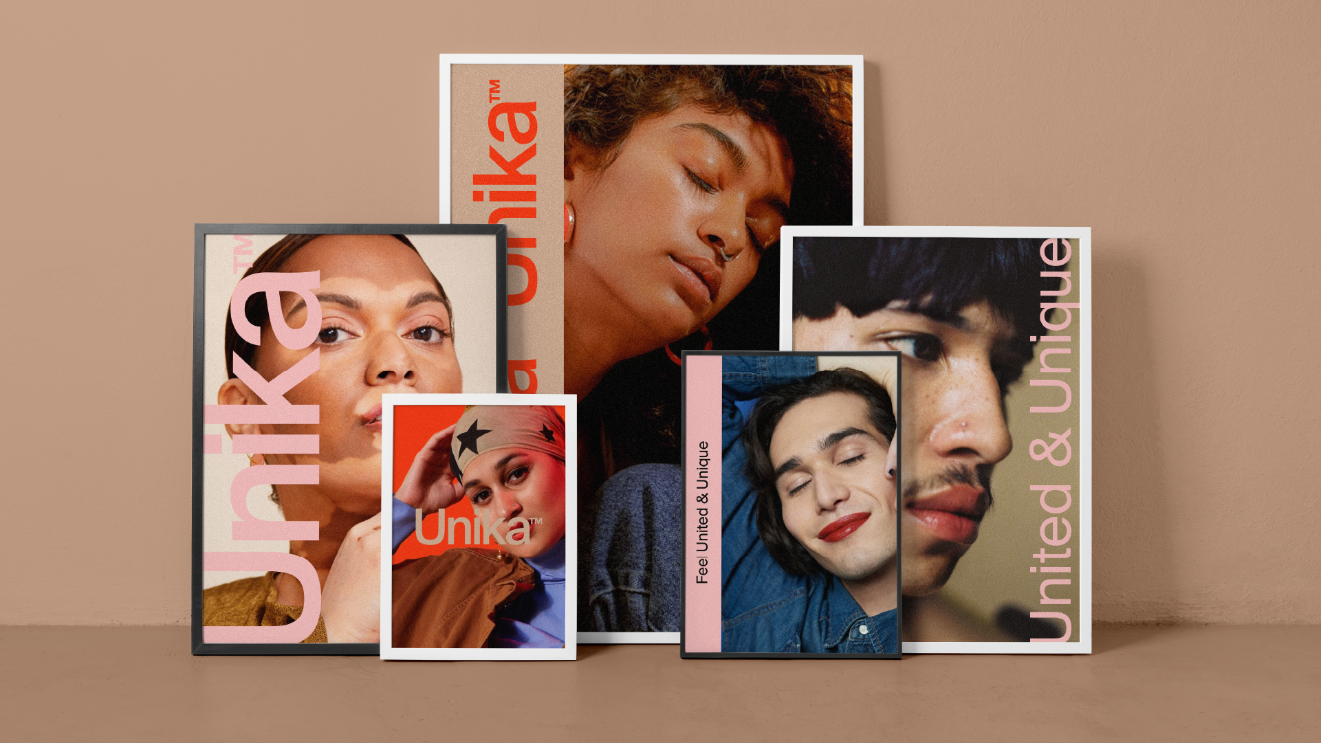
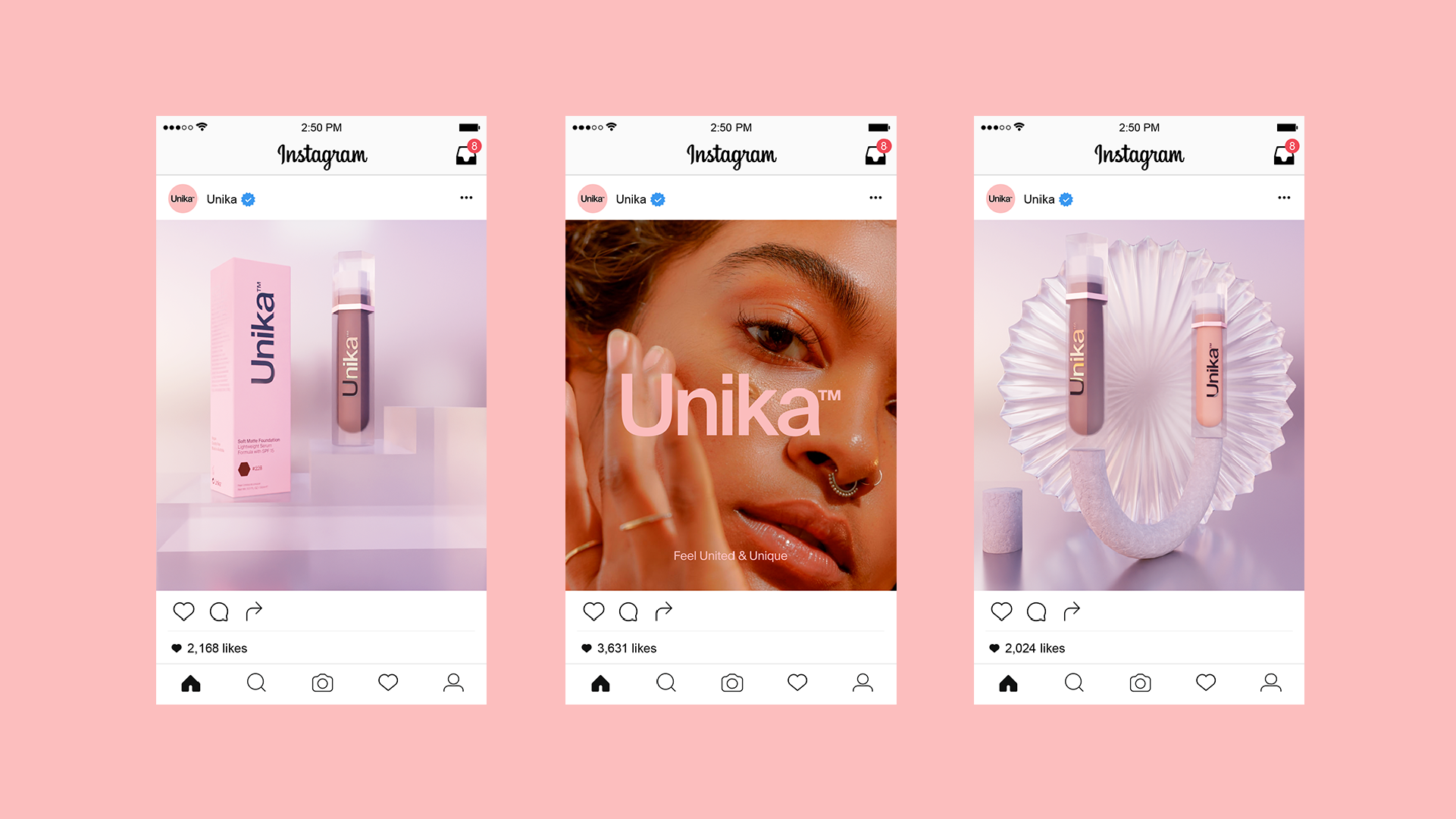
Unika by Control Studio
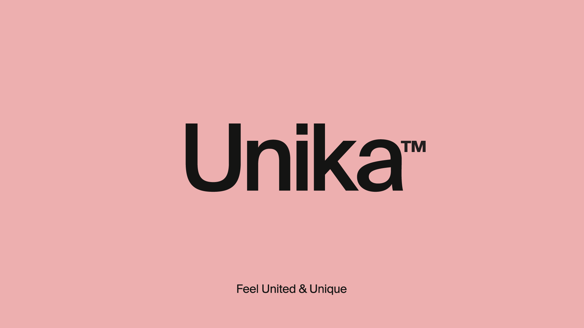
Submitted by Control Studio
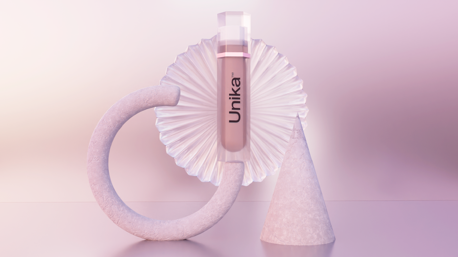
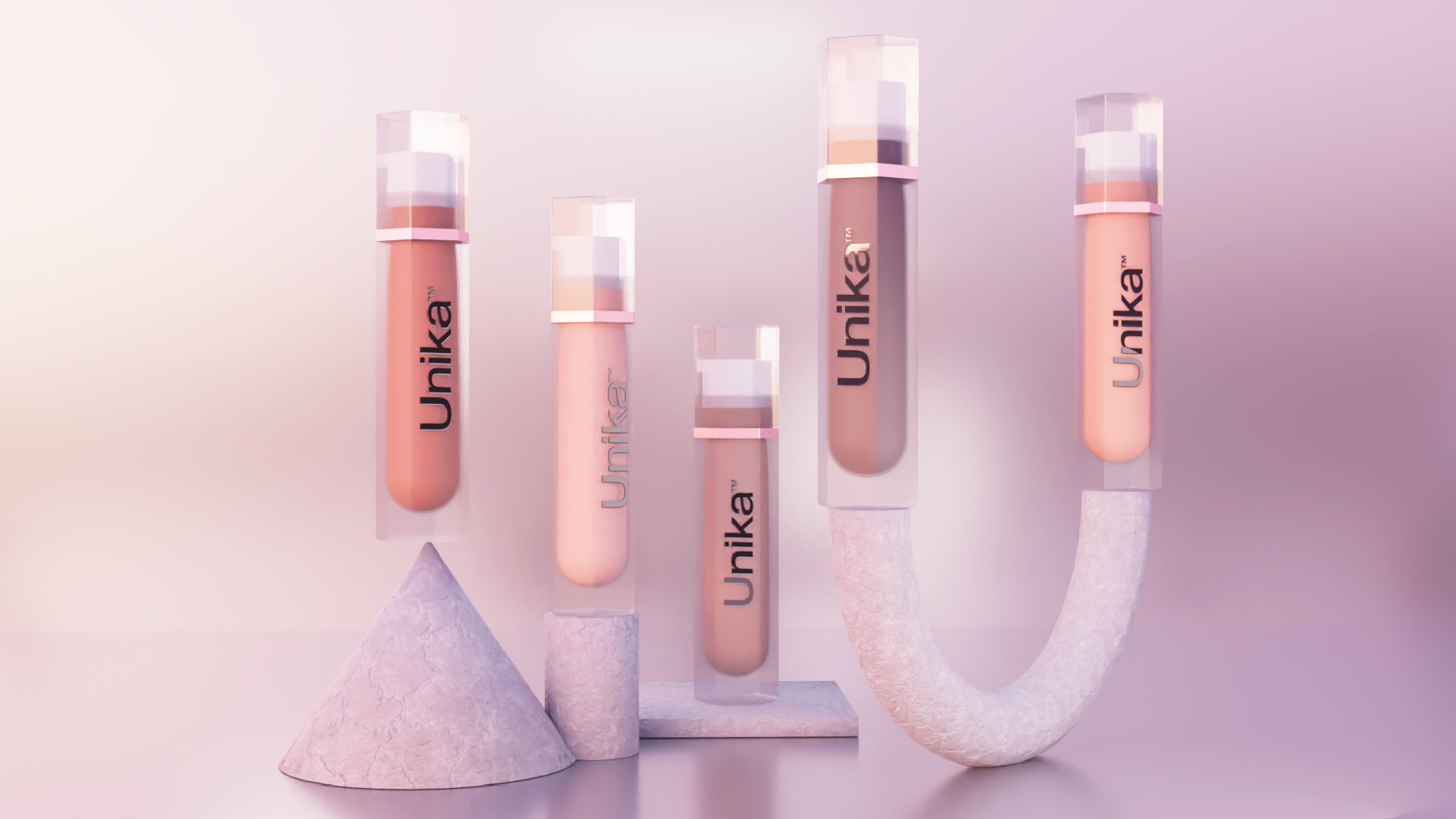
When two migrant-born women of colour grew up in Melbourne feeling unseen and underrepresented when it came to make-up, they decided to create their own. An inclusive modern range of beauty products that everyone could use. Whether your skin is oily or dry, black, brown or white, young, mature, and regardless of gender, Unika believes that everyone should be able to shine.
They required a name and brand that stands out from all other cosmetic labels and it needed to be as inclusive and unique as their customers. They need to appeal and stand for all of the qualities of their principles.
Control Studio helped Unika create its name and articulate its brand through the physical and digital worlds. The name Unika is a unisex name of African origin meaning “shining”. An inclusive and non-gendered aesthetic was paramount to communicating who Unika are, as they debuted into the market. Fine details and considerations were made when designing every aspect of their product and identity, the 3D product shots are representations of being a balanced brand which is expressed through the use of light, proportion, and composition. Art direction for photography was selected to represent unique people and unite them to communicate that we all come in different shapes, colours, and different walks of life. The hexagon of the product was specifically chosen to represent DNA molecules because no matter what your skin type, your age, your gender, we all are humans who have DNA.
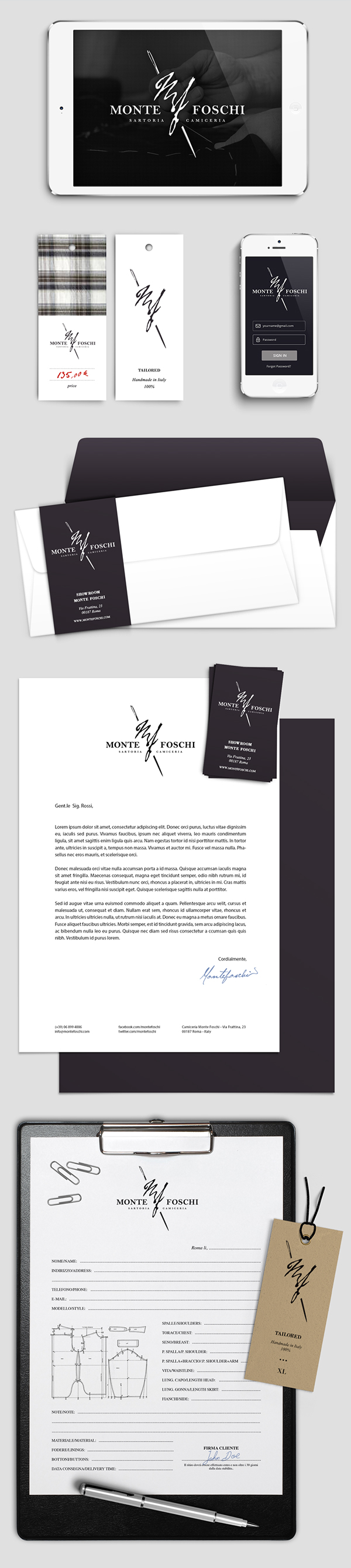
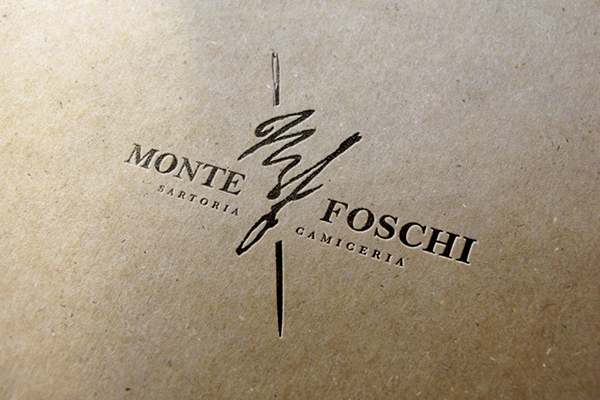
Monte Foschi by Lucia Gelardini


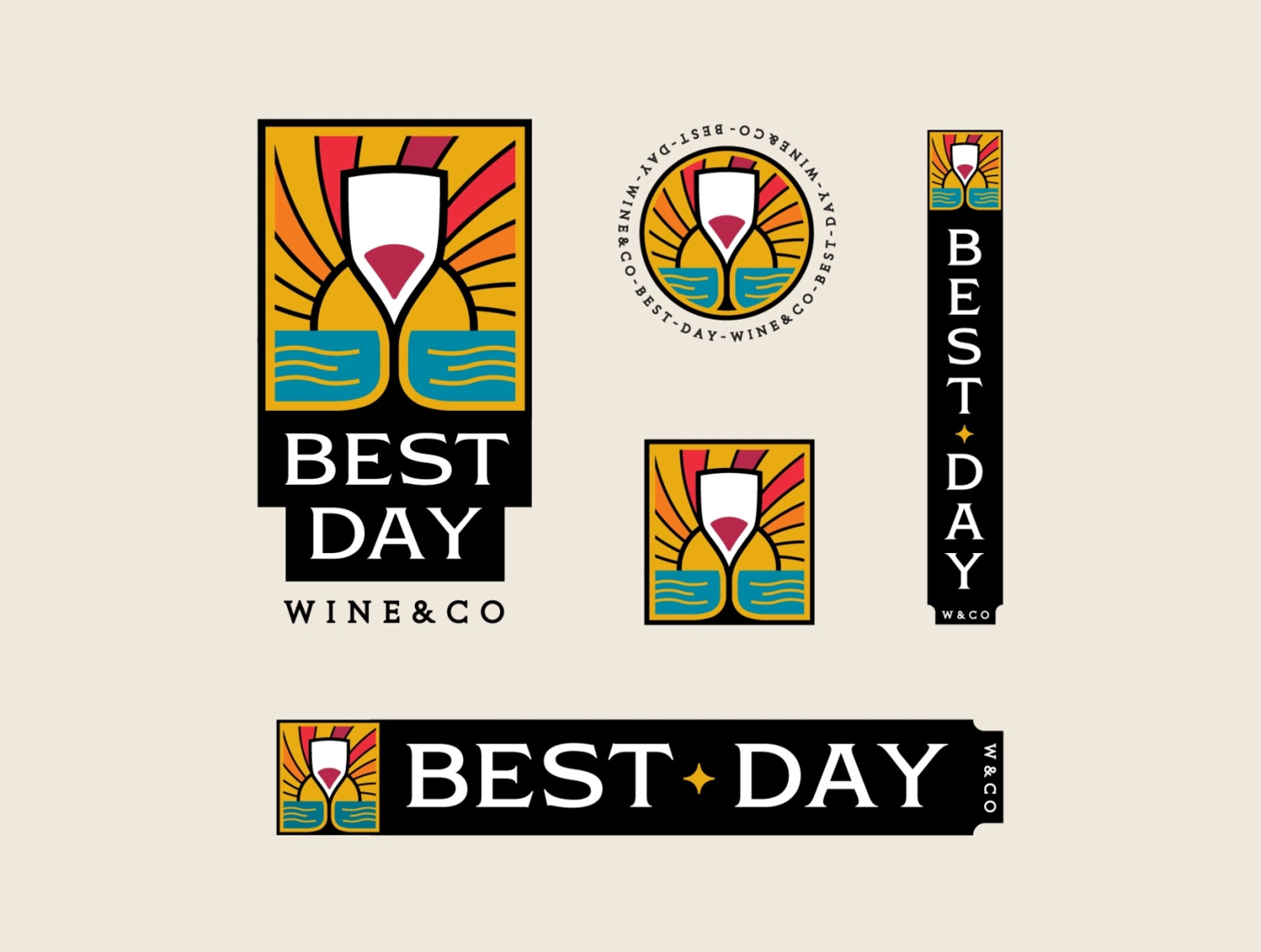
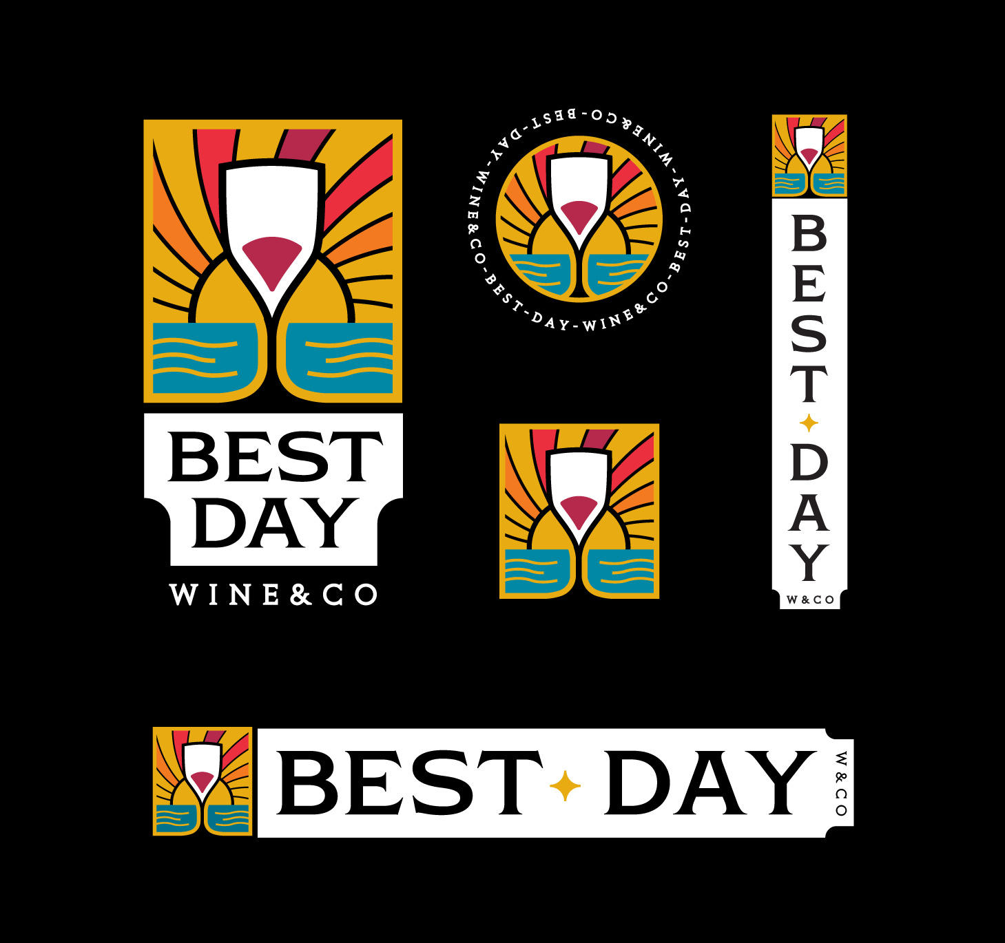
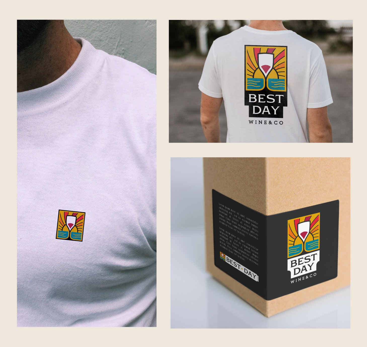
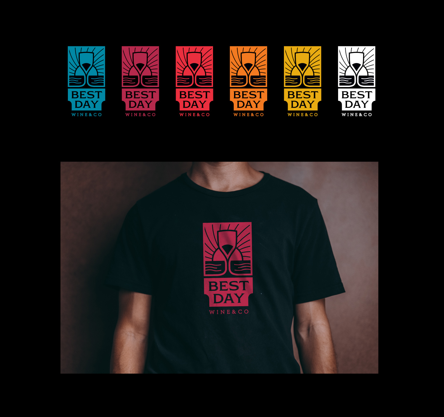
Best Day by Jessie Maisonneuve
Do you like this article? Support our blog with a small donation.
We keep our contents authentic and free from third party ad placements. Your continued support indeed can help us keep going and growing. By making a small donation would mean we can pay for web maintenance, hosting, content creation and marketing costs for the YDJ Blog. Thank you so much!