Check out this month’s curated logo design and branding projects for your inspiration. They are top-notch branding works created by designers from all over the world.
Are you a brand identity designer and have a project you’ve created and proud of? Then showcase your work in this category. Just submit your best piece here.
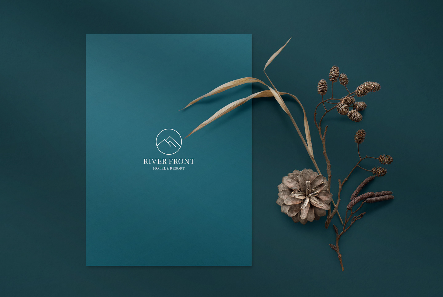
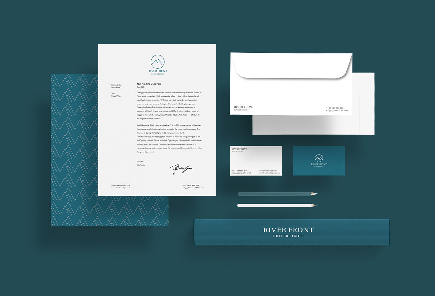
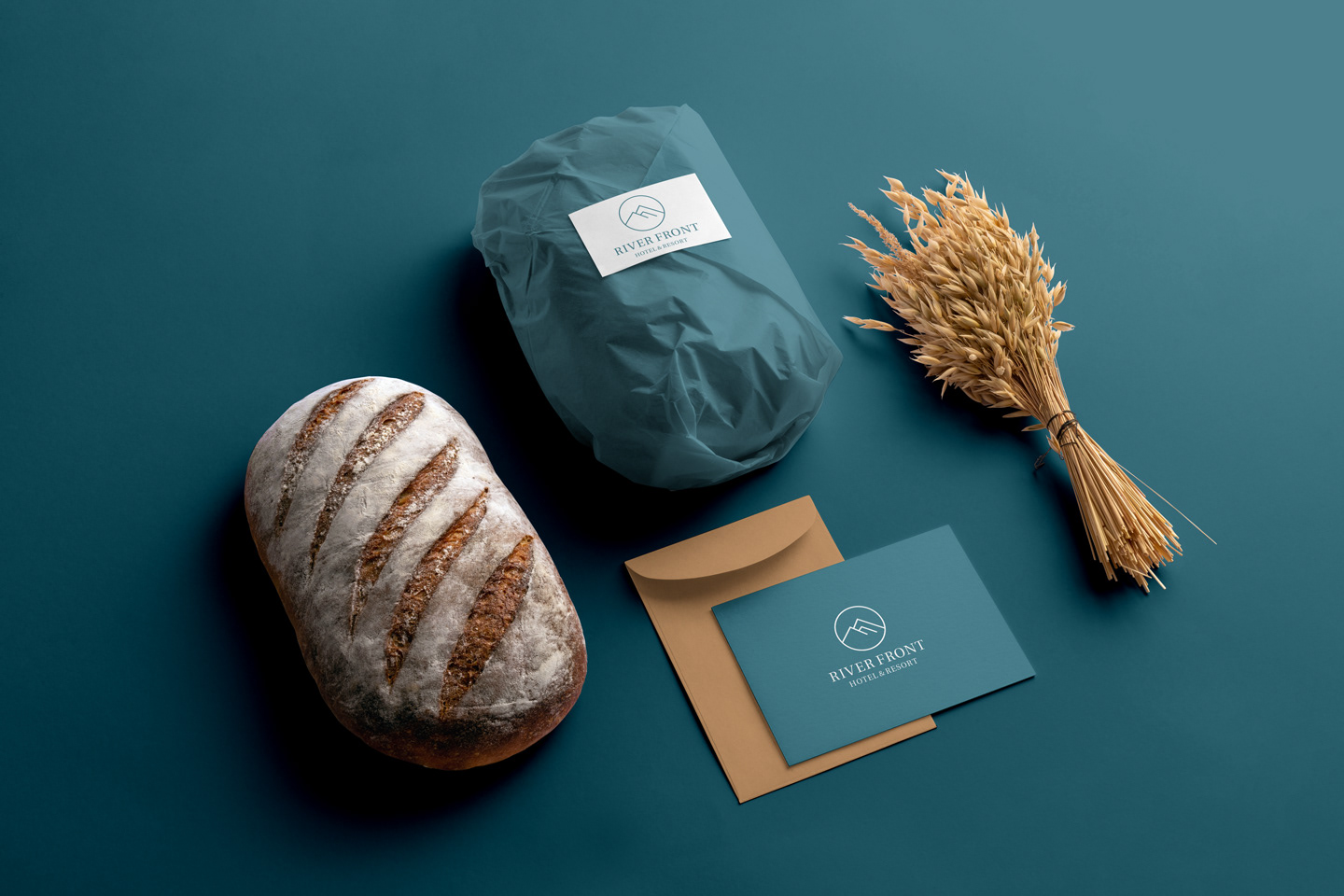
RIVER FRONT Hotel & Resort by Afa Fatulla


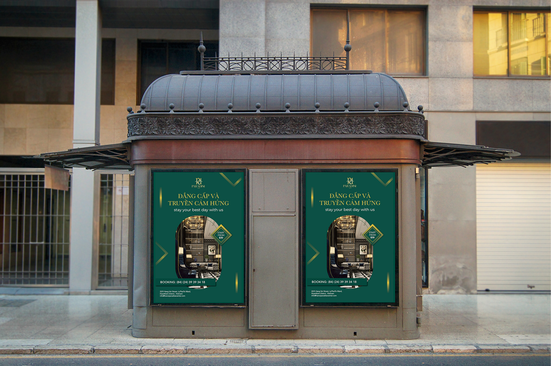
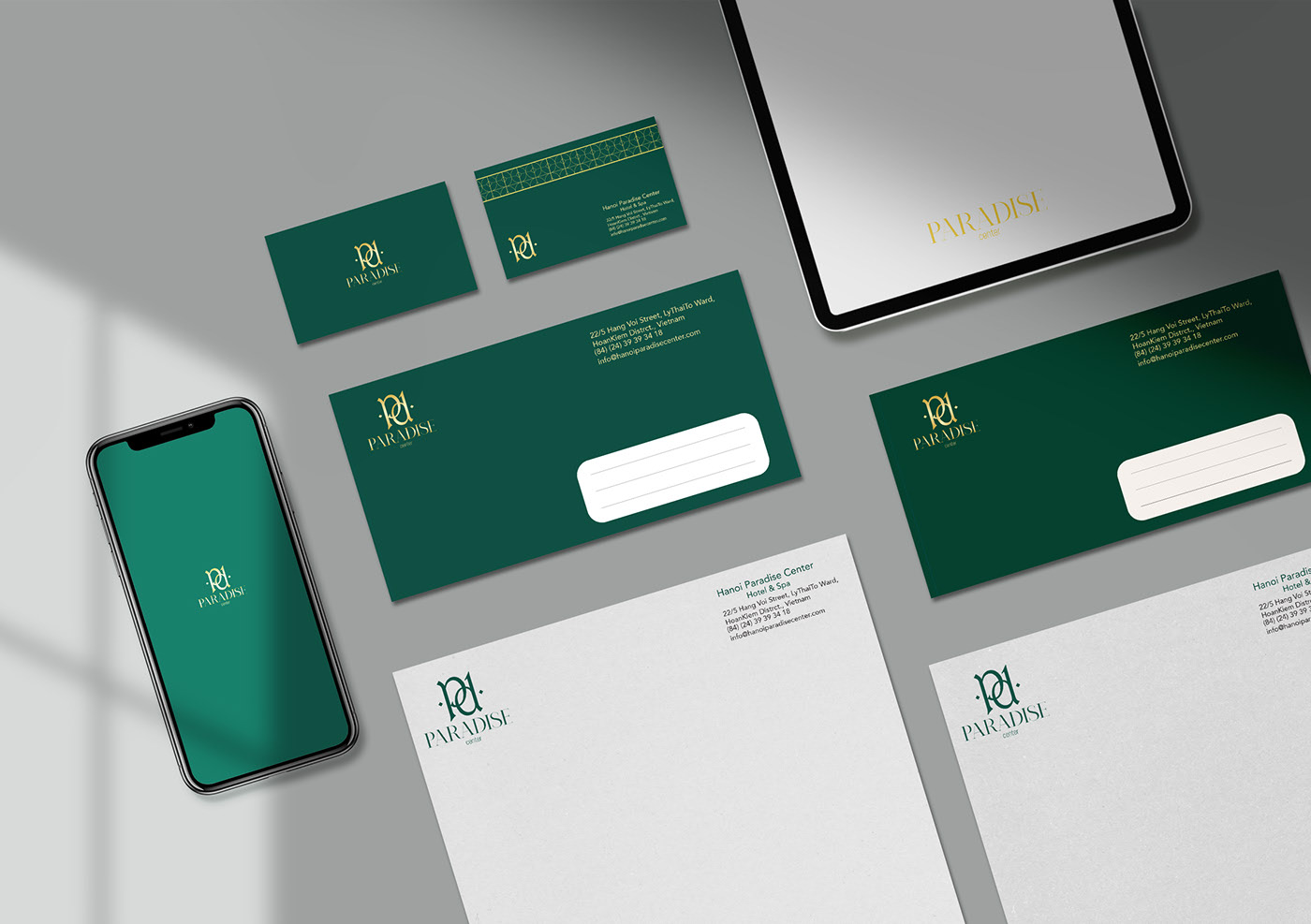
branding hotel by Quỳnh Anh Đặng
KING SHRIMPO by Shadi Shahin
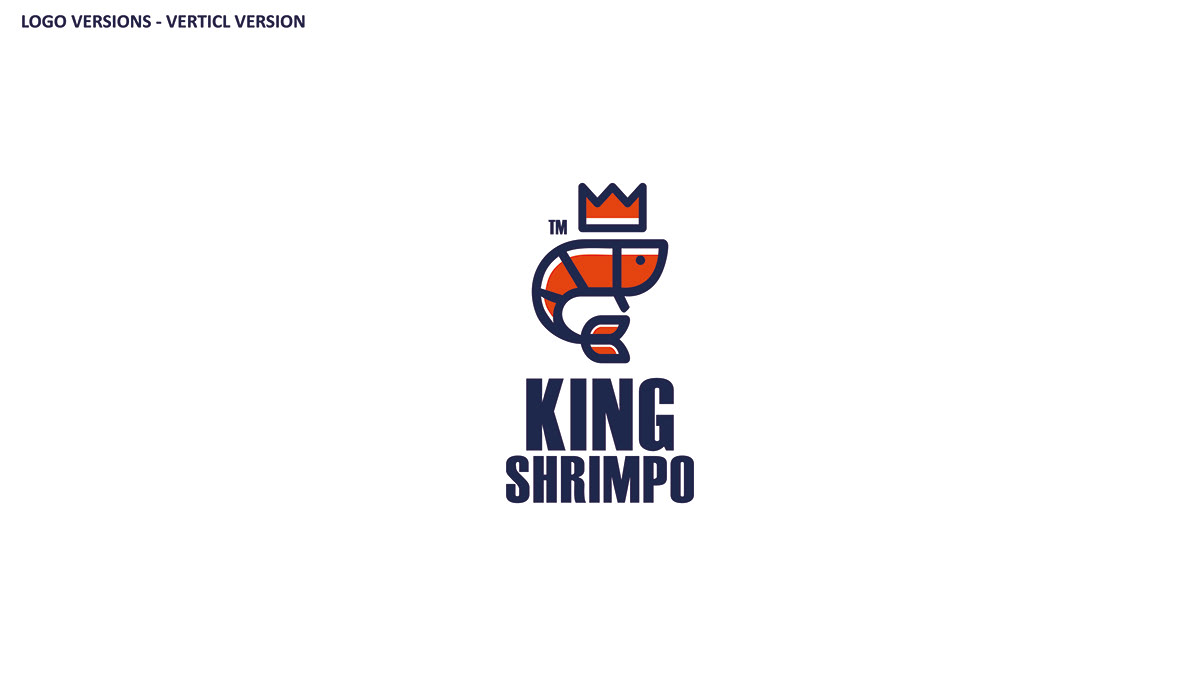

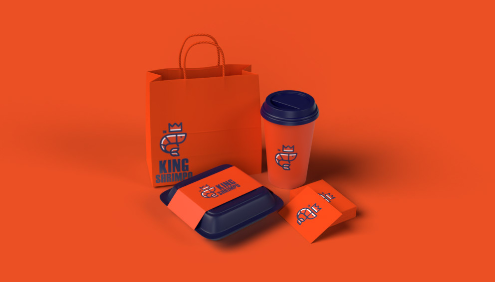


Submitted by Shadi Shahin
Mind Over Matter by Serchis Creative
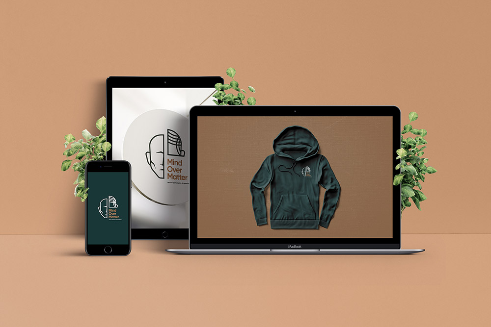
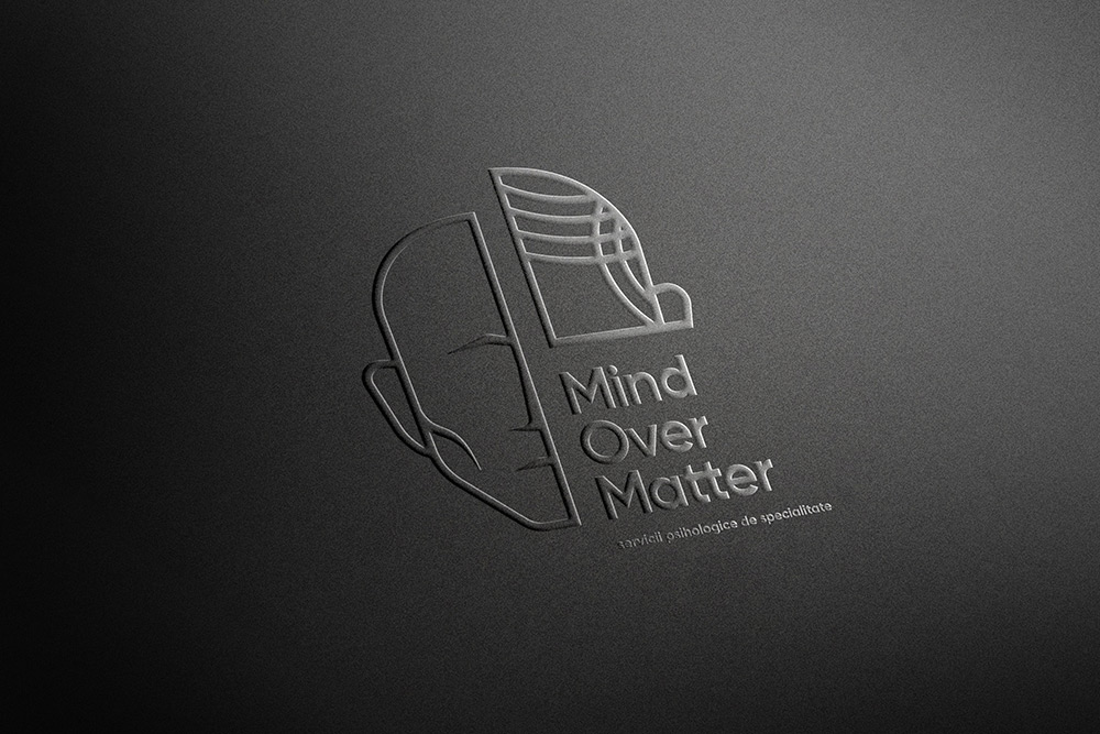
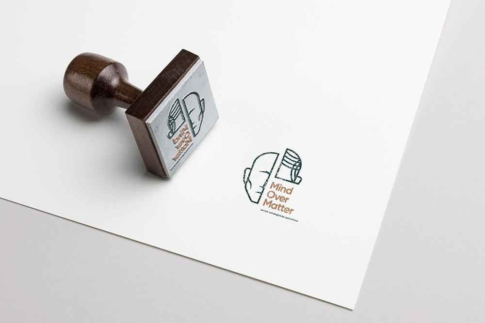
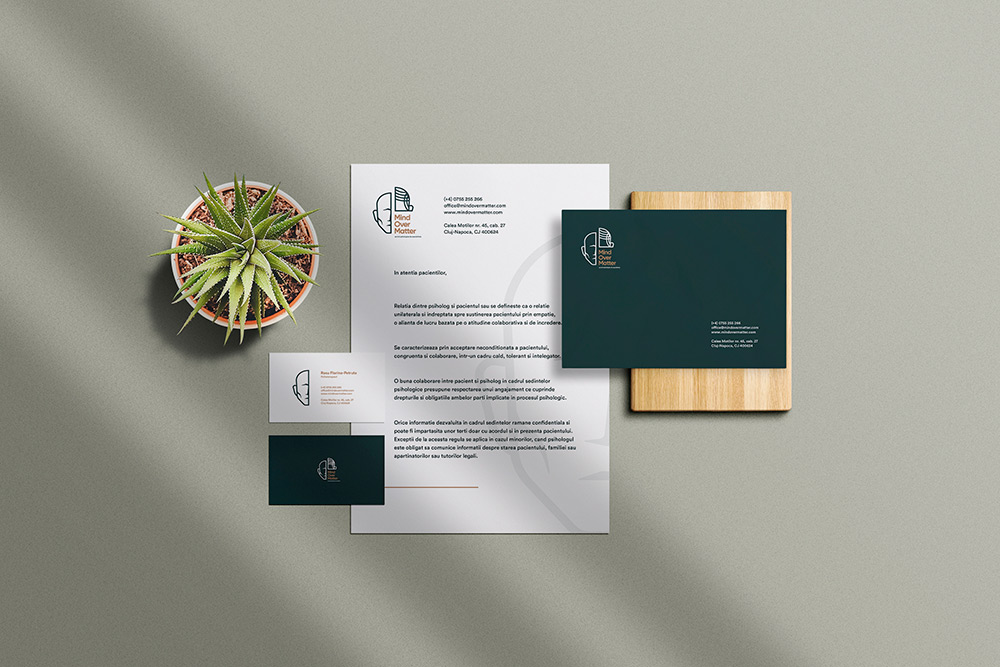
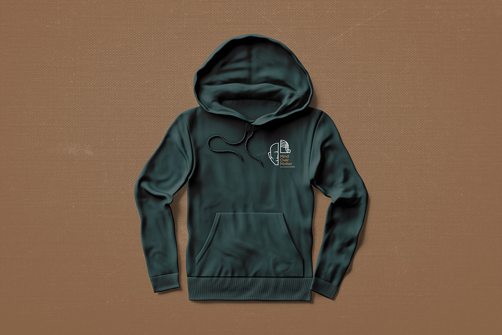
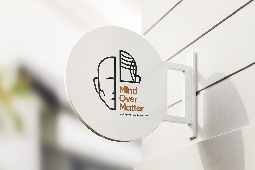
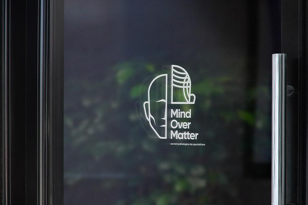
Submitted by Serchis Creative
Mind Over Matter is a newborn psychological counseling office in Cluj-Napoca, started out with a mission to improve and optimize their clients’ lives by offering CBT sessions in a privately-owned mental health service facility.
CBT, short for Cognitive Behavioral Therapy, is a type of psychotherapeutic treatment helping people learn how to identify and change destructive or disturbing thought patterns that have negative influence on behavior and emotions. CBT encompasses an extensive variety of techniques, ranging from structured psychotherapies and coping strategies to self-help resources, making it an extraordinary tool in dealing with a broad array of issues such as stress, addiction, anger, anxiety, depression and many other mood and personality disorders.
Following their recent establishment, Mind Over Matter set their mind on getting a professional brand identity that enforces their commitment to excellence while securing a bold position on the market. Our team helped Mind Over Matter reach these objectives by developing a solid and unique brand, further enforcing their visual identity through consistent brand collateral.
The Mind Over Matter logo has been built as a modern minimalist symbol paired with a bold logotype and supported by a compact tagline, intentionally aligned in an unconventional way. The mathematical baseline of the composition facilitates logo placement on either side and corner of its applications. The typeface picked for Mind Over Matter secures a clean and modern look for its logotype and tagline, both asymmetrically positioned and dressed in tender shades of dark green and mellow brown.
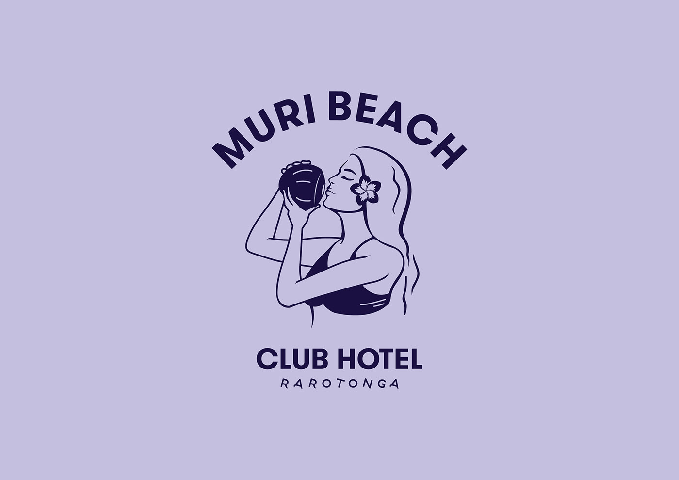
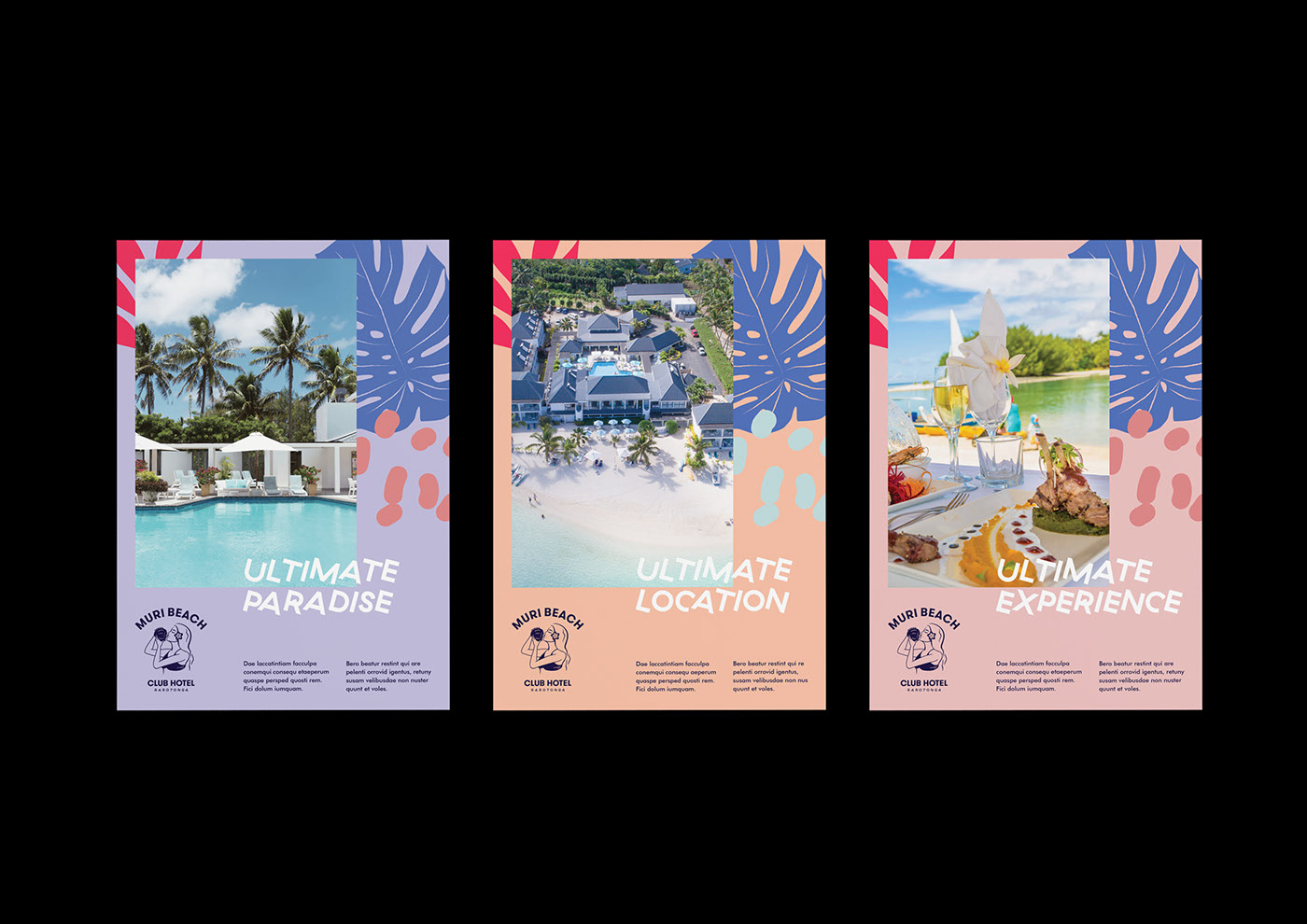
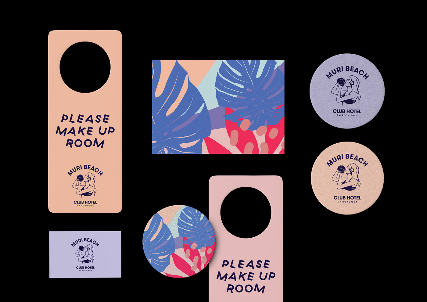
Muri Beach / Branding by Mai Creative and Yes Open


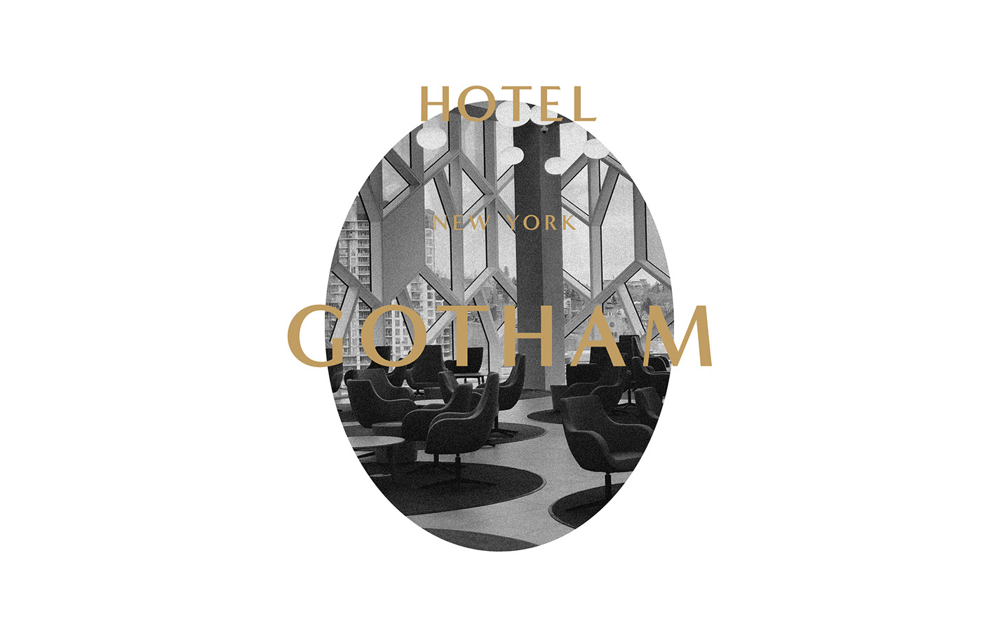
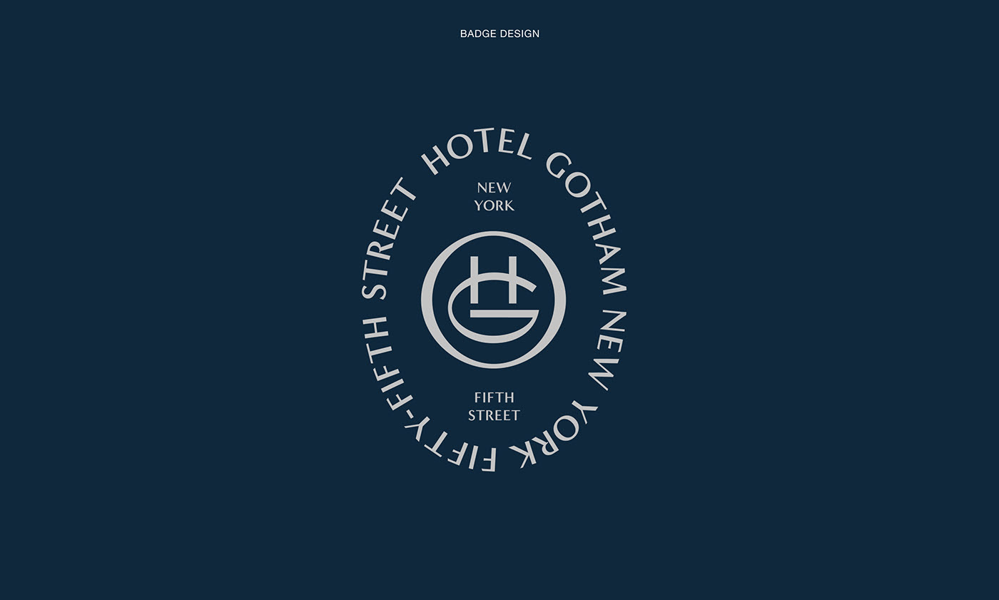
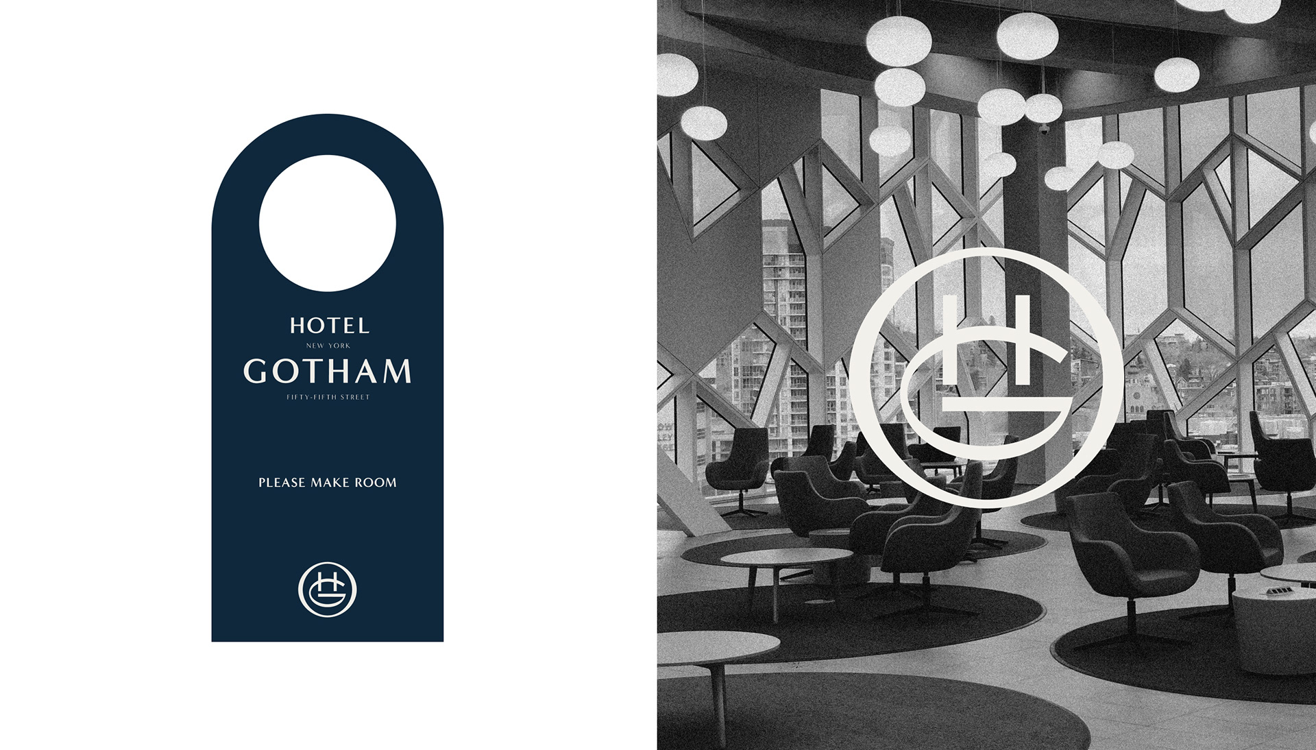
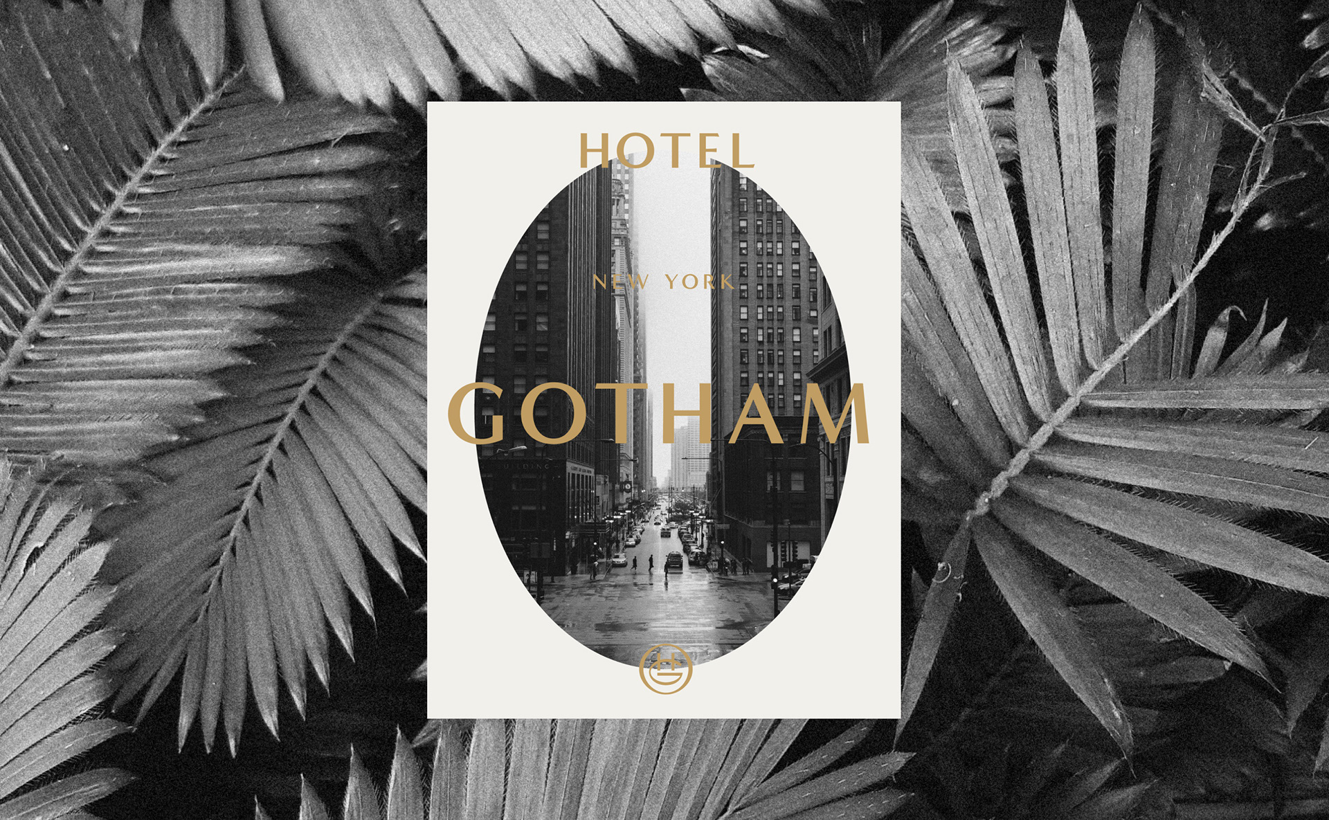
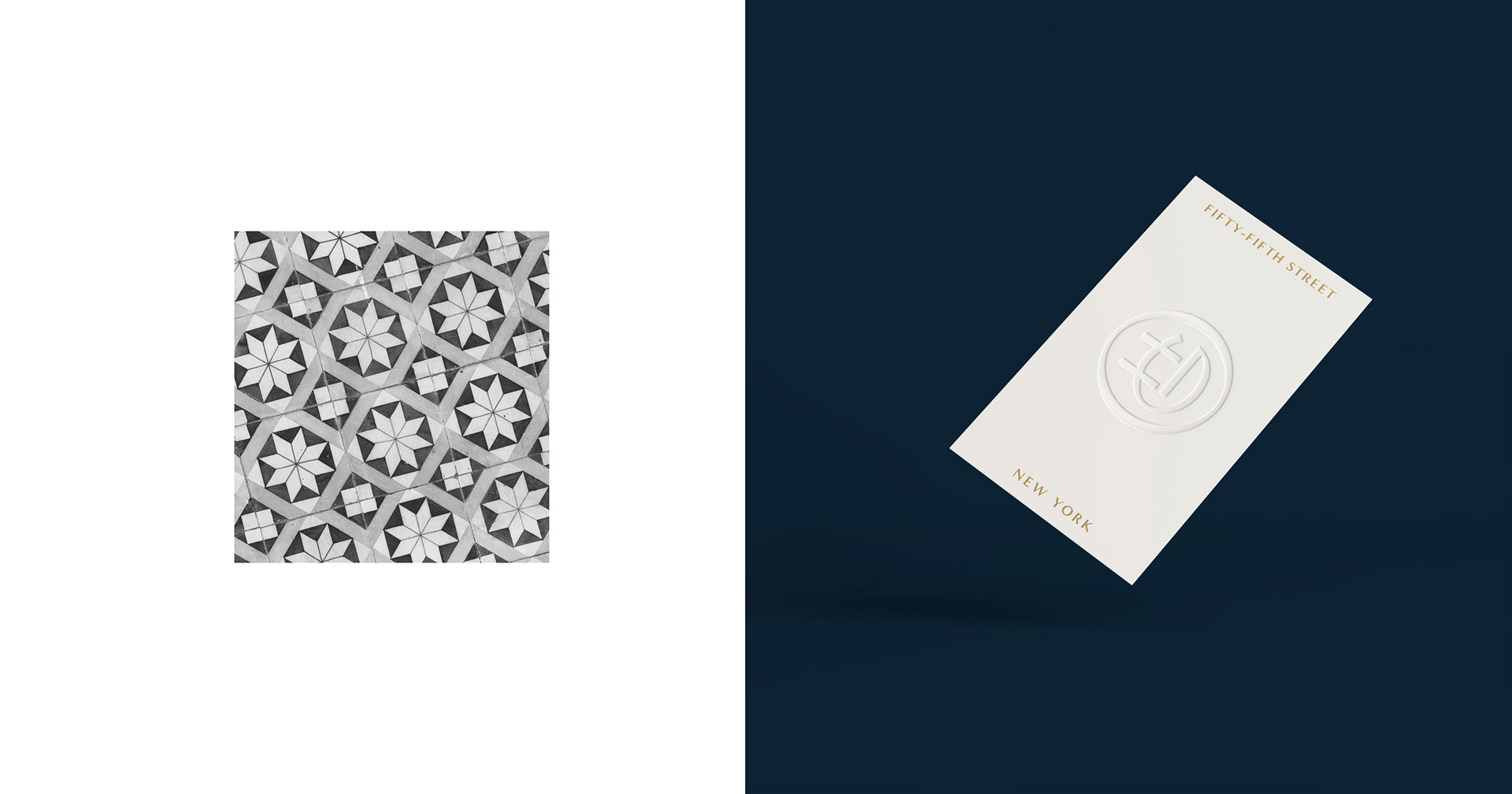
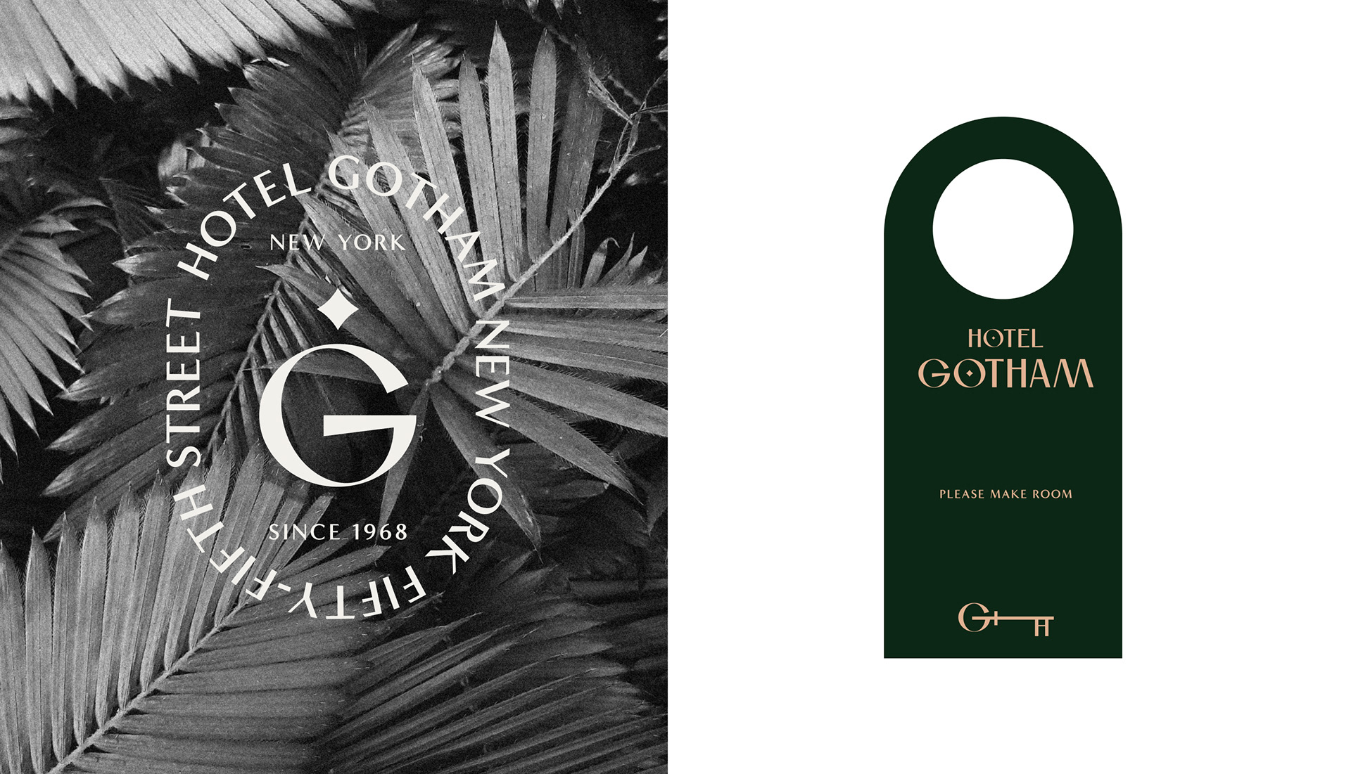
Hotel Gotham – Brand Identity Design by Alex Aperios

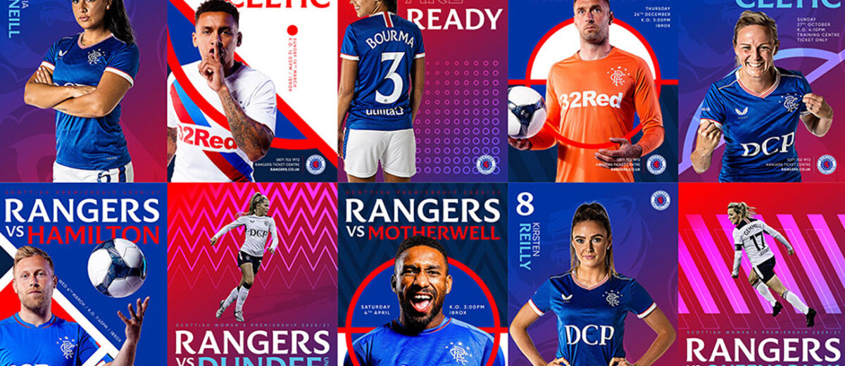
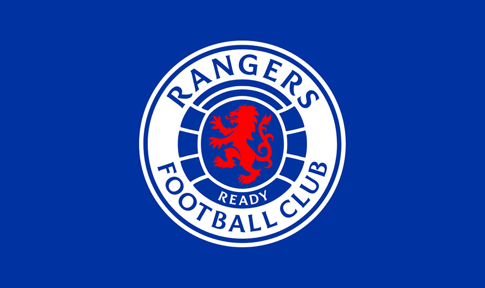
Rangers F.C. Brand Evolution by See Saw Creative Lynsey Campbell
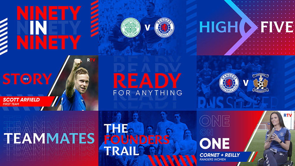
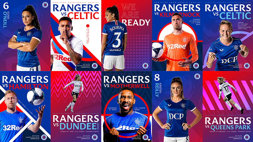
Submitted by Lynsey Campbell
Supporting one of the world’s oldest and most successful brands step into the digital eraProud of a rich history stretching back to 1872, Rangers FC is one of the world’s oldest and most successful football clubs amassing more years and trophies than the likes of Barcelona, Juventus FC, Manchester United and AC Milan. Preparing for the world’s glare during 2022’s 150-year celebrations, alongside embarking on a radical digital transformation strategy to support global growth and fan engagement ambitions, Rangers challenged us with modernising its visual style for a global digital audience, while holding true to its heritage.
Applying initialism to their ‘Ready’ motto to guide the development of brand values, we sought to amplify these values and visually position Rangers as the global giant it is.
A brand strategy guided by heritage, character + vision
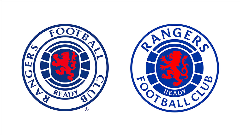
As an emblem of unity, heritage and glory, no Club’s brand asset is closer to its beating heart (quite literally) than the badge. We knew to kneel to both Rangers’ loyal fans and the Club’s brand value of ‘Yours’ by retaining, but restoring and re-energising original visual elements to keep fans and stakeholders on-side, whilst making a transformative impact.
Excellence is in the detail
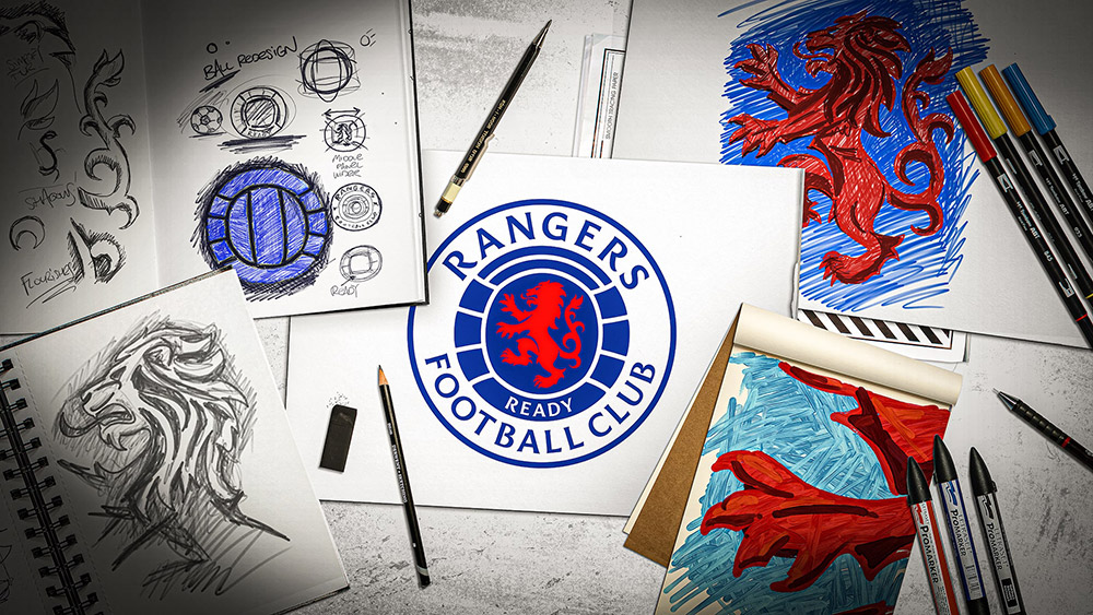
We kicked-off the project by restoring precision to the Club’s main ‘Ready’ crest (the ‘Scroll’ crest being exclusive to kits). We redrew the Lion Rampant in his existing position to support Rangers’ ‘Ready’ motto, yet with heightened artistic precision + detail to present a far more fierce and relentless quality.
We extended further by developing three versions of the Lion Rampant: a detailed yet flat version to be used within the crest; a larger version using light and shade to introduce texture to be used independently or cropped to extract abstract background shapes to enhance the creativity of marketing collateral; and a Lioness Rampant to provide Rangers Womens’ Team with its own sub-identity for the first time, further supporting Rangers’ brand value of ‘Diversity.’
A bold custom typeface that captures Rangers of the past and present
Partnering with internationally renowned typographer + lifelong Rangers’ fan Craig Black, together we explored Ibrox, delving through the archives to craft a custom font, Rangers Display, which perfectly captured Ranger’s heritage and personality. With serif kicks that echo those of the bluebells at Ibrox’s iconic gates, the new typeface also takes cues from Ibrox’s entrance floor mosaic in addition to various letterheads used over the years.
Rangers Display manages to be both modern and fresh, yet instantly recognisable as Rangers — representative of not only the past, but the now and the future.
Redressing balance to the badge
Spacing between ball panels has been made equal, whilst the ball has been enlarged to best house the Lion Rampant and ‘Ready’ text. We also slightly ‘inflated’ the ball to capture a sense of personality and fun, centring proportionately to make the strongest visual impact. The word ‘Rangers’ now sits proud at the top of the crest in its own custom font for ultimate legibility, clarity and confidence.
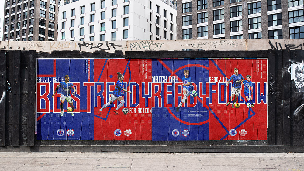
Establishing clarity and consistency across Rangers’ brand house
Produced to help support Rangers successfully and consistently roll-out their new identity across the world, we’ve also documented the new identities for Rangers’ many sub-brands, alongside other assets such as their ‘Scroll’ crest and web fonts.
Finger Ink Logo Design by Dalius Stuoka | logo designer
Neumorphic Shazam Button by Vadim Demenko
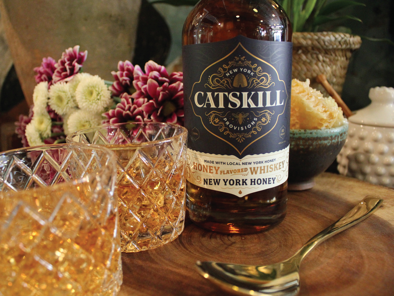
Catskill Provisions Logo & Packaging by Billy Baumann for Delicious Design League
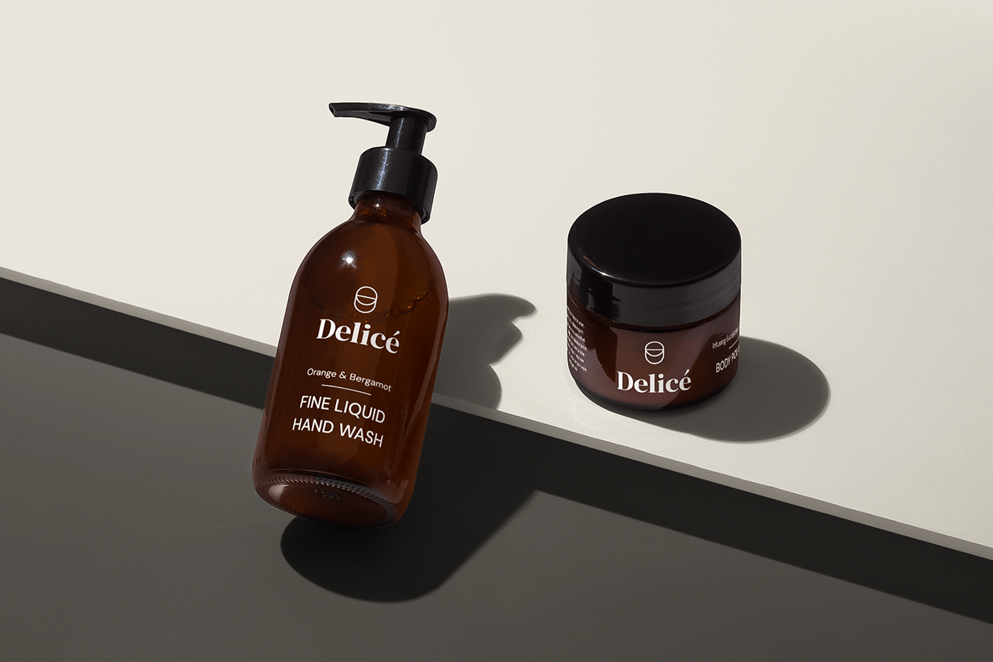
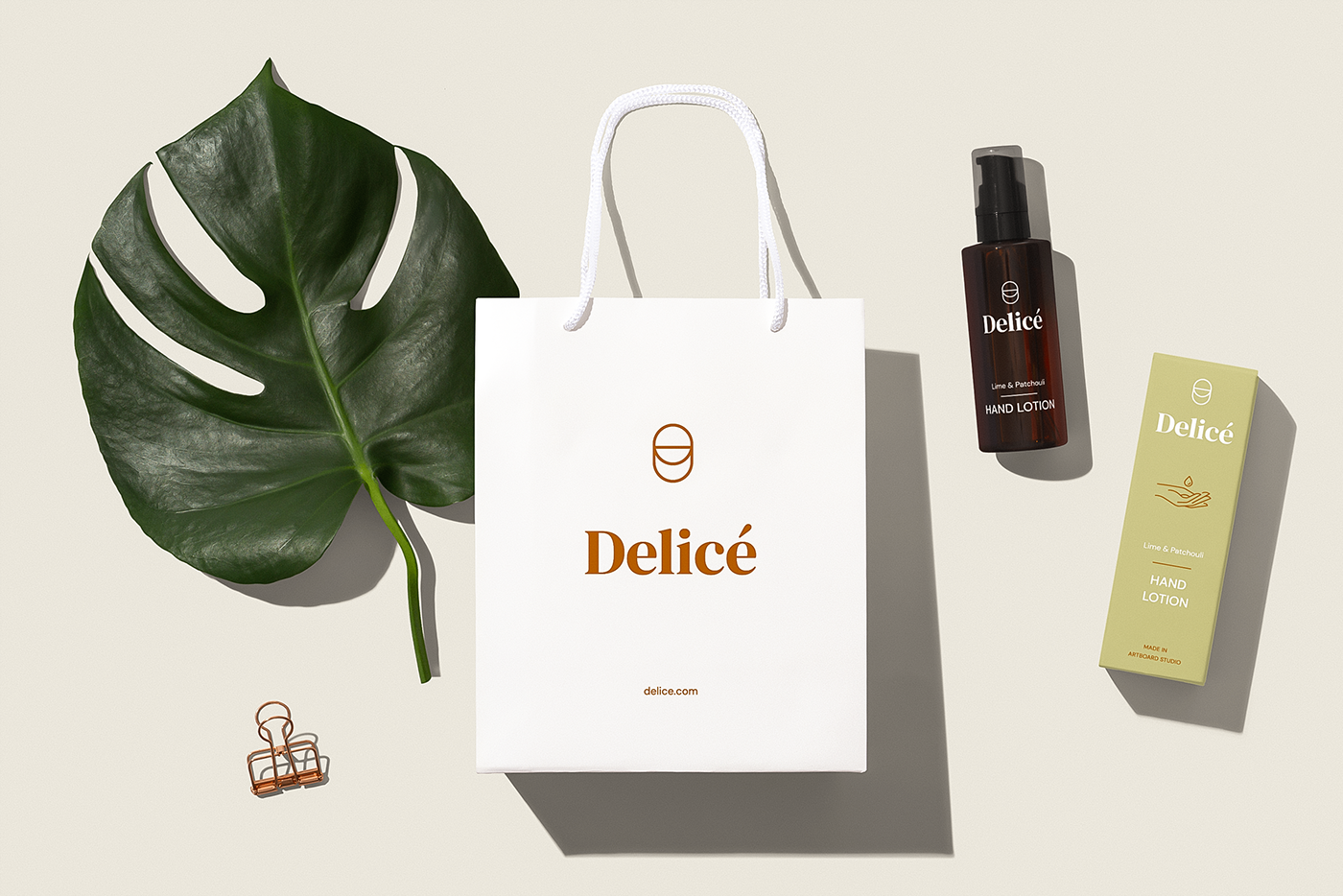
Delicè – Branding Design Concept with Artboard Studio


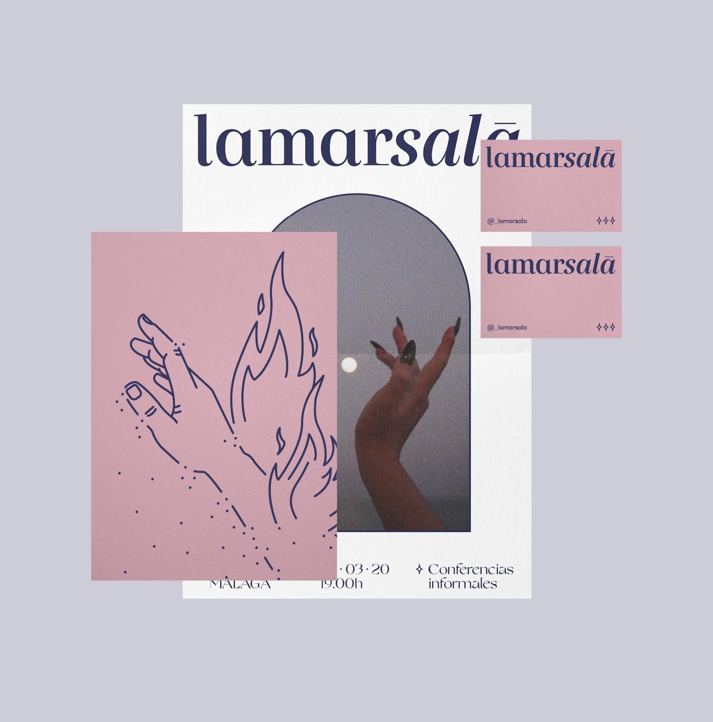
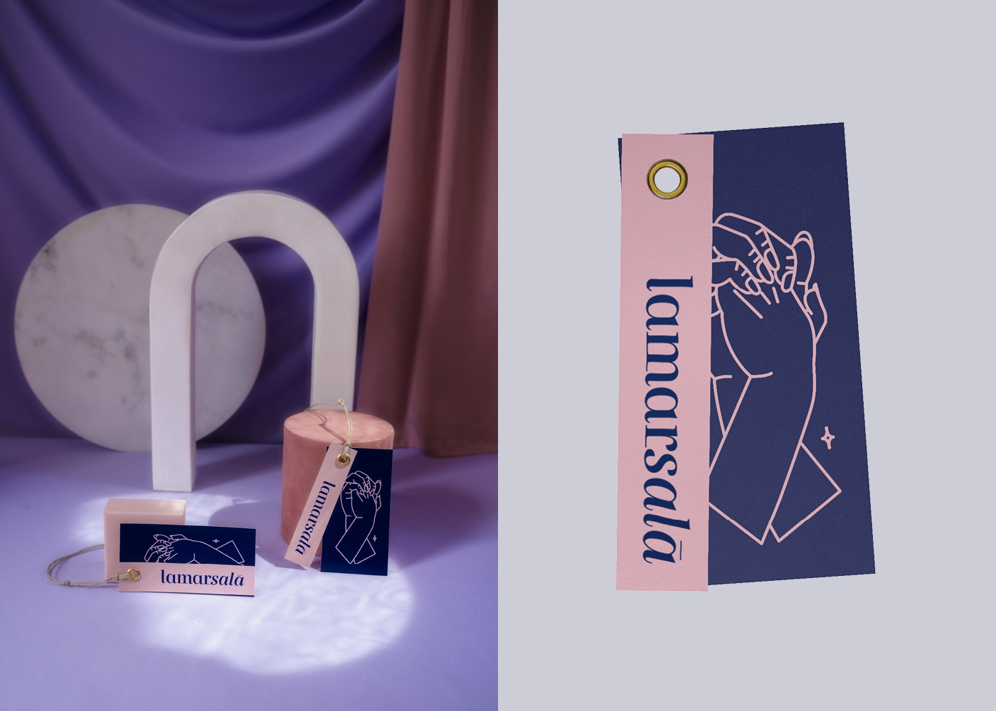
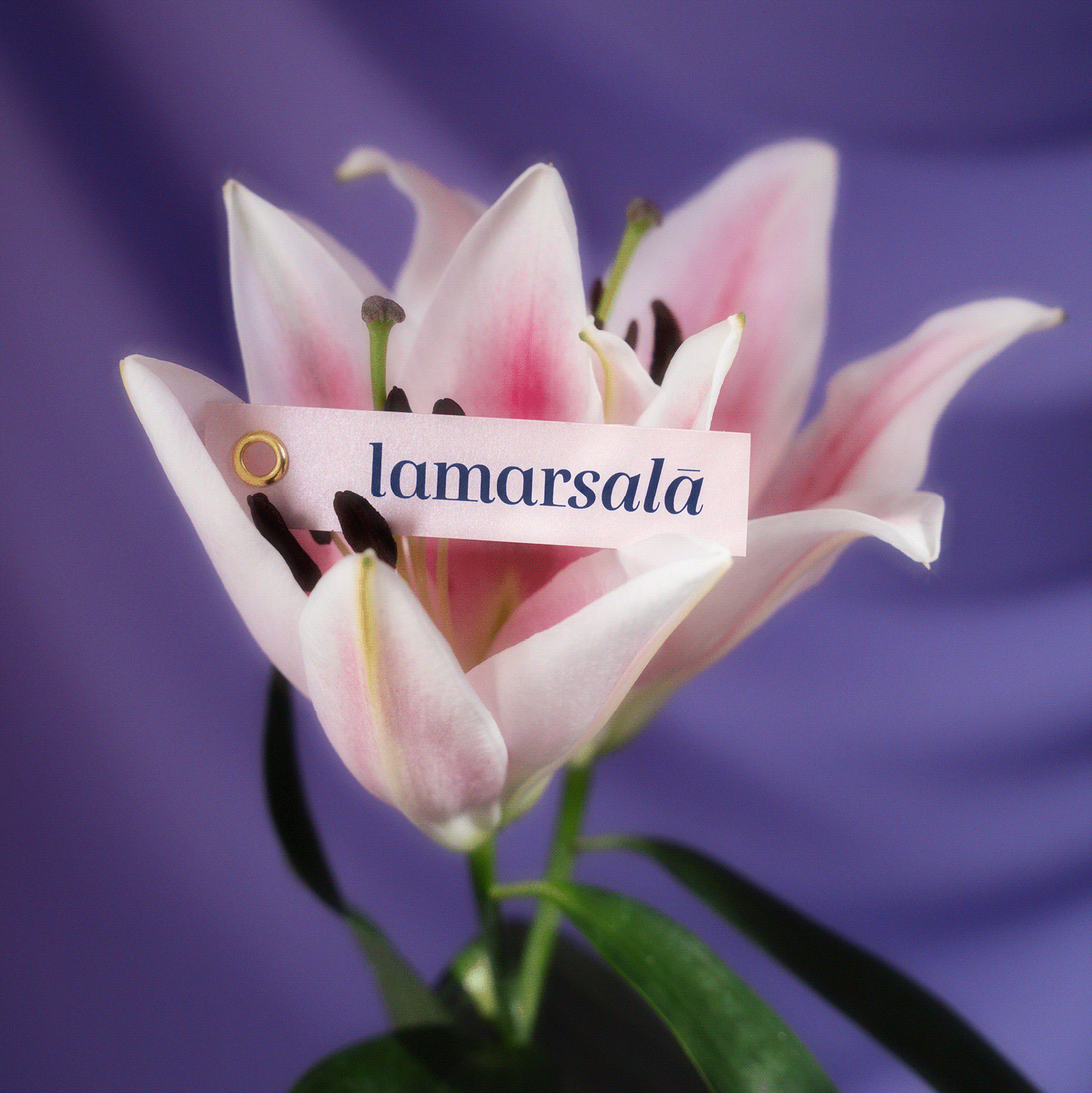
Lamarsalá by Tiquismiquis Club, Roberto Espartero, Juan Martín and Marina – Lamarsalá


VFX animated logo by the vfx dude
Submitted by the vfx dude
Hey. I‘m a 15 year old Motion Designer, Graphic Designer and Game Developer from Germany.
My main project is a first person shooter. I‘m the only developer, working at this game. I code everything, design everything and make my own ideas. If you want to download my game and support me, follow my IG and click on the Discord link or click on the Discord link at this website.
I will release information, snapshots and versions on my Discord and IG. Thanks for reading this blog. It means a lot to me. Have a nice day!!!
Logotypes & Symbols 2018-2021 by Deebben Subramaniam
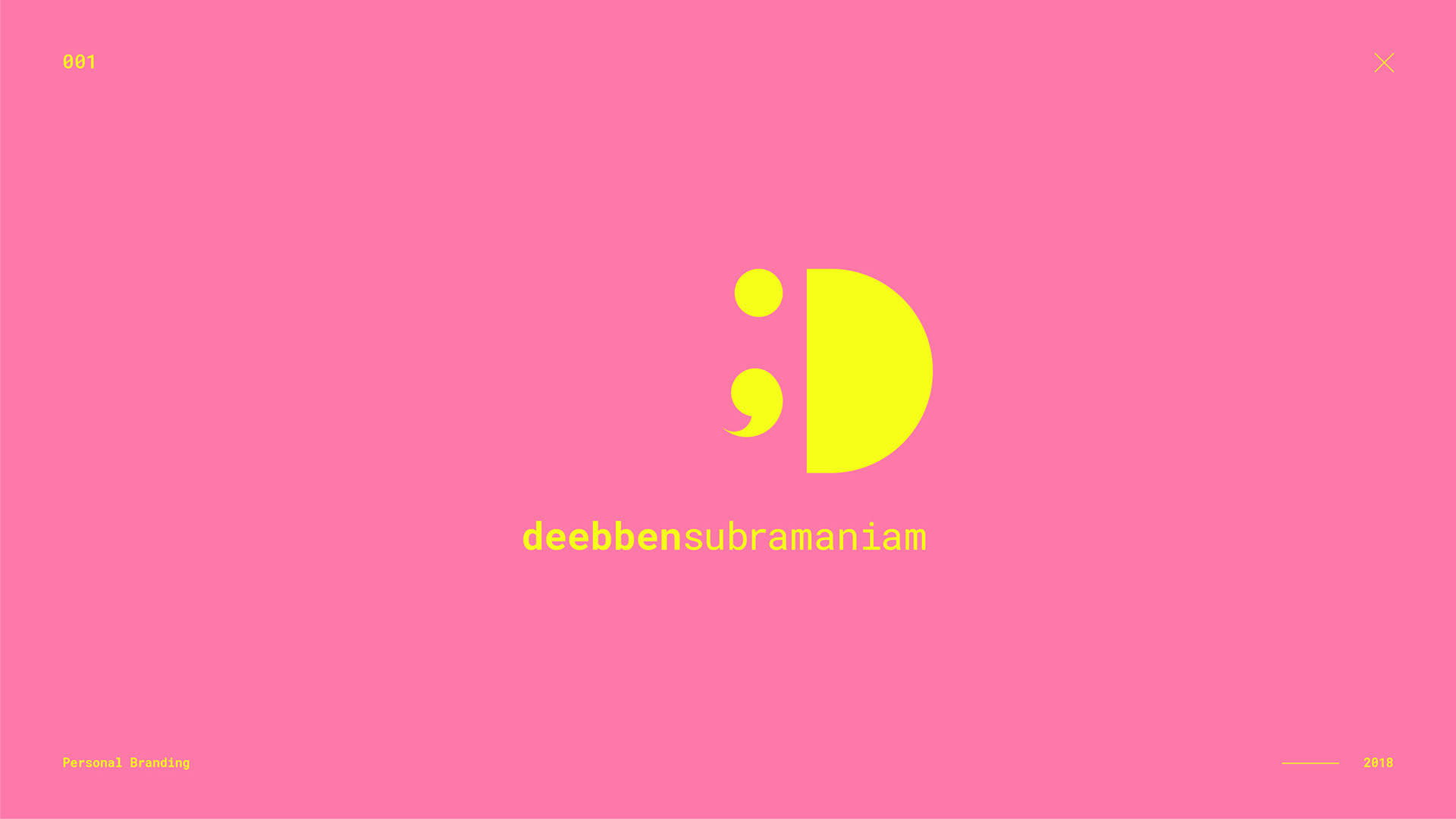

Submitted by Deebben Subramaniam
I’ve always been an advocated for good, solid branding. So naturally, coming out of uni, I set my mind to getting a job at a branding agency. But the Design Gods had other plans for me and I accepted a job at an advertising agency. It was love at first sight, I quickly fell in love with the culture, the people, and the work in the advertising world.
Still, to appease the designer in me, now and again I indulge myself in a good branding exercise, and these are some of the fruits of my labour. Please enjoy.
The Writing Studio by Nick McGee


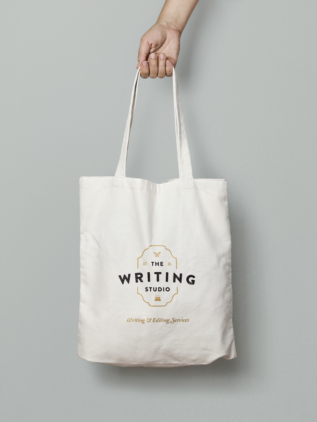

Submitted by Nick McGee
Cute Logos


Tekni Logo Animation by Edgar Vehbiu