
Almost every business owner prefers to go digital with their brand. While this is most ideal method in terms of promoting a product or service, print media is still relevant. While the digital media is overcrowded with heavy contents and ads, print media still makes a huge impact in terms of marketing and promoting a brand or a product.
Marketing collateral like business cards, brochures, posters, T-shirts, and even product packaging give a tangible appeal to a brand, especially if they are designed in the most compelling manner like in the examples below. You’d think twice about discarding them.
Want your work to be featured? Just submit your best piece here.
Witch’s Brew by Sofia Froeder
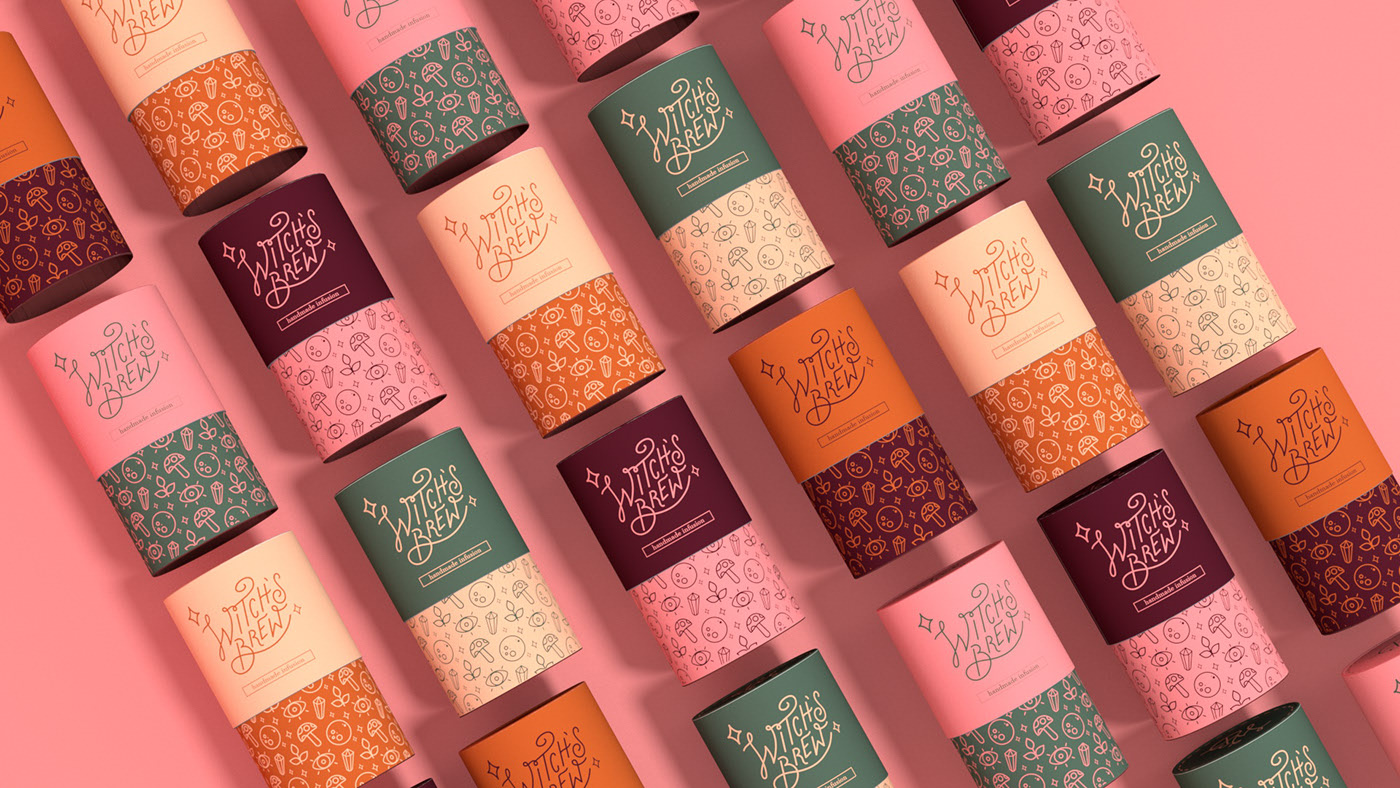


Submitted by Sofia Froeder
Hello!
I’m Sofia Froeder, a design student from São Paulo, Brazil. I like to experiment a lot in my design works. I didn’t found a especific area to focus right now, so I’m studying packing, branding, motion, illustration…. Hope you like this packing and branding project!
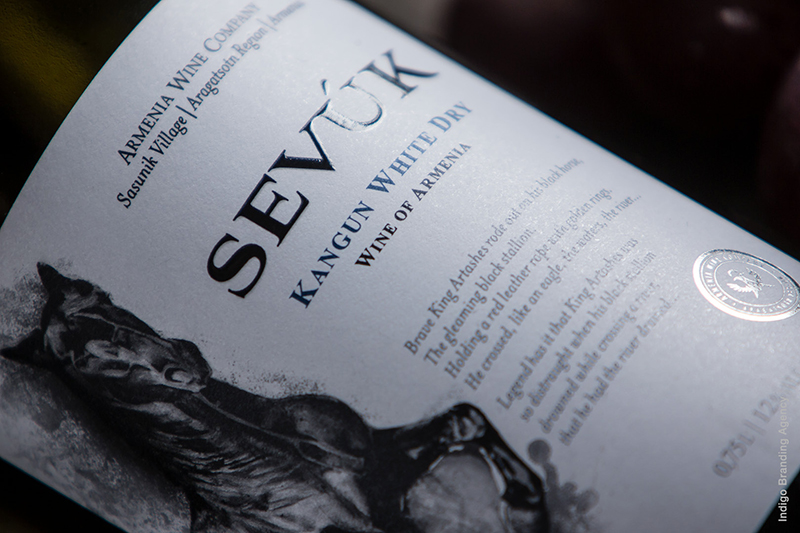
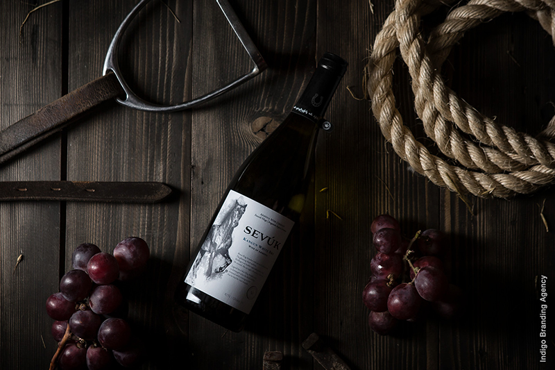
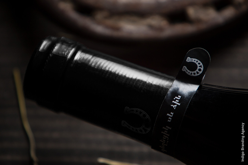
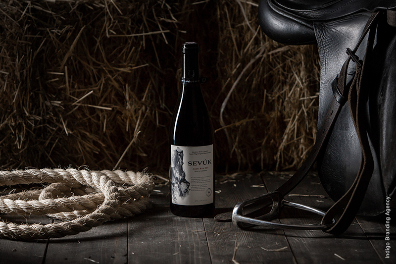
Sevuk Wines by Indigo Branding
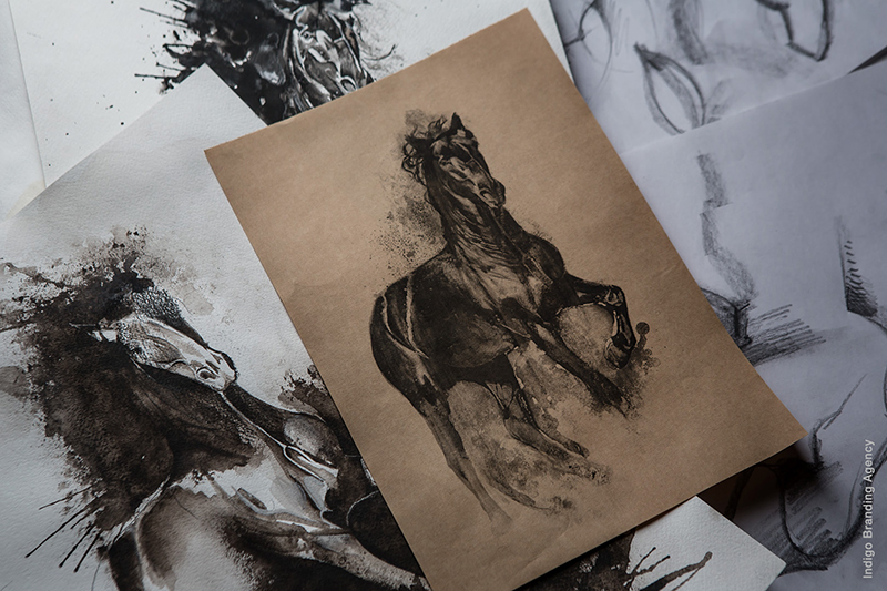
Submitted by Indigo Branding Agency
We are Indigo Branding Agency. We unite intelligence, curiosity and passion to create extraordinary brand experiences.
As the Armenian legend goes, King Artashes always took his horse Sevuk, Blackie in Armenian, to a fight or a war. When Sevuk drowned while crossing a river, the king was so outraged that he had the river drained. Armenian Wine Company has decided to honor Sevuk’s brave and noble character by turning it into a marketing icon for the packaging of their wine bottles. The task of our team was to visualize the company’s idea in the most honorable way possible. We chose to portray the horse in watercolor, which would allow its strong and dynamic character to stand out. The illustration was made in black and white in order to illuminate any distractions and concentrate the eye on the horse alone. The choice of the emphasis on black in the illustration, logo and photo shoot was also made to go around the theme of Sevuk’s name. Our designers also made sure to add an accent on the letter “U” in the logo to make sure we would achieve the correct pronunciation both in Armenia and worldwide.
Passion Land by Alex Trang


Submitted by Alex Trang
Passion Land is a local fashion brand that includes imported goods and designer goods. Founded by young fashion designers, the desire to bring elegant and sophisticated costumes for Vietnamese.
The main goal is to create simple, beautiful products for young Vietnamese people. Bringing comfortable but elegant!
Japan 2020 by Yusuke Yamazaki
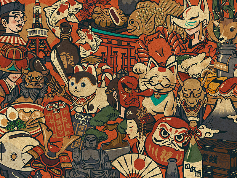
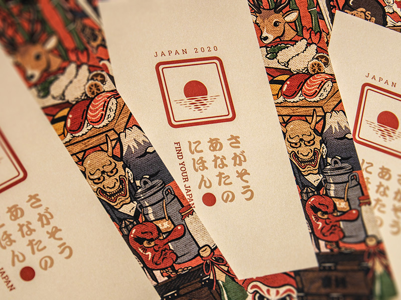
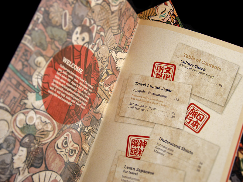
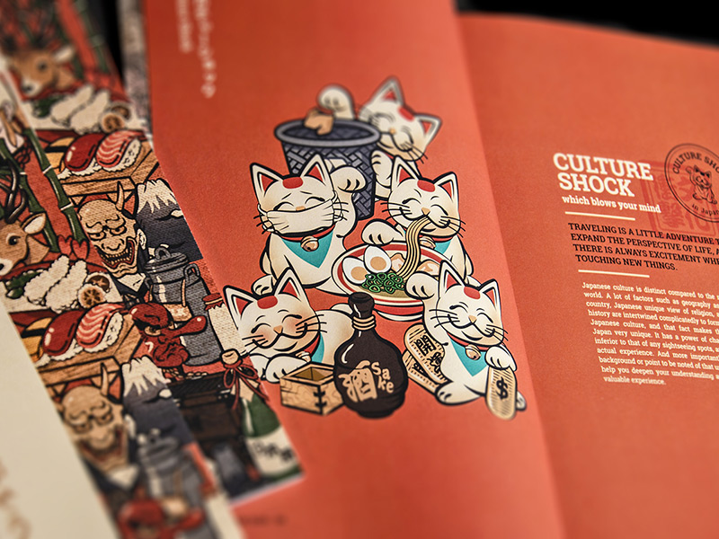
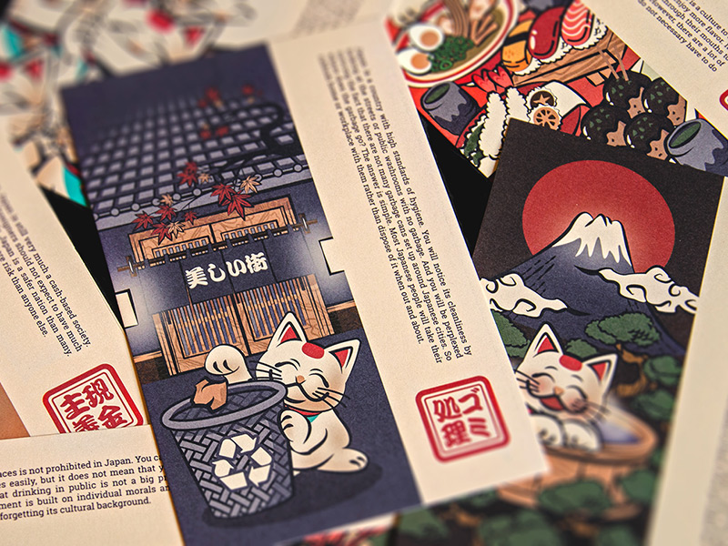
Submitted by Yusuke Yamazaki
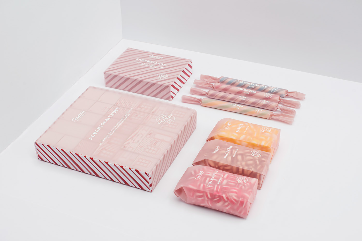
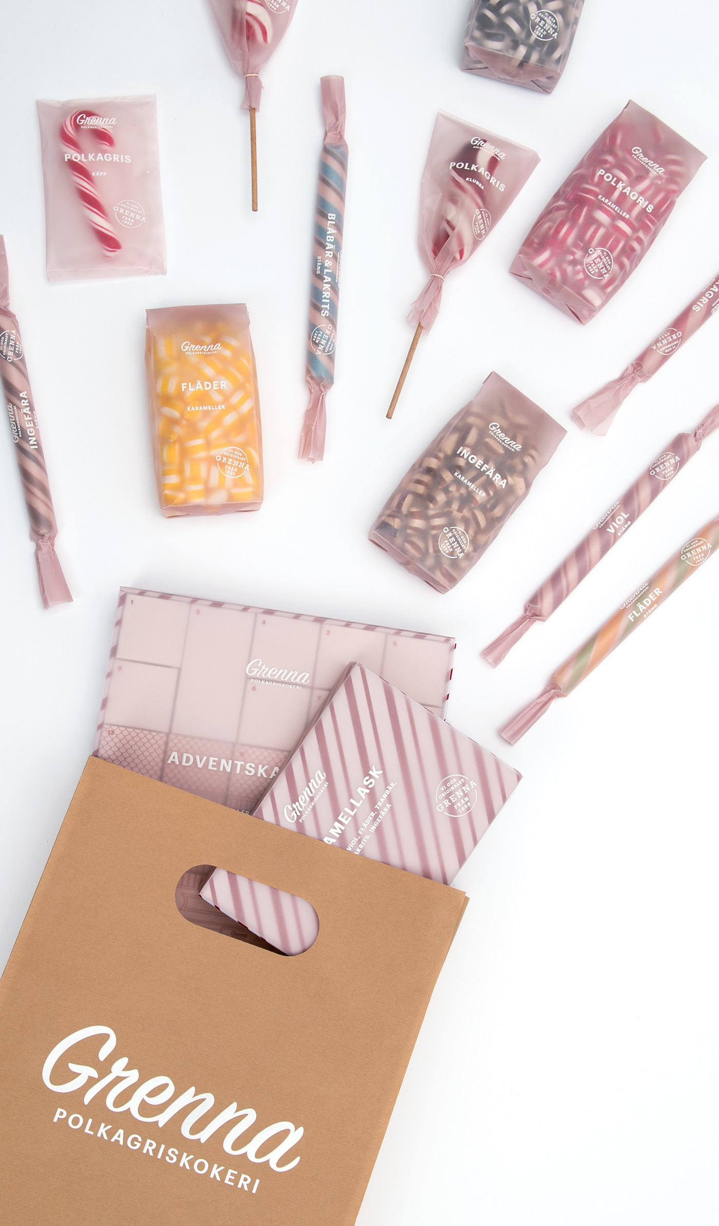
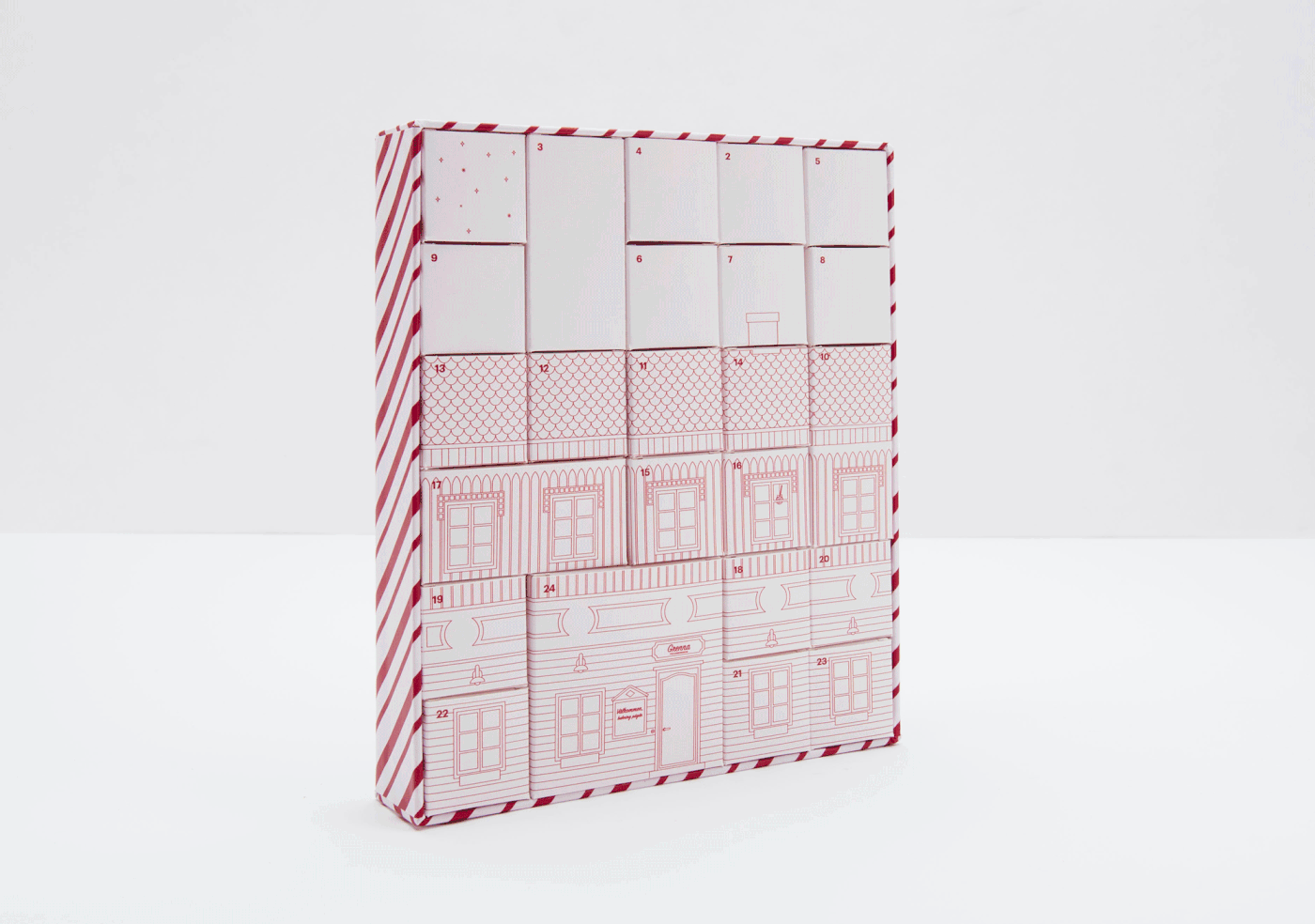
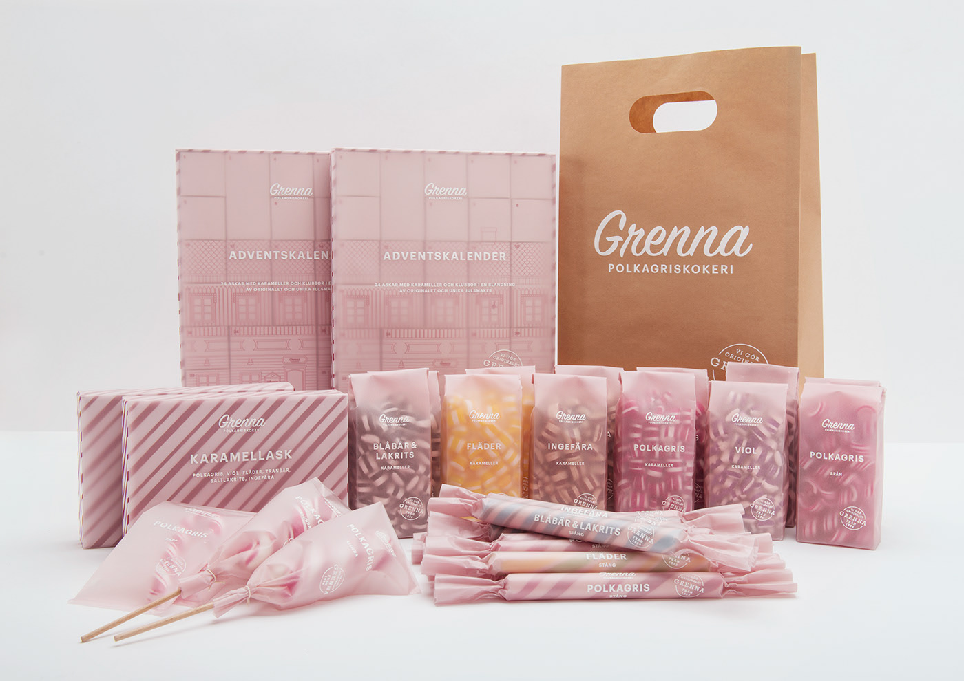
Candy packaging / Grenna Polkagriskokeri


Eastcoast Heights Booklet by Simon Ellery

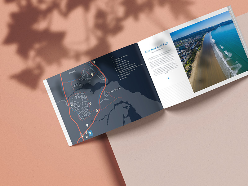

Submitted by Simon Ellery
Elegant, Modern & Minimal Real Estate Booklet Design
We incorporated a generous amount of white space with beautiful large imagery to create an elegant brochure design that captivates readers. Subtle wavy line patterns were used to draw the readers eye through and provide visual interest while giving a nod to the wave of the beaches near this all new housing development.
With its beautiful layouts, clear modern typefaces and vivid imagery, this real estate brochure brings a level of quality and prestige to the booklet design.
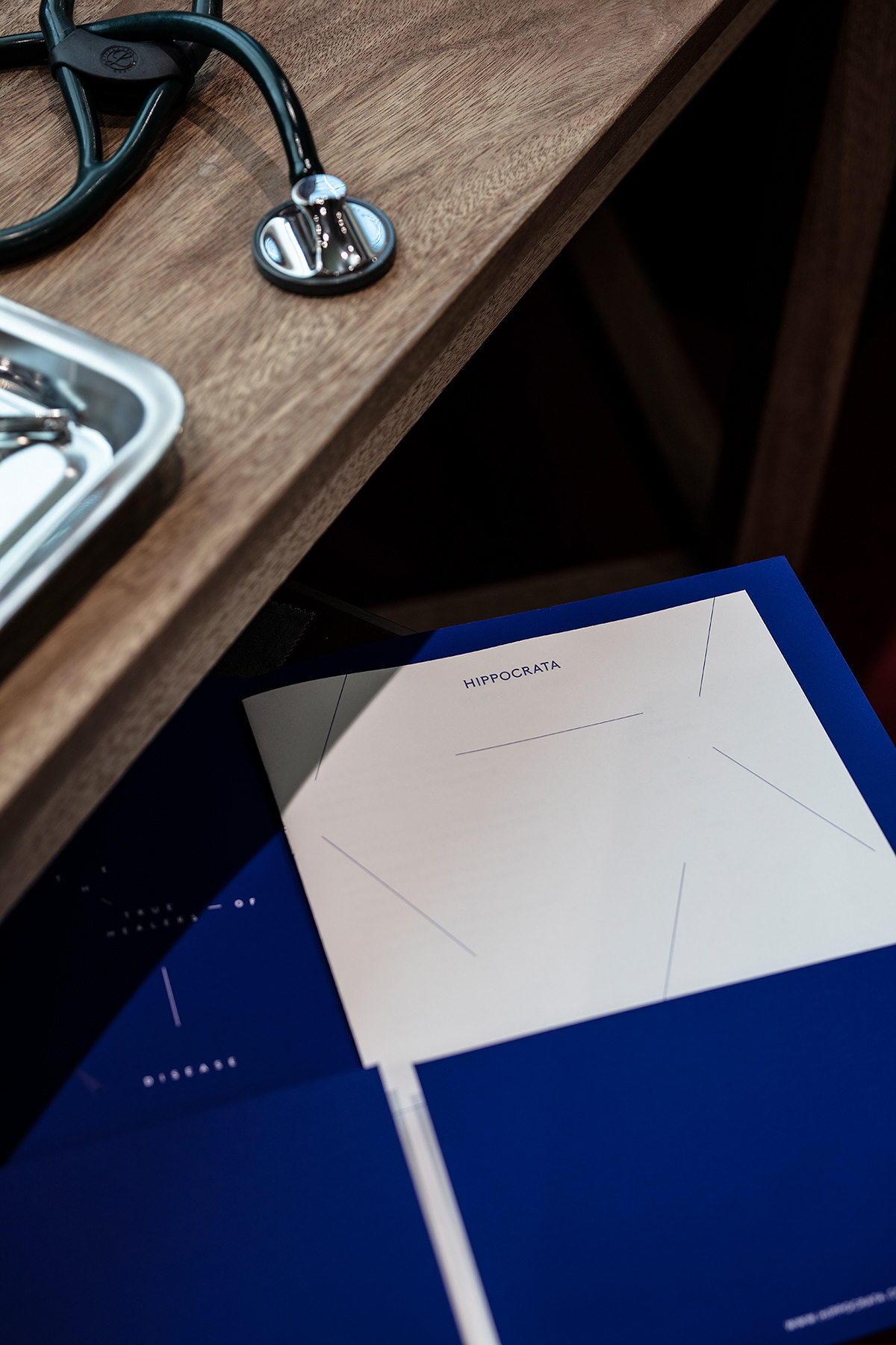
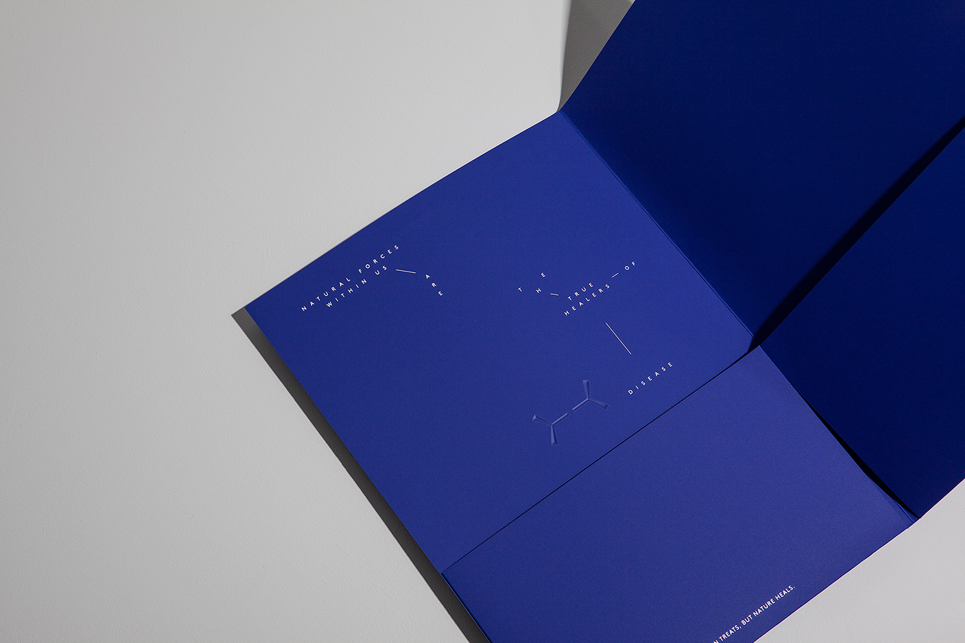
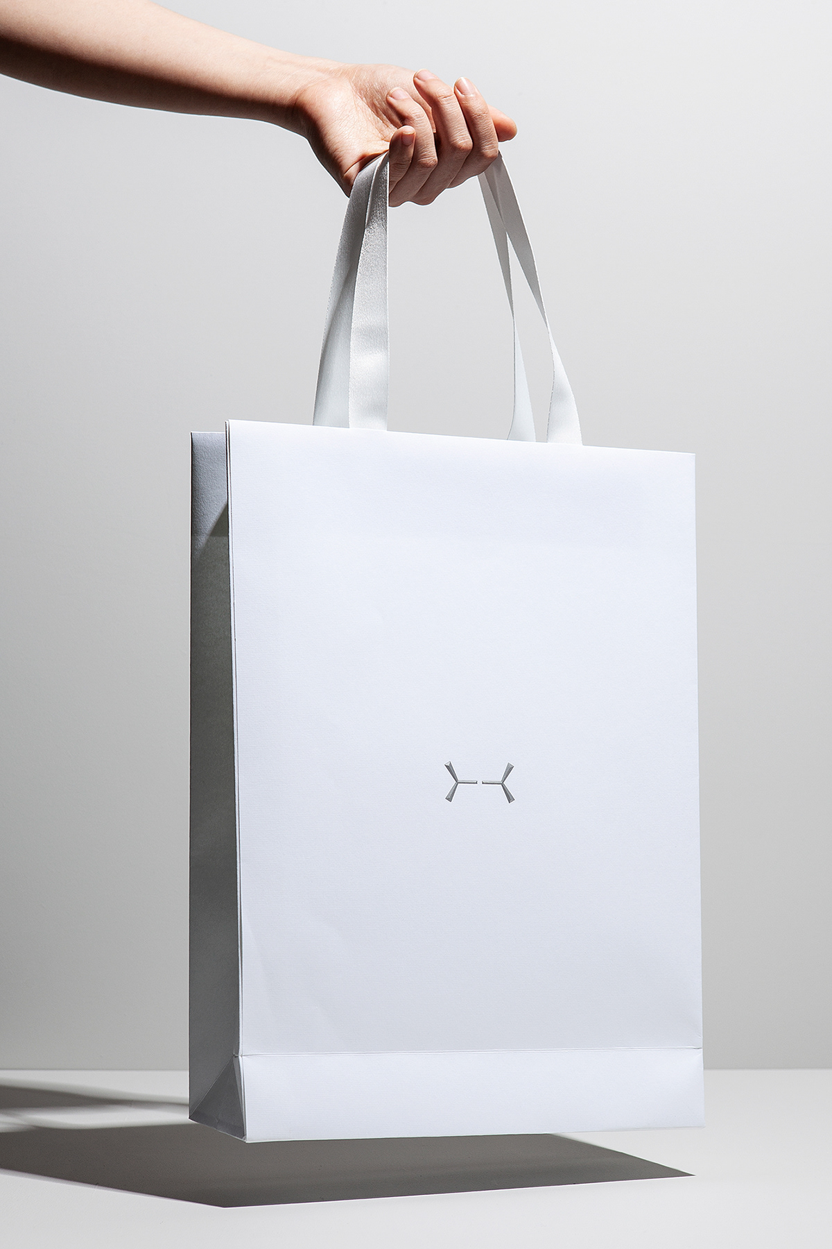
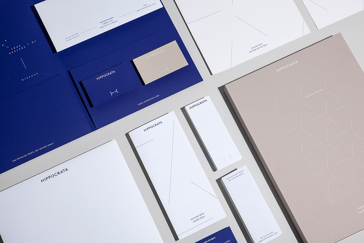
Hippocrata Clinic by Charry Jeon, CFC, Saerom Kang and Nara Yoon


Flow Water by Diana Ivanova
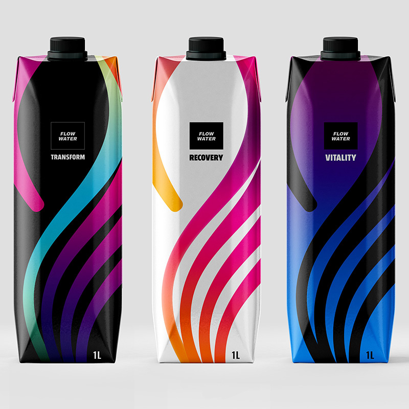
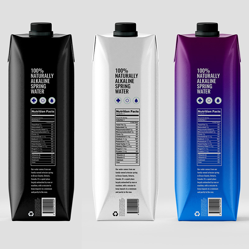
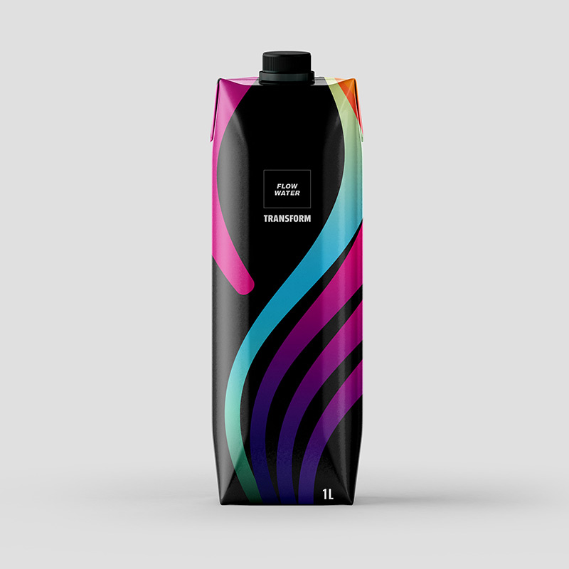
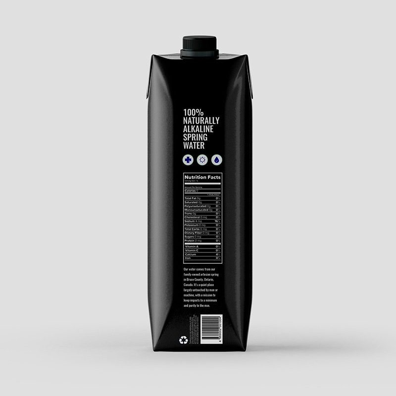
Submitted by Diana Ivanova
This is a project I was assigned to redesign in my final year of Packaging and Graphic Design. Flow Water is a Canadian owned Alkaline water that houses healthy minerals.
Flow Water believes in pure properties, positive renewal and sustainability. The nutritious minerals and electrolytes allow for exhilarated athletic recovery. The Tetra Pak allows for a 100% recyclable bottle that is made with up to 70% renewable material. Sustainability is an ought as protection of the In the Clear Water Act.
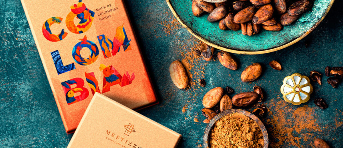
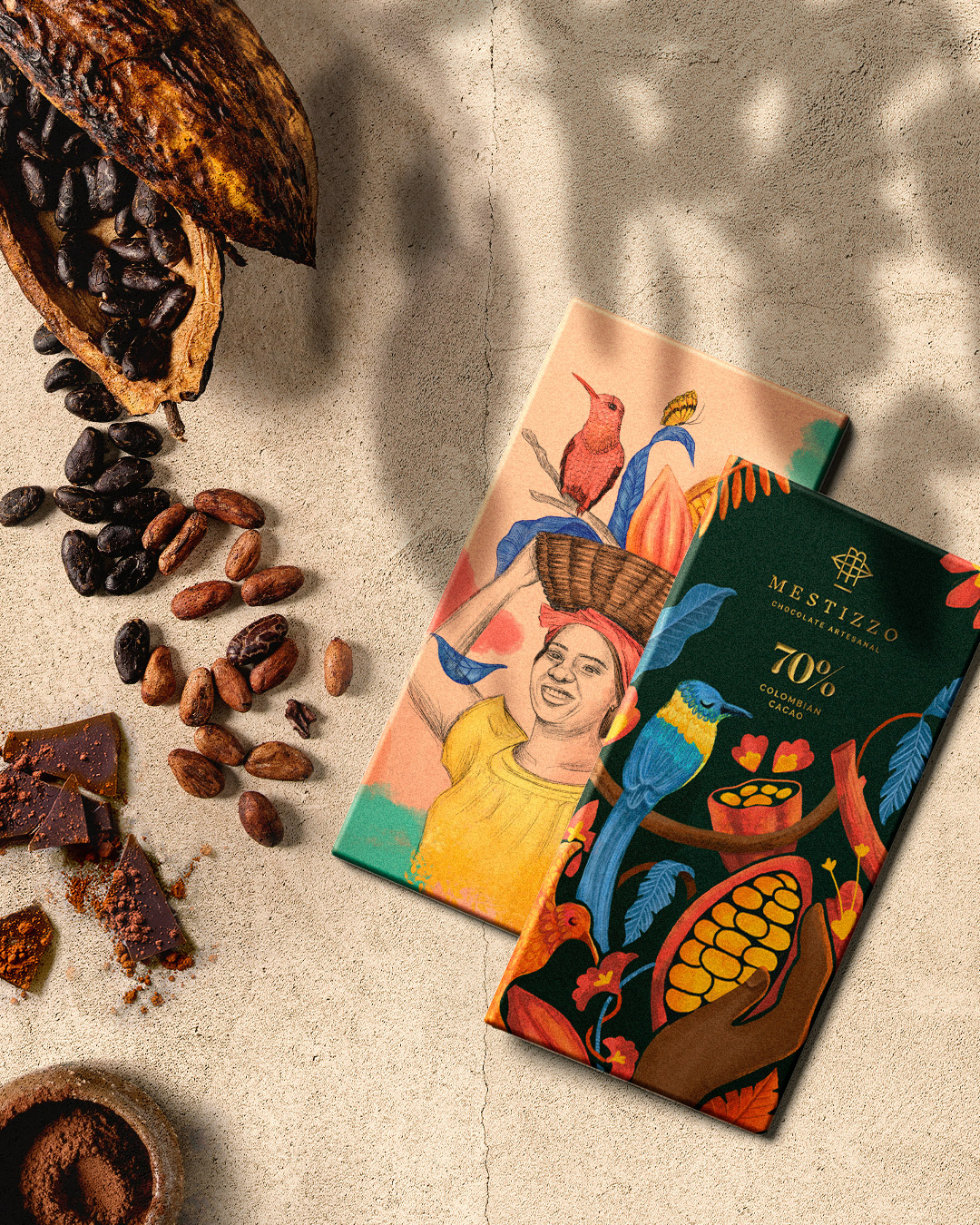
Mestizzo – Packaging illustrations by Susana Ríos
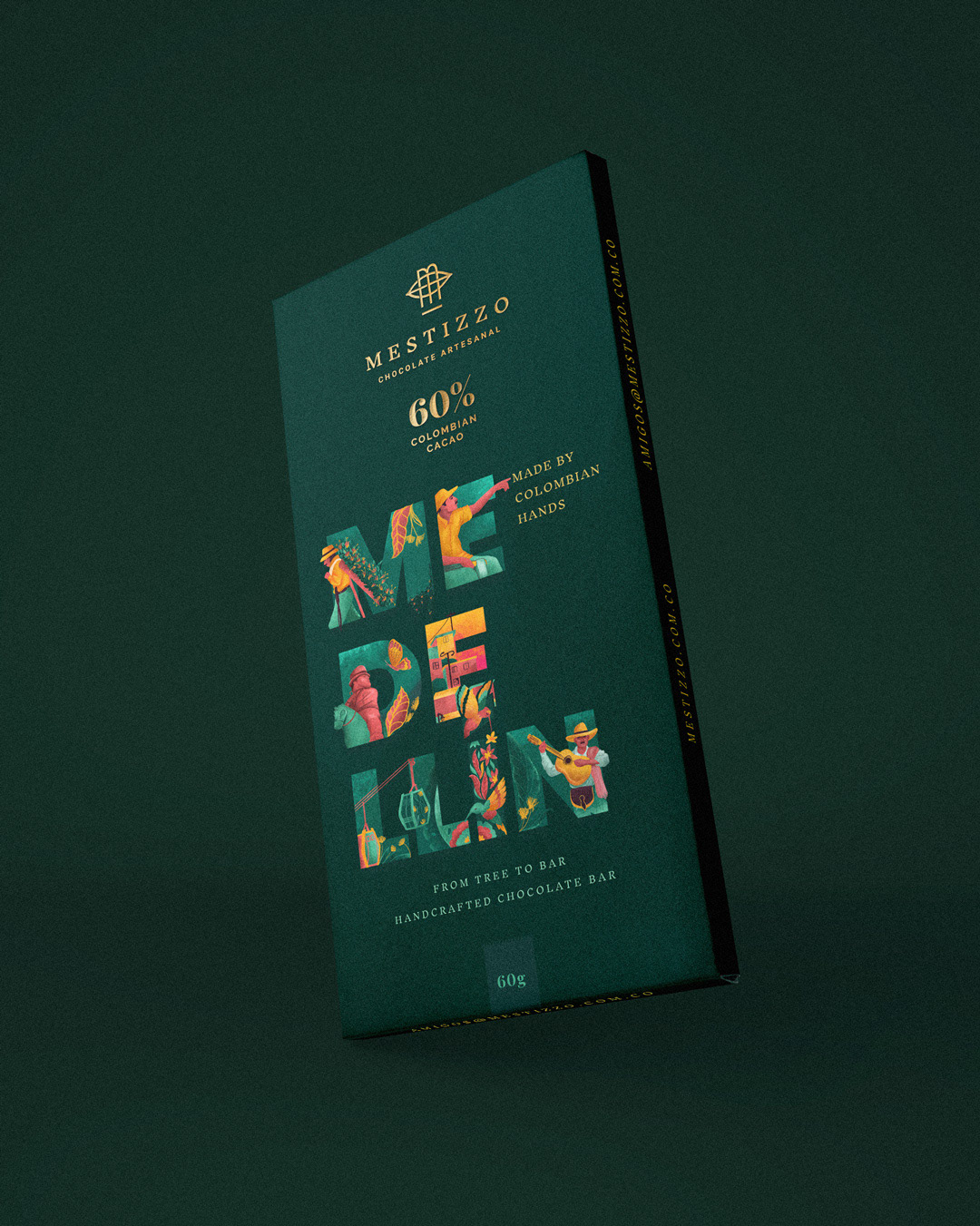
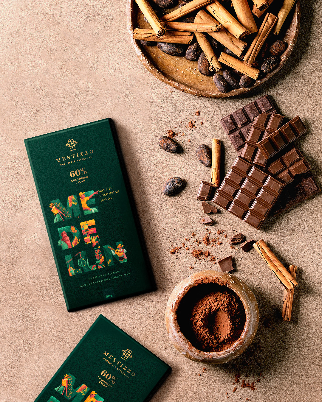
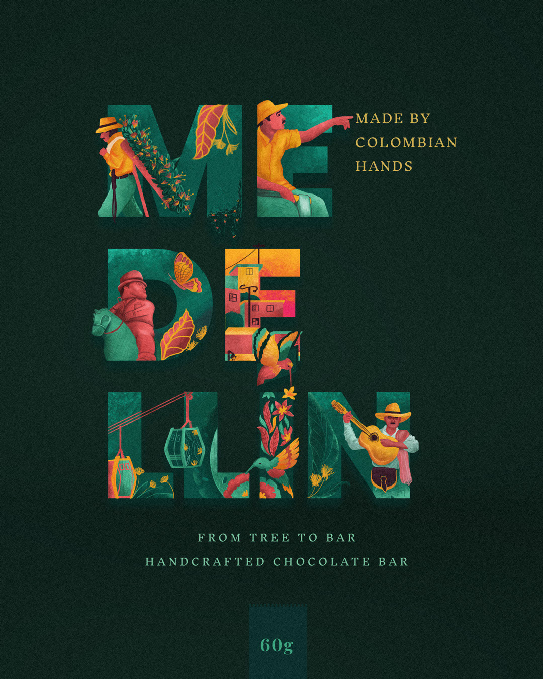
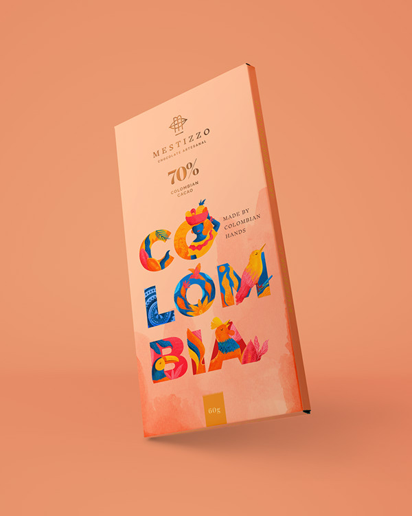

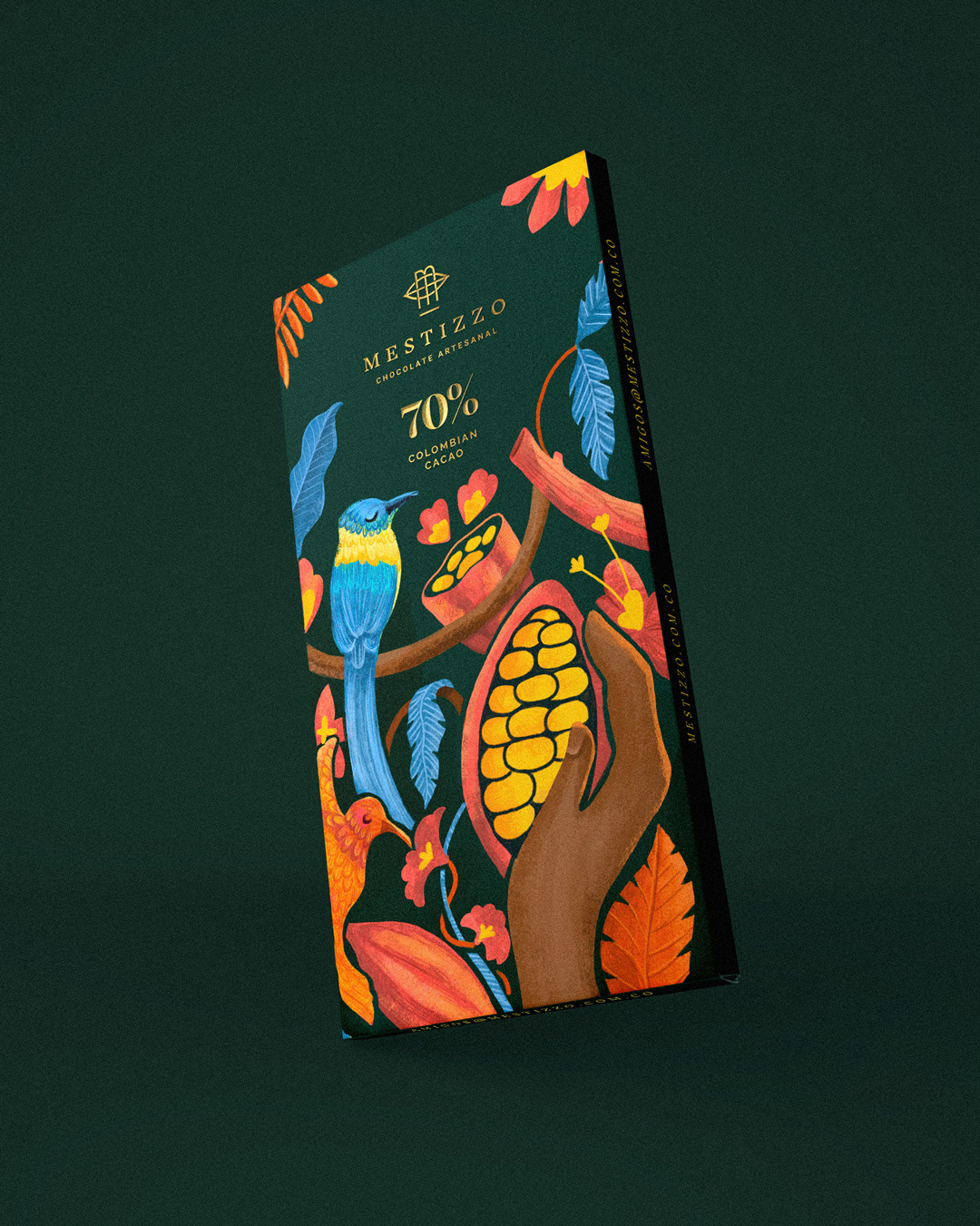
Submitted by Susana Ríos
Mestizzo es una marca de chocolates gourmet en la ciudad de Medellin, Colombia, Mestizzo busca ilustrar algunos sitios y sobre todo la cultura colombiana, a través de trazos imperfectos y colores vibrantes, que se conecten con el usuario y desplieguen un sin fin de sensaciones desde la vista hasta el gusto!
Mestizzo is a brand of gourmet chocolates in the city of Medellin, Colombia, Mestizzo seeks to illustrate some places and especially Colombian culture, through imperfect strokes and vibrant colors, that connect with the user and display endless sensations from the view to taste!
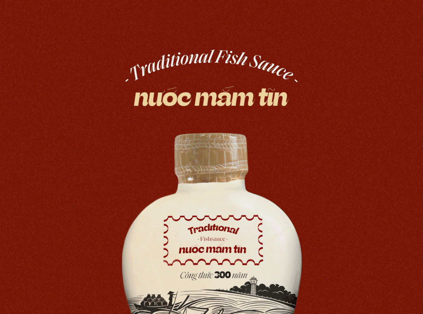
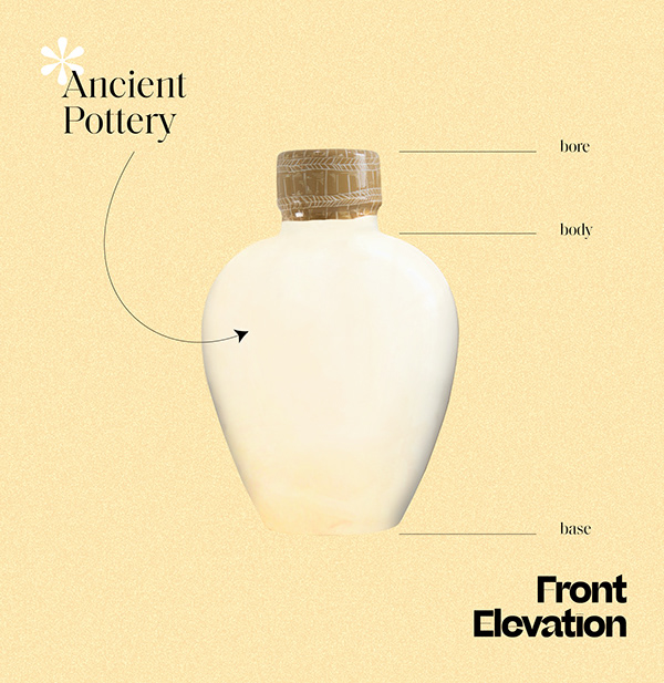
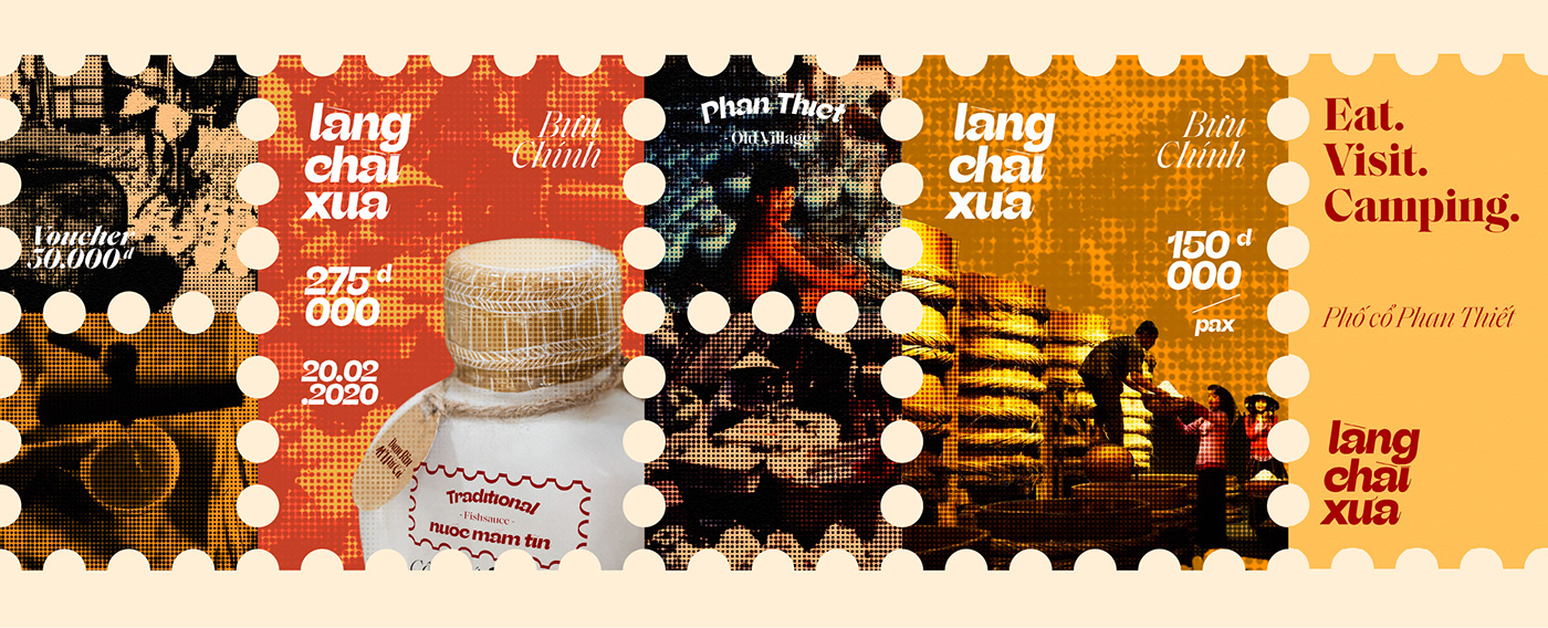
“Tĩn” Fish Sauce and the Old Fishing Village by Taste Design Studio

Submitted by Taste Design Studio
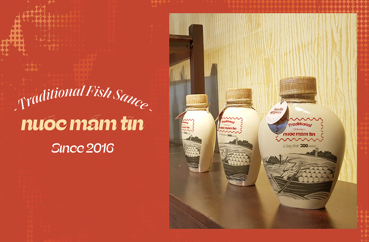
“Tĩn” Fish Sauce“Nuoc Mam Tin” is a brand of pure rin fish sauce, rich in fish meat, inheriting the traditional formula of more than 300 years of the ancient fishing village of Phan Thiet. The history of fish sauce has been apparent for over 300 years in the Phan Thiet old fishing village by the ancestors Tran Gia Hoa, who was qualified as “Quan Bát Phẩm” by the Nguyen King for his birth giving to the fish sauce tradition. The ceramic fish sauce covered with lime squared labelled, was transported from Ca Ty River to across the South to the Central and the North and occupied the largest market share in Vietnam at that time. People used to call this kind of pure rin fish sauce as Tĩn fish sauce. But as a result of the war, the disappearance of craft villages, the traditional values of famous Phan Thiet fish sauce gradually disappeared. We based on this true historical story, along with the image of the Fish Sauce to inspire the idea of package design of the “Nuoc Mam Tin” brand.
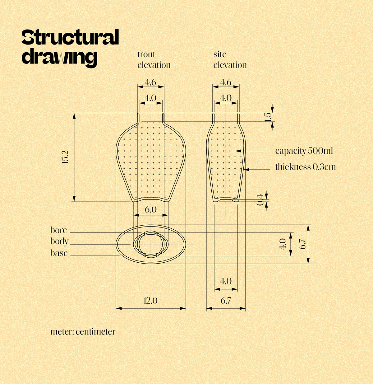
About the form structure
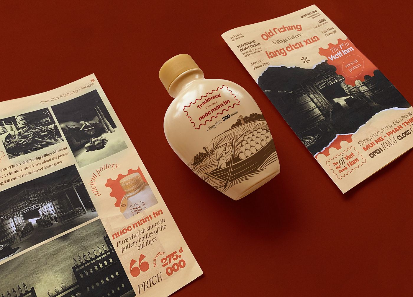
We study the ancient structure of Tĩn, then restructure and redesign. The anthropometric data was adjusted, in order that people can hold and use it easily in the kitchen and dining table. The ceramic material for the outer packaging keeps the rough texture, combined with the printing of label elements such as brand identity and product information. The inside of the “Tĩn” bottle is coated with special enamels to ensure the fish sauce will not degrade in a long time.
Regarding the main image of the packaging, we hand-painted the trading scene of ancient Phan Thiet, with boats and Tĩn bottles, surrounded by typical landscapes of Phan Thiet sea. The back packaging is the image of a traditional fish sauce production model, with rows of oak barrels, where anchovies are naturally brewed according to the typical recipe of Phan Thiet people.
Old Fishing Village
In order to emphasize the story about the 300-year recipe of the Fish Sauce product from the Fishing Village, we along with the investors have created a brand identity for the “Old Fishing Village” fish sauce museum. The museum was designed with a contemporary concept, as a role-playing film studio. The area of nearly 2,000 square meters is divided into 14 automatic light-hitting spaces to describe 300 years of Phan Thiet fishing village from Champa, Nguyen Dynasty, French colonial periods and 40s, 50s and 60s. Visitors can learn about the history and recipe of 300-year fish sauce of Phan Thiet fishermen. This is also the highlight of the marketing of “Nuoc Mam Tin” products to the consumers.
Taste Design Studio
Creative Director: Nam Moj
Art Direction: Huy Thien
Graphic Designer: Huy Thien, Thong Dinh
Motion: Thong Dinh
Illustration: La Vy
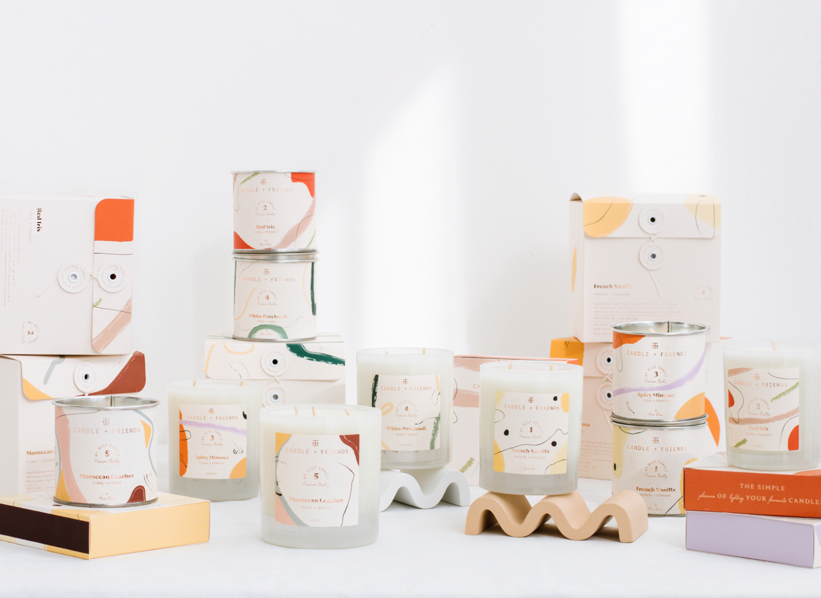
Candle + Friends by Cansu Merdamert
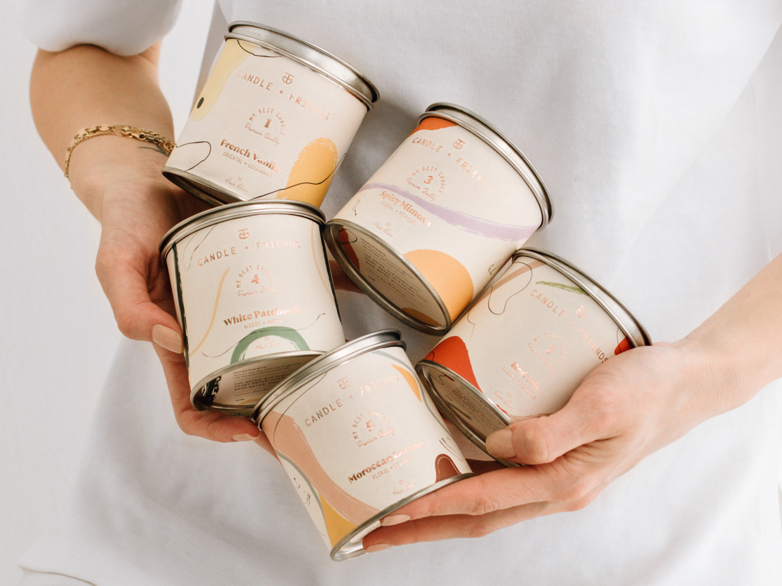
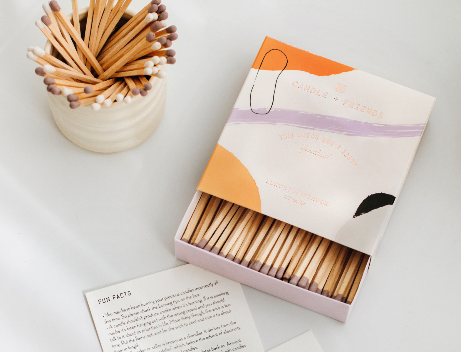
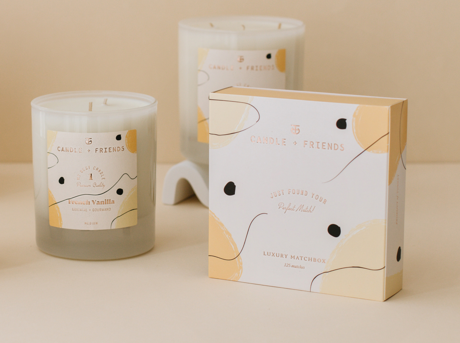
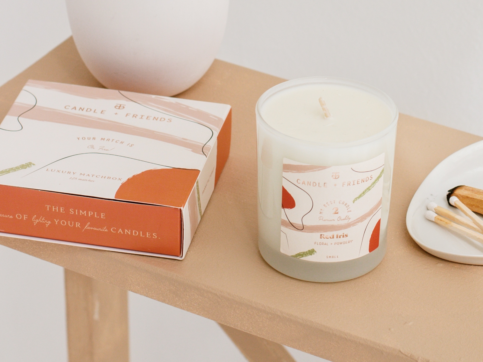
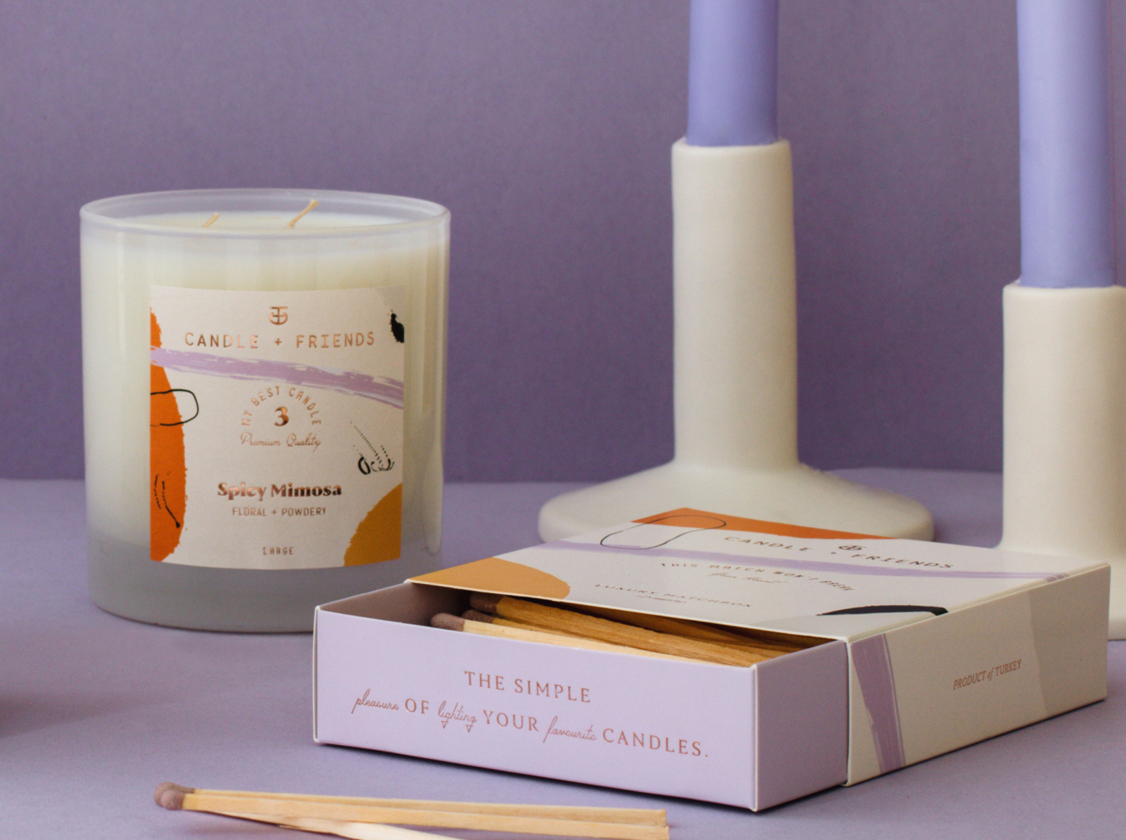
Submitted by Cansu Merdamert
The idea to improve customers’ moods in a sustainable way perfectly embodies the sleek and elegant design we created for Candle + Friends. Candles are handmade with 100% domestically-grown soy wax, premium fragrance oils infused with essential oils and cotton wicks. Unlike paraffin candles, C+F candles burn clean and are non-toxic. We designed the series with the luxury rose hot foil labels of candles and boxes, inspired by abstract illustrations, personal memories + journeys, life philosophies, different cultures. Firstly, we start our journey with 5 scents and accessories that accompany this ritual. Welcome to the C+F family!
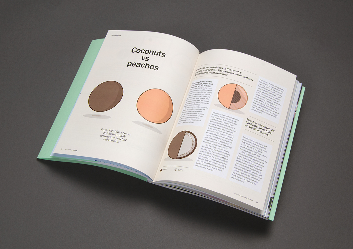
Thinking 5 by Strategy Creative, Chris Flack, Geoff Courtman and Eddy Davies