
A logo is a visual representation of a brand – the very first impression. Designing a logo that represents a brand is more than just graphic design. Like any line of work, a logo design requires a lot of knowledge and creativity skills.
So for this reason, I’d like to share with you some essential rules to design an effective, speak-for-itself logo.
Design Style Should Suit Your Client
Research your client and their audience before you begin your preliminary work. As a graphic design professional, you should obtain some background information first about your client and their brand they’d wish to create.
Some effort here goes a long way. It helps you to determine the best design style from the start and saves you time from having to amend a logo design too many times.
Preliminary Design

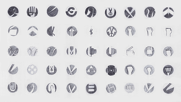 Image source – Uppercut Logo Design on Behance
The first step in designing a logo is to come out with preliminary sketches. Start with 10-20 or more sketches then, branch out to create variations of the original ideas. An efficient graphic designer will carry out preliminary work or logical designs before proceeding to the next phase of logo creation.
Create Balance
Balance is important in logo design because our minds naturally perceive a balanced design as being pleasing and appealing. Keep your logo balanced by keeping the “weight” of the graphics (i.e; colours, and size) equal on each side.
Use Colours Cleverly
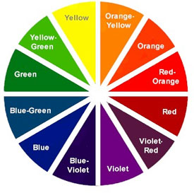
Use colours near to each other on the colour wheel (e.g. for a “warm” palette, use red, orange, and yellow hues). Do not use colours that are too bright and hard on the eyes. If you are applying only two colours on a logo make sure it looks good especially in black and white.
Keep this in mind as you try out different colour combinations, and try to match the colour to the overall tone and feel of the brand. Playing around with individual colours on their own is another good idea as some brands are recognizable solely by their distinct colour.
Size Matters

When it comes to logo design, size does matter. A logo has to look good and be legible at all sizes. A logo is not effective if it loses too much definition when scaled down for letterheads, envelopes, and small promotional items. The logo also has to look good when used for larger formats, such as posters, billboards, and electronic formats such as TV and the Web.
The most reliable way to determine if a logo works at all sizes is to actually test it yourself.
Typography Matters Too!
Choosing the right font type is very important. Three main points to consider when choosing a font type either as a tagline to go with your logo, or for the logo itself:
- Avoid the most commonly used font such as Comic Sans. It will make your amateurish and very unprofessional.
- Make sure the font is legible when scaled down, especially with script fonts.
- Avoid using more than two font types. Usually one font is ideal.
Strongly consider a custom font for your design. The more original the font, the more it will distinguish the brand. Examples of successful logos that have a custom font are Yahoo!, Twitter, and Coca-Cola.
Dare Yourself – Be Unique and Different

Try something different for a logo design. Rather than copy another design or style, be innovative and stand out from the crowd to distinguish yourself as a designer with a distinct style.
Try a variety of styles to find the one that works best for your client. Try different color combinations until you find one that makes your design truly original. Have fun with the design program you use, and keep tweaking the design until you feel you’ve got it right.
Do you practice these rules when designing for a brand? Or do you shatter it and create your own rules? Feel free to share your thoughts in the comment fields below.