In this Part 2 series of Choosing The Best Typography For Your Brochure Design, we’ll be talking about more useful tips which you can apply in the design of your new brochure. Follow the rest of the tips below and you’re on your way to increasing your brochure’s marketing potential.
If you missed Part 1, click here to read the beginning of this article.
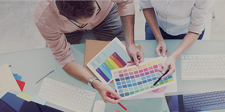
8. Choice of Colours

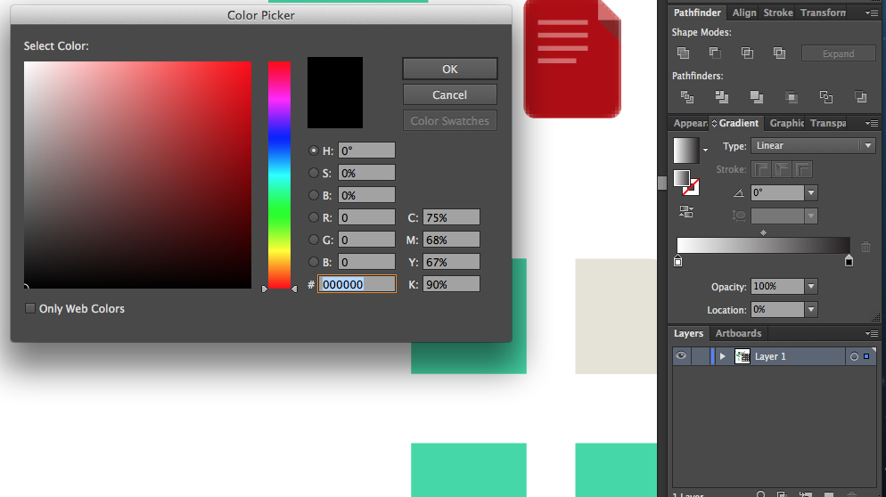
They can be rightly called as attention grabbers. People appreciate colours, and it is the first thing that your prospects will notice when they see your brochure. With this in mind, you should pick the colours for your brochure design with great attention and care. For example, Black text on a white background (or light background) is widely considered to be the most readable colour for text. I’m not saying you should go and set everything to black-on-white, just that when you’re designing, you should be aware of the contrast of your text. It could come back to bite you if you’re not careful.
You should experiment with different colours before selecting the final set of colours for your brochure design. The colours you select for your brochure design should ultimately complement with your products or services.
- Check out COLOURlovers.
9. The Grid
No, we’re not talking about the AI (Artificial Intelligence) website builder here because it doesn’t have any relevance to Typography in print. We’d like to focus on utilizing grids in print. It is the most important idea for practical typography on a brochure.


 Image source: Golden Modular
Using a grid when you’re designing with Type provides a clear balance and geometric structure to your design. It isn’t the magic fix to a bad design, but if you design with a grid from the start, you can be sure that at the very least, your layout will be solid.
So what does a grid have to do with typography?
Put simply: Everything. The grid embodies all the fundamental ideals of typography; it’s geometric, consistent, usable, and above all: beautiful. Setting your text with a grid is a key way of establishing visual hierarchy, and it’s a great indicator of how large (or small) your text should be.
How to create grids on a brochure template?
Adobe’s Creative Cloud tools such as InDesign and Illustrator CC provide grids and guide preferences which you can set and use for your projects. The video below shows a how-to on Adobe Illustrator.
For further reading on grids, check out Design Shack’s article here.
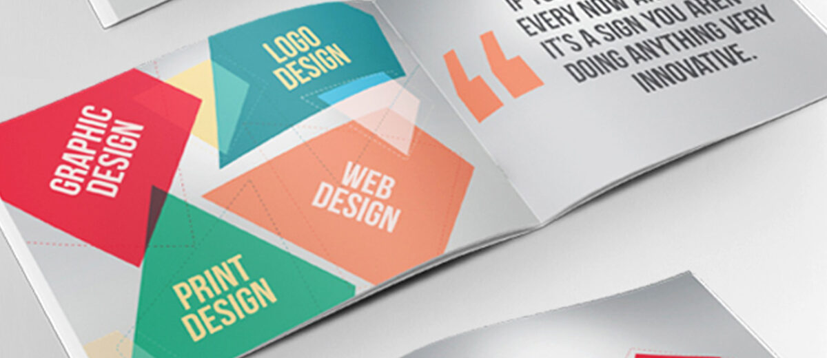
10. Standing Out
We enter unchartered waters here to being unique.One way of making your brochure stand out is to employ some unique typography. As graphic designers, it’s good that we experiment with different types of fonts. But what makes a unique font? For me, it’s not one that isn’t used often, but one that has a message or feeling not employed by other faces.
Choosing a unique font is really about the feeling. Does this font feel different? Or does it just look different? When choosing typefaces for any projects, you should always be considering the feeling of the design. As this is totally a personal opinion.
11. Match Your Design
Typography is not its own thing. It’s a part of brochure design process. Type is important, yes, but you shouldn’t forget that it’s just part of what makes a brochure design great. You should design your type with the rest of your design in mind. If you use a highly elaborate background texture, then maybe a nice serif would be good for your titles.
My point here is simple: Don’t forget the context. Design is a huge field, and I’m just talking about one part of it. A well designed brochure is where all the parts can mesh together successfully. That’s the goal: to craft the experience that everybody will love. You can’t do that with just type, or just color, or even just content!
12. Quality Printing
 Design isn’t only about nicely laid out pages, but also about the end physical product that people will hold in their hands. Brochure printing can sound quite boring, but if you know printing techniques well, it can seriously enhance your design. Some of my favorite techniques, among others, are:
-
- Letterpress: The inked (or not inked) parts are pressed into the paper, thus creating a nice look and feel.
- Die Cut: Irregular shapes created by cutting in the paper. It’s great to create some unusual effects.
- Varnish: A varnish layer that adds a glossy effect, my favorites are partial varnishes.
When the font is being printed from a screen the contrast and brightness should be adjusted to enable the font to look as it will when it is printed. This can assist the designer in deciding whether the typeface that has been chosen is achieving the desired effect.
- Quality of Paper: The quality of paper holds an important place in the brochure design and on-hand visual representation of your Typography. A quality paper can transform a brochure design from a boring piece of information to a fantastic content. So you should look and test some samples before selecting the right paper for your brochure design.
13. Get Feedback
Design isn’t just for designers; it’s for users as well. Once you’ve made your informed decisions, remember to find out how people react to your design choices.
Practical Typography
Well, you’ve reached the end of the post. I hope that at the very least you’ve learned something. If there’s one thing I want to leave you with after reading this, it’s that above all: be readable. The rest will follow. Even in this digital era, beautifully designed brochures still hold an important place in your overall marketing strategy.
Do you like this article? Support our blog with a small donation.
We keep our contents authentic and free from third party ad placements. Your continued support indeed can help us keep going and growing. By making a small donation would mean we can pay for web maintenance, hosting, content creation and marketing costs for the YDJ Blog. Thank you so much!