Typography is the art and technique of arranging type to make written language readable and appealing. And since text does a lot of the heavy lifting in communicating purpose, you need a solid understanding of typography.
Typography For Your Brochure
Promotion is one of the tools in marketing that you can use to create a buzz for your offered products and services. It would give you more opportunities to reach potential customers. One good example is through handing out brochures. The content of your brochure is correlated with the brochure design. Your brochure design is at the most important, because this is one of the deciding factors of potential customers if they will take or disregard your brochure, while content persuades them to go forward into buying your product. Your brochure design should create a lasting first impression to your target audience.
Typography continues to be overlooked by many designers yet it is a very important aspect of the design process as choosing the right typeface can make a real difference to the effectiveness of your design. Hence, choosing the best typography for your brochure design is essential.
How Can I Choose The Best Typography Fonts For My Brochure Design?
The elements you should focus for choosing the best typography for your brochure design are:
- Readability
- Choice of Typeface
- Sans or Serif?
- Pairing
- Size
- Hierarchy
- Leading
- …
1. Readability
What do you do with type? Read it! So why do so many brochures make it so difficult to do just that? Be it tiny font sizes, crammed line-height, or just plain fonts, it seems that a lot of brochures out there are determined to not let you enjoy their content!
By making your type readable, you immediately jump ahead of at least half of the competition, which is fortunate, really, because it’s not that hard!
2. Choice of Typeface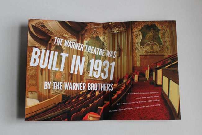
The effectiveness of the message of the page is strongly influenced by the choice of typeface. A good typeface will engage the audience and influence their perception of the message. The key is to choose a typeface that will link the text with the graphics to achieve the objective of the page.
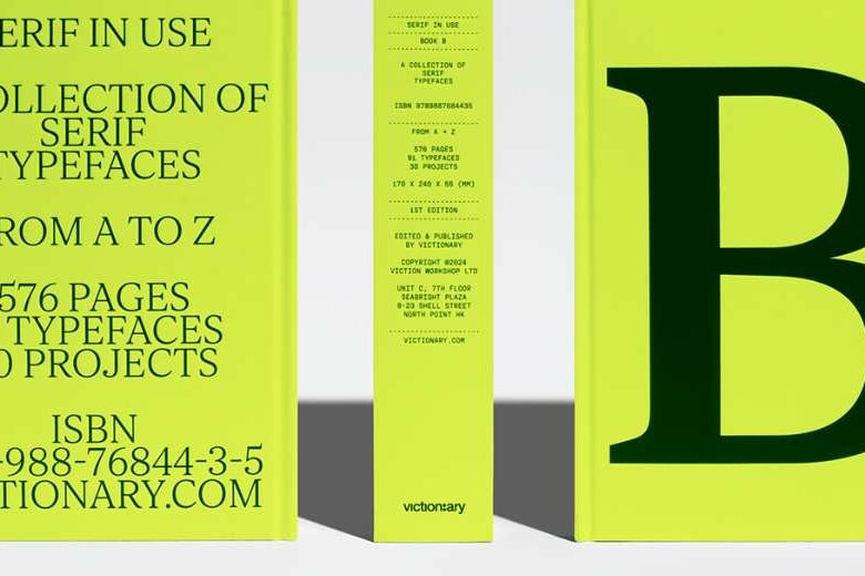
3. Sans or Serif?
The most widely used typography categorization is serif or sans serif. Fonts that are known as serif have feet at the end of the letterforms. This feature is not found in sans serif fonts. There is a wide range of different styles of fonts in both groups that can make them difficult to classify. As a general rule though serif fonts are more traditional and sans serif fonts are considered modern. Serif fonts are sometimes considered to be more readable.
4. Pair & Compare
There’s rarely a situation where just one typeface is appropriate for use on a brochure. If you need to put lots of text in a brochure,there is no way one typeface will work for all of them! When choosing a set of fonts, the most important thing to consider is how they work together. “Are they similar enough?”
“Too similar?” “Not different enough?” these are questions you should be asking yourself. I find that the best way to choose a pair of fonts that works is to just put a lot of them side by side and decide on the best. There’s no way to know which one is the best – until you’ve tried all of them.
5. Size
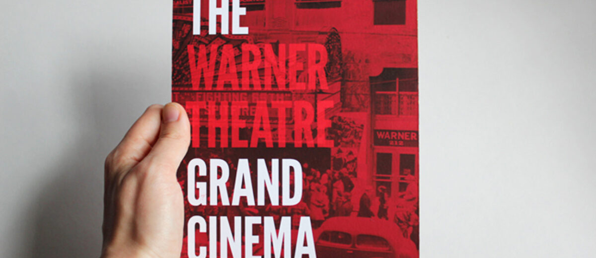
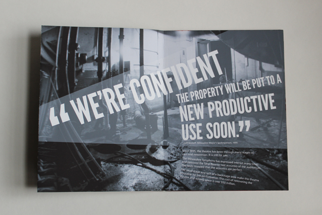 Image source: The Grand Cinema Book
How big should your titles be? It depends. In my observation and creation, I’ve come to the conclusion that a title should only be as big as it needs to be. This means that you should try out different sizes until you find one that is just big enough to draw the attention you want to it, but no bigger, unless huge text is what you’re going for – in which case go right on ahead.
6. Hierarchy
The nature of a title is big. It’s an important item on the page, so naturally it should be bigger, right? Yes and no. Yes, titles are generally bigger than other elements, but no, this is not the only way to draw attention to them. Color, weight, and placement are all equally important to establishing a clear visual hierarchy to your pages.
The key point to remember about visual hierarchy is that it’s all relative. The use of type is a very important tool to establishing visual hierarchy, be it through size, color, weight, or even placement.
7. Leading
Leading, or the space between lines of text, is an invaluable tool for readable text. Bad leading can ruin an otherwise stellar piece of copy, and good leading can make even the worst type look readable. Fortunately, it’s not that complicated to implement.
What Are Your Thoughts?
And this concludes Part 1 of two of Choosing The Best Typography Fonts For Your Brochure Design article. Be sure to pay this blog a visit again, as I will share more brochure design tips with you soon. If you have any comments or opinions that you’d like to share, leave our thoughts below. I’d be happy to know.
Do you like this article? Support our blog with a small donation.
We keep our contents authentic and free from third party ad placements. Your continued support indeed can help us keep going and growing. By making a small donation would mean we can pay for web maintenance, hosting, content creation and marketing costs for the YDJ Blog. Thank you so much!